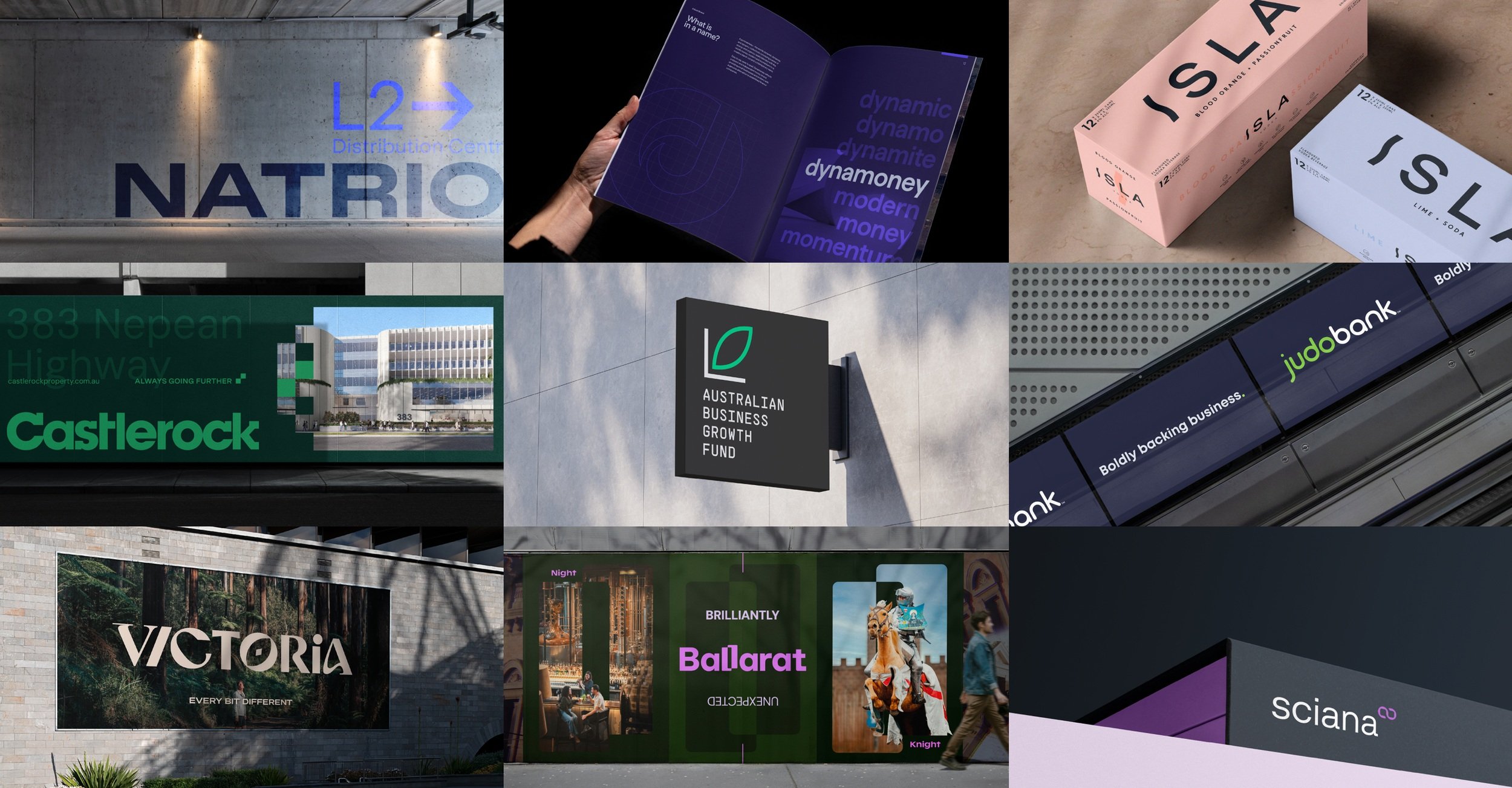
Australian Business Growth Fund * Castlerock * City of Ballarat * Club Assist * Dynamoney * For The Love * Goodbye Gas * ISLA Vodka * Judo Bank * Kidsafe * Mount Hotham * Natrio * ORDE Financial * Sayers * 7-Eleven * Tourism North East * Tourism Midwest * Towong Shire Council * Visit Victoria * Zip Pay *
Australian Business Growth Fund * Castlerock * City of Ballarat * Club Assist * Dynamoney * For The Love * Goodbye Gas * ISLA Vodka * Judo Bank * Kidsafe * Mount Hotham * Natrio * ORDE Financial * Sayers * 7-Eleven * Tourism North East * Tourism Midwest * Towong Shire Council * Visit Victoria * Zip Pay *
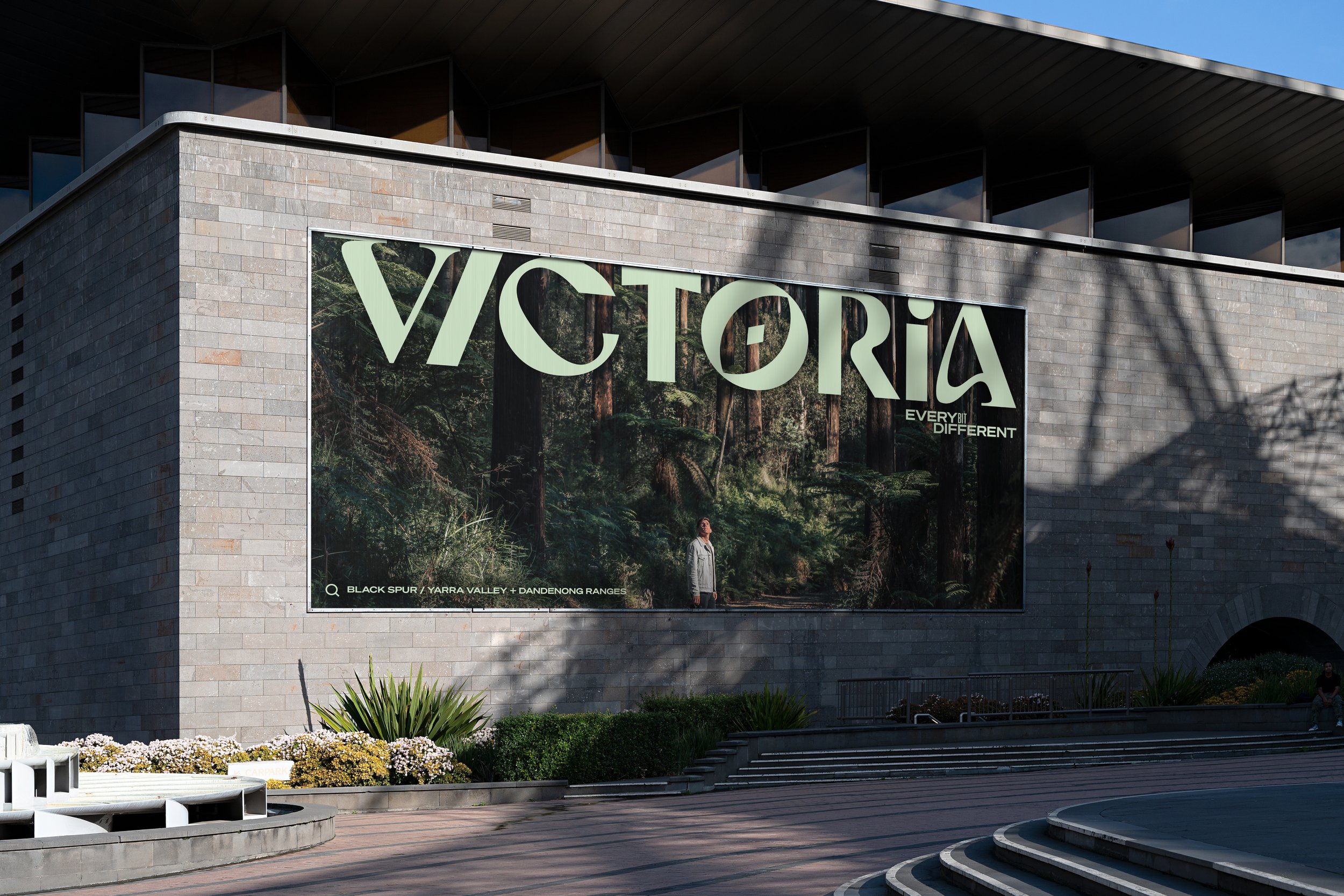
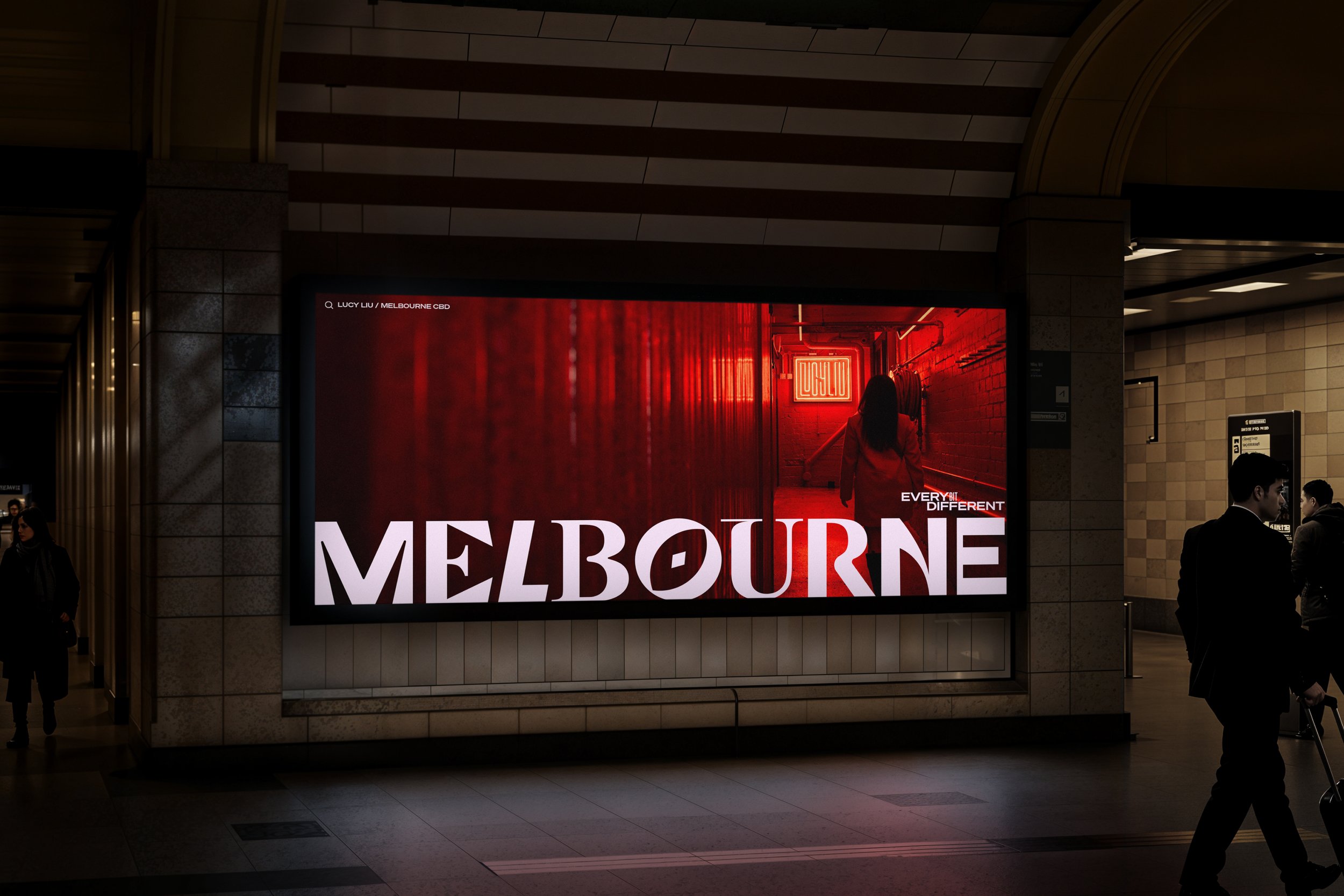
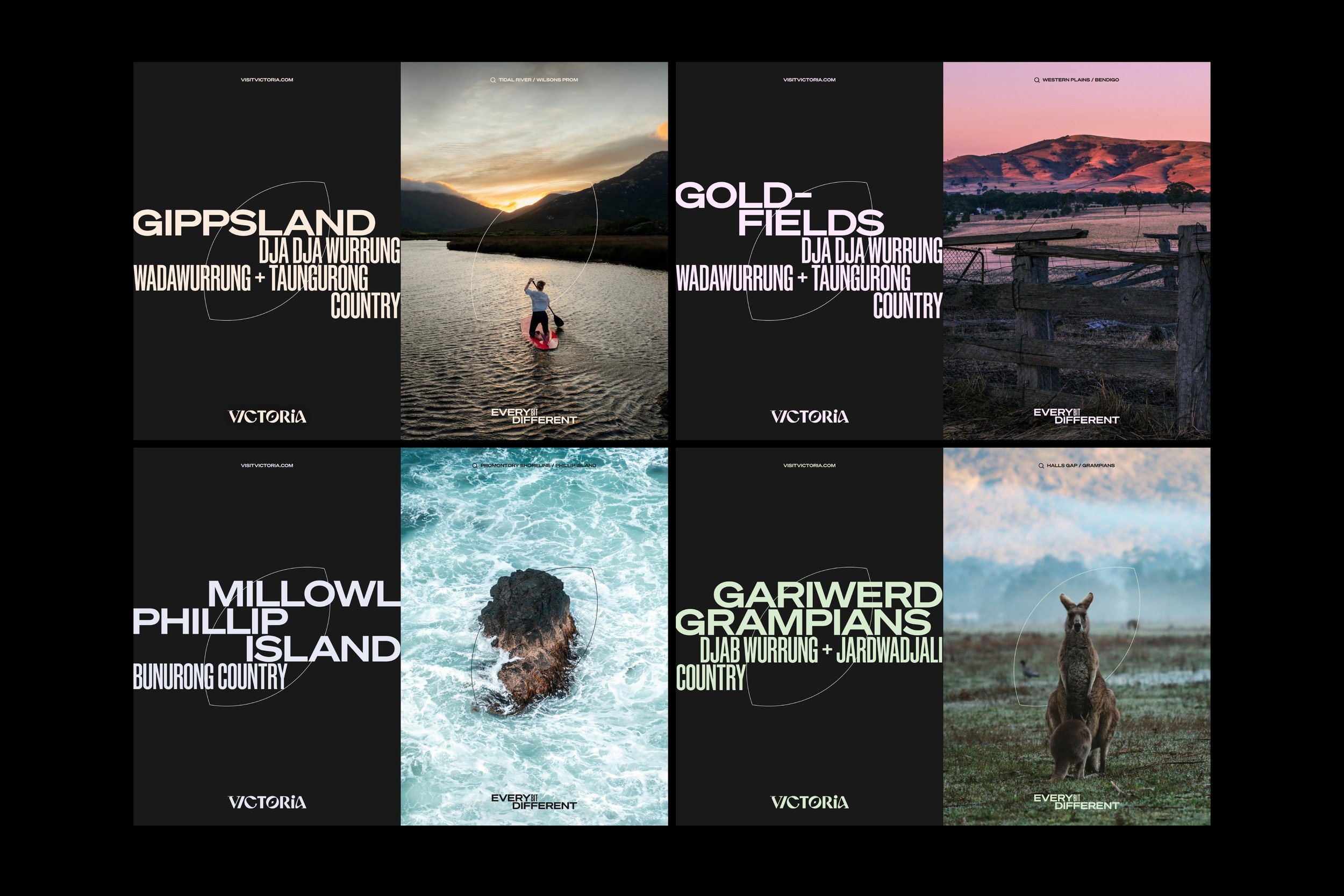
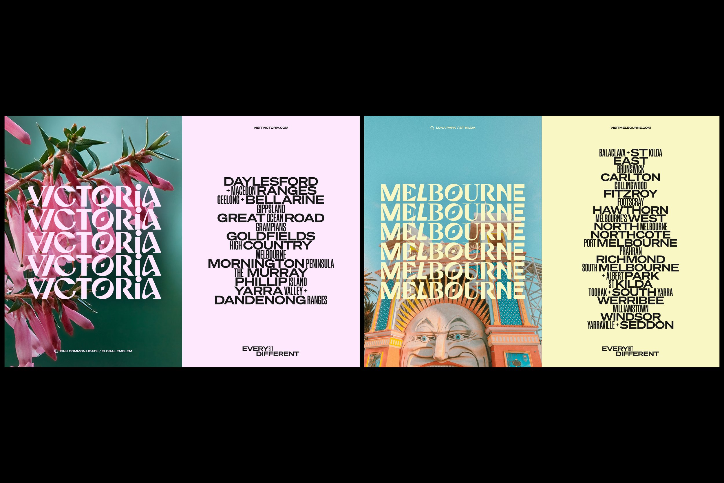
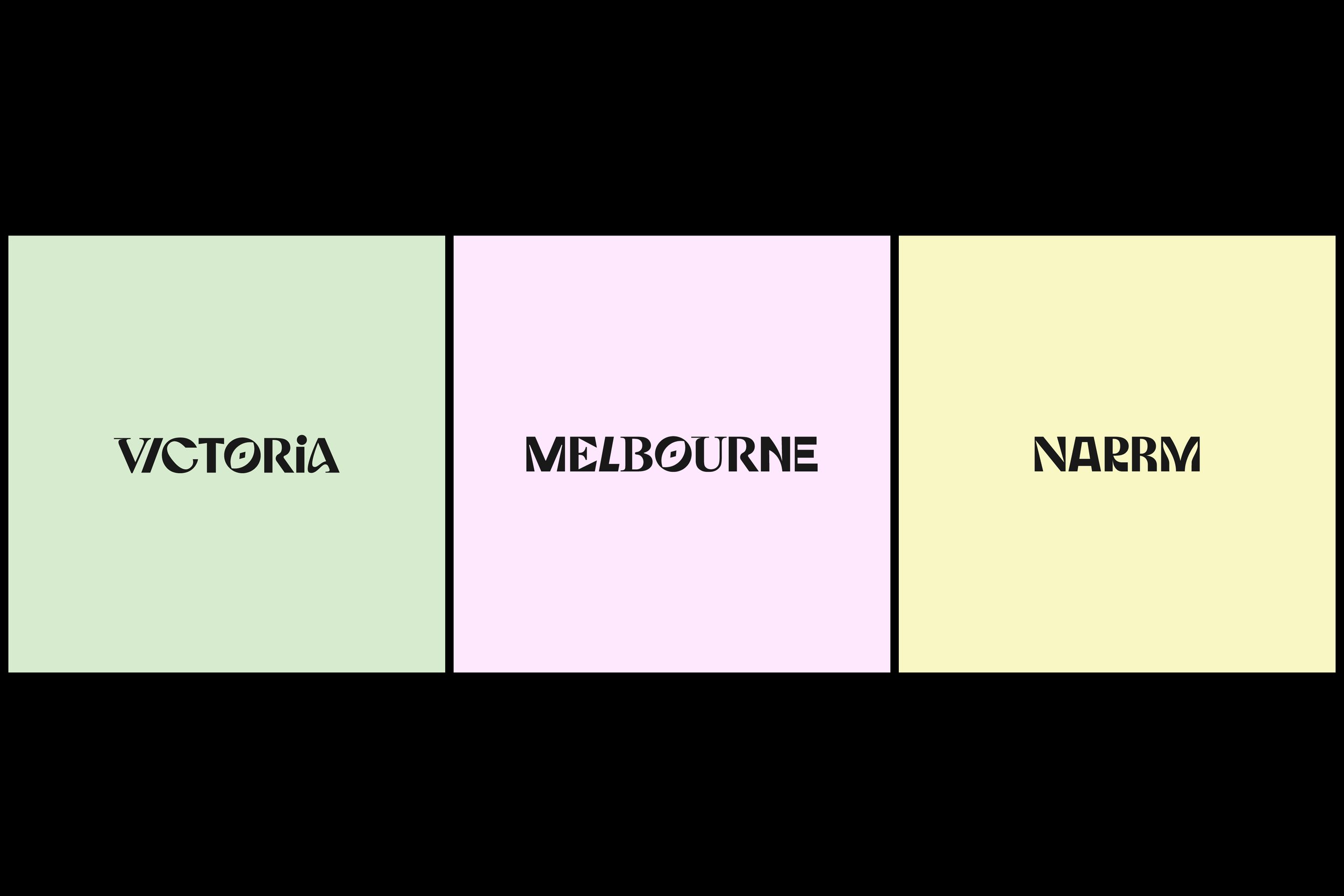
01_Visit Victoria
Rebrand > Brand Identity
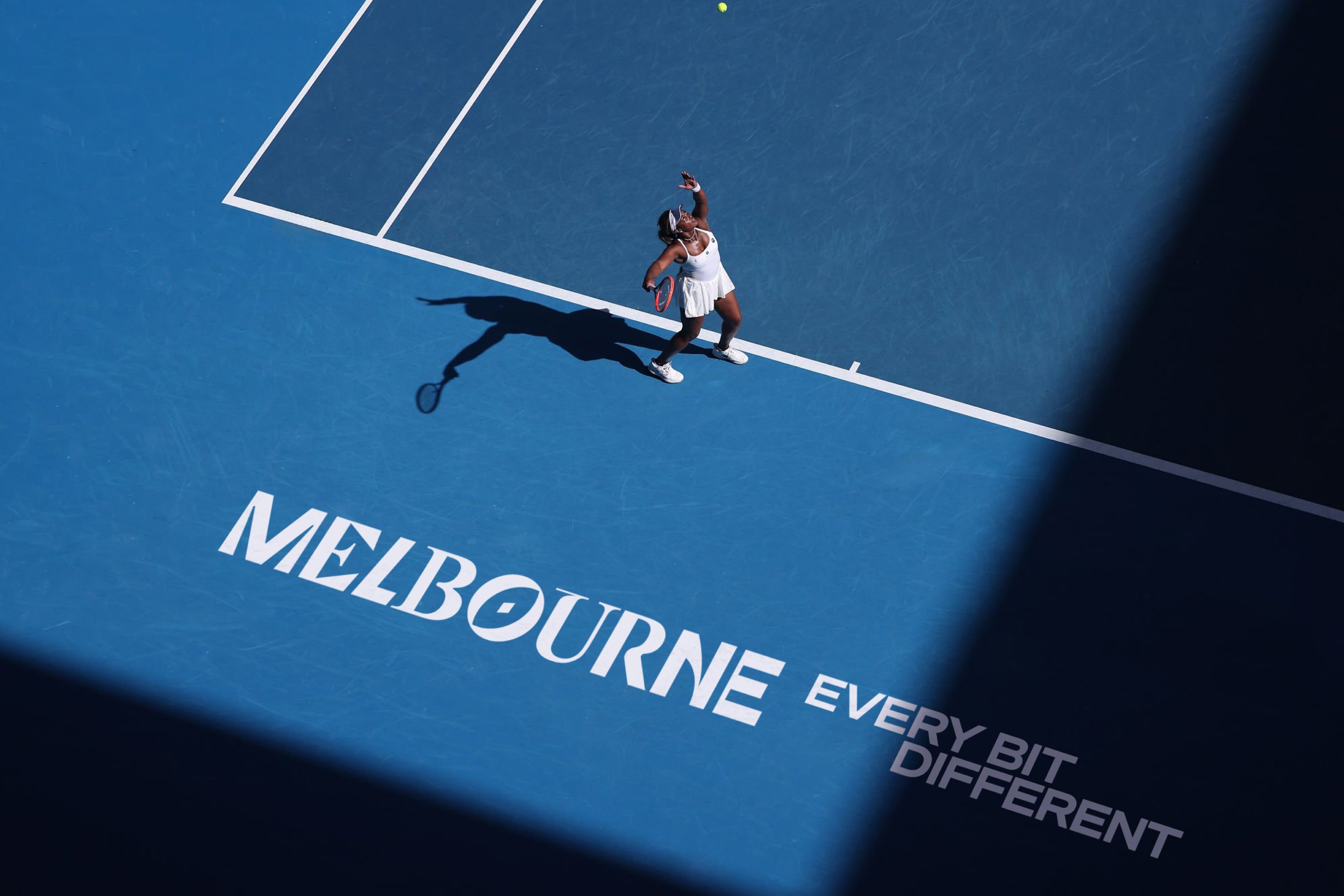
A global brand for Victoria and Melbourne that’s every bit different
-
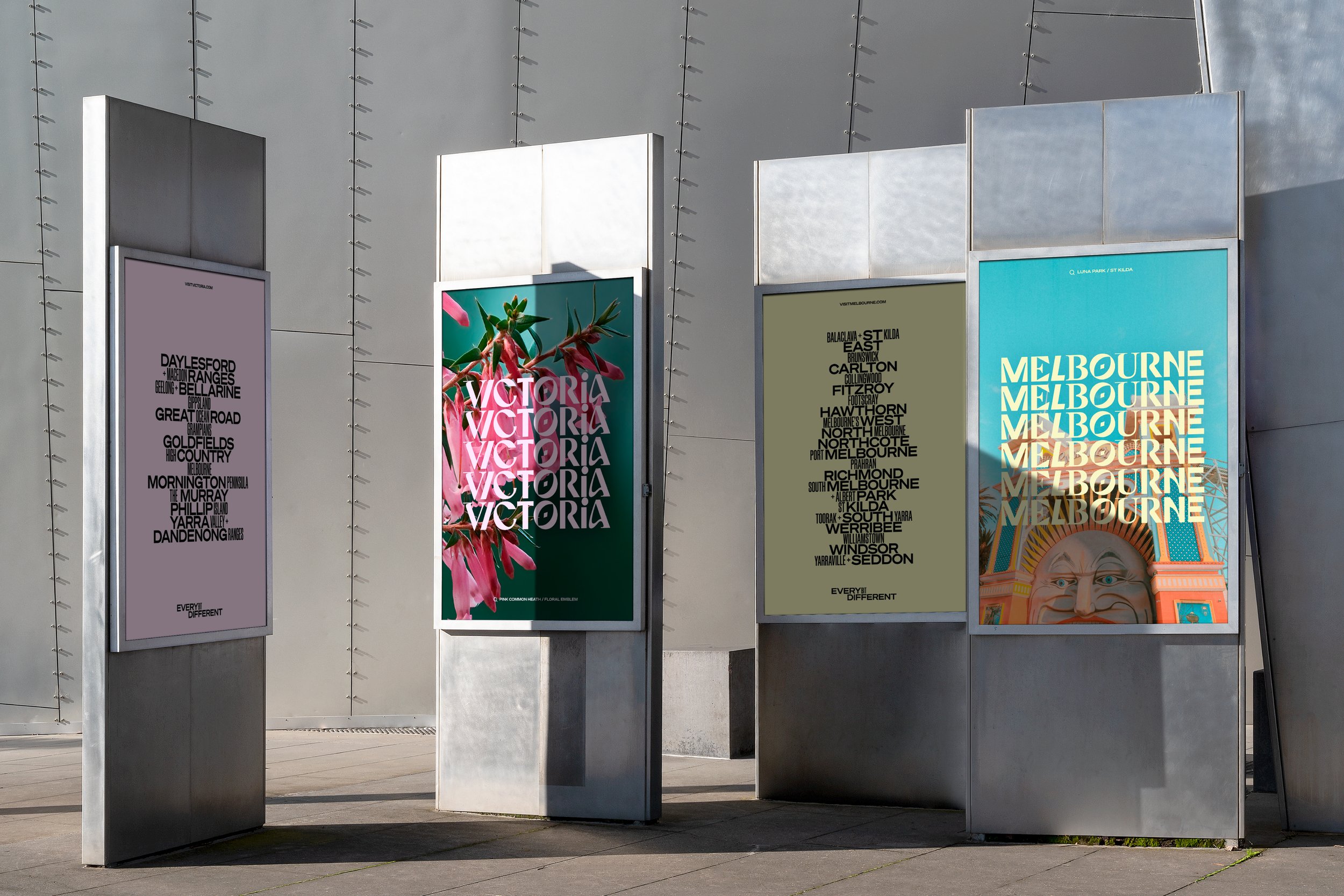
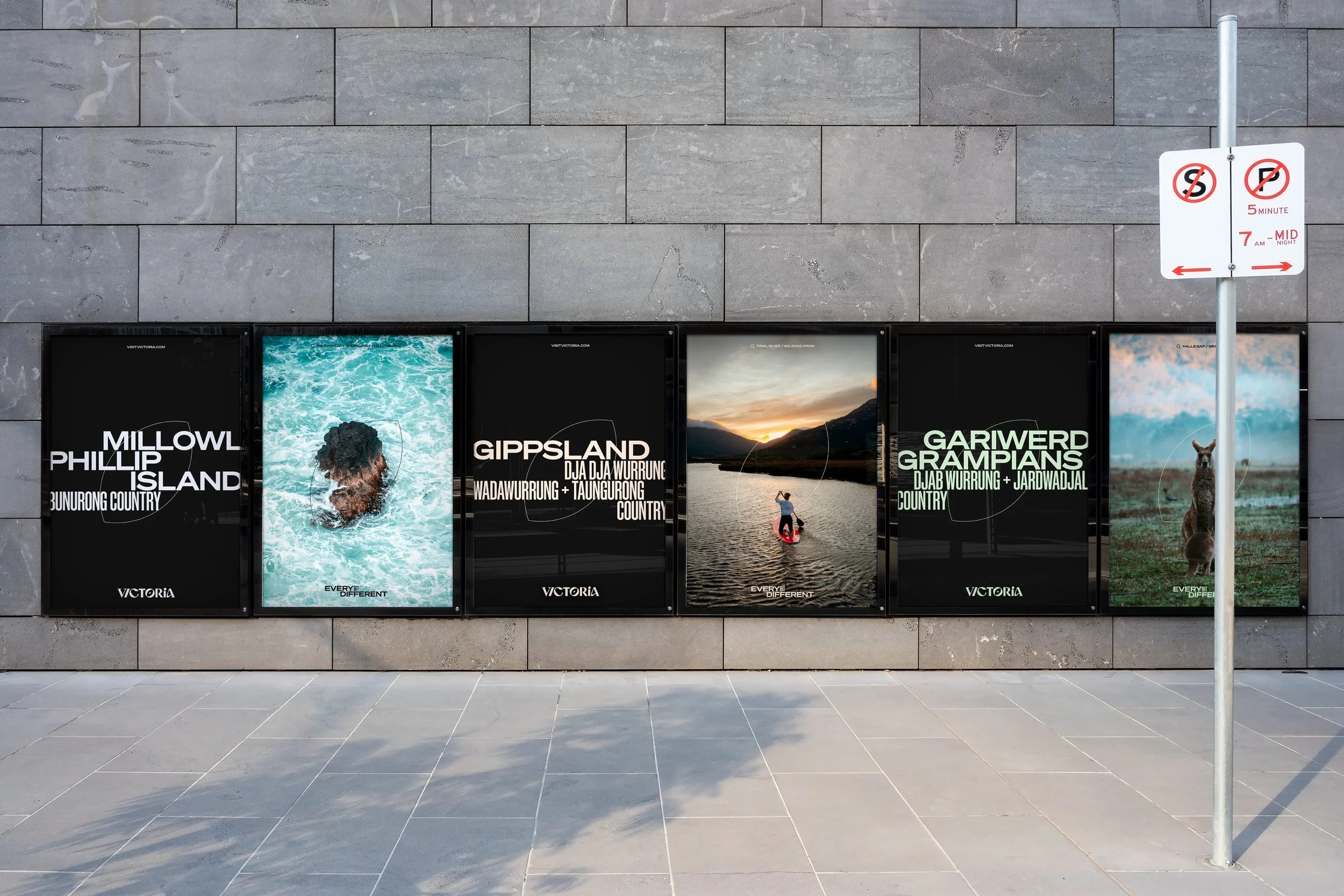
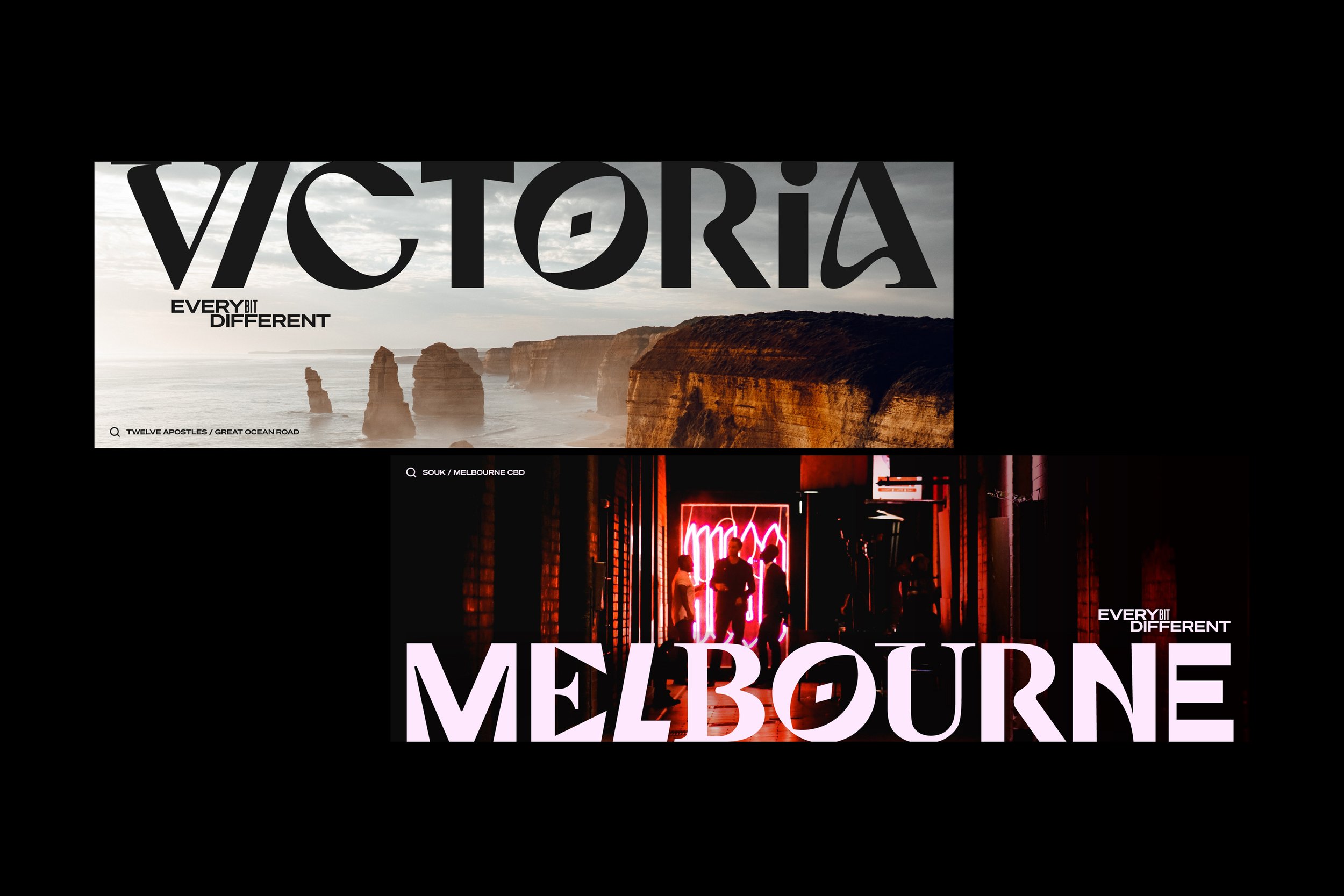
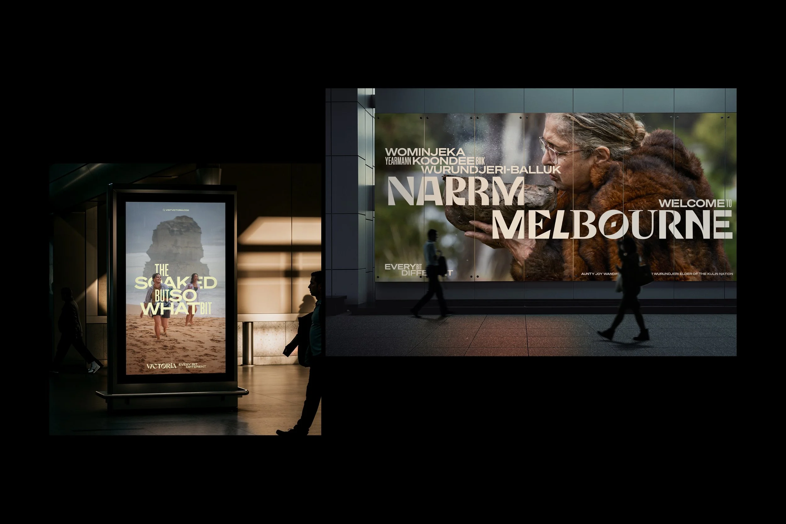
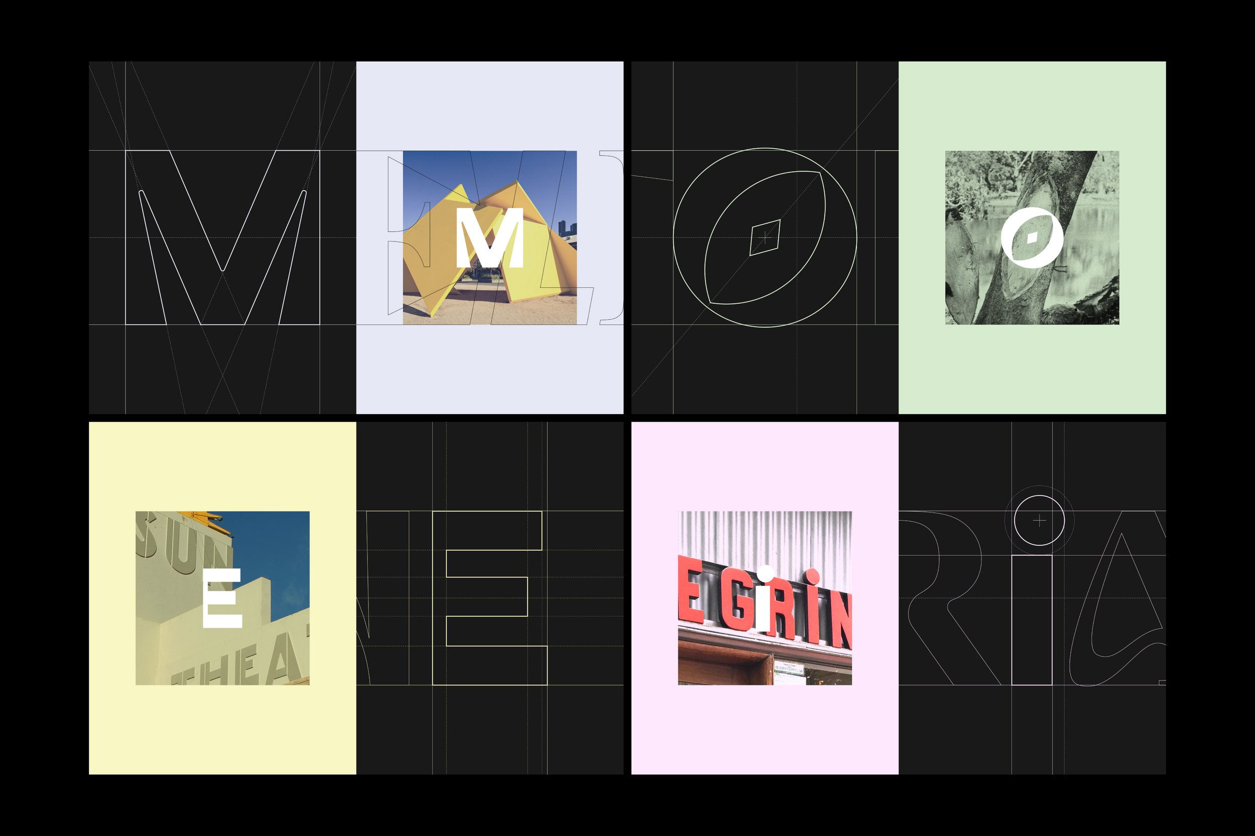
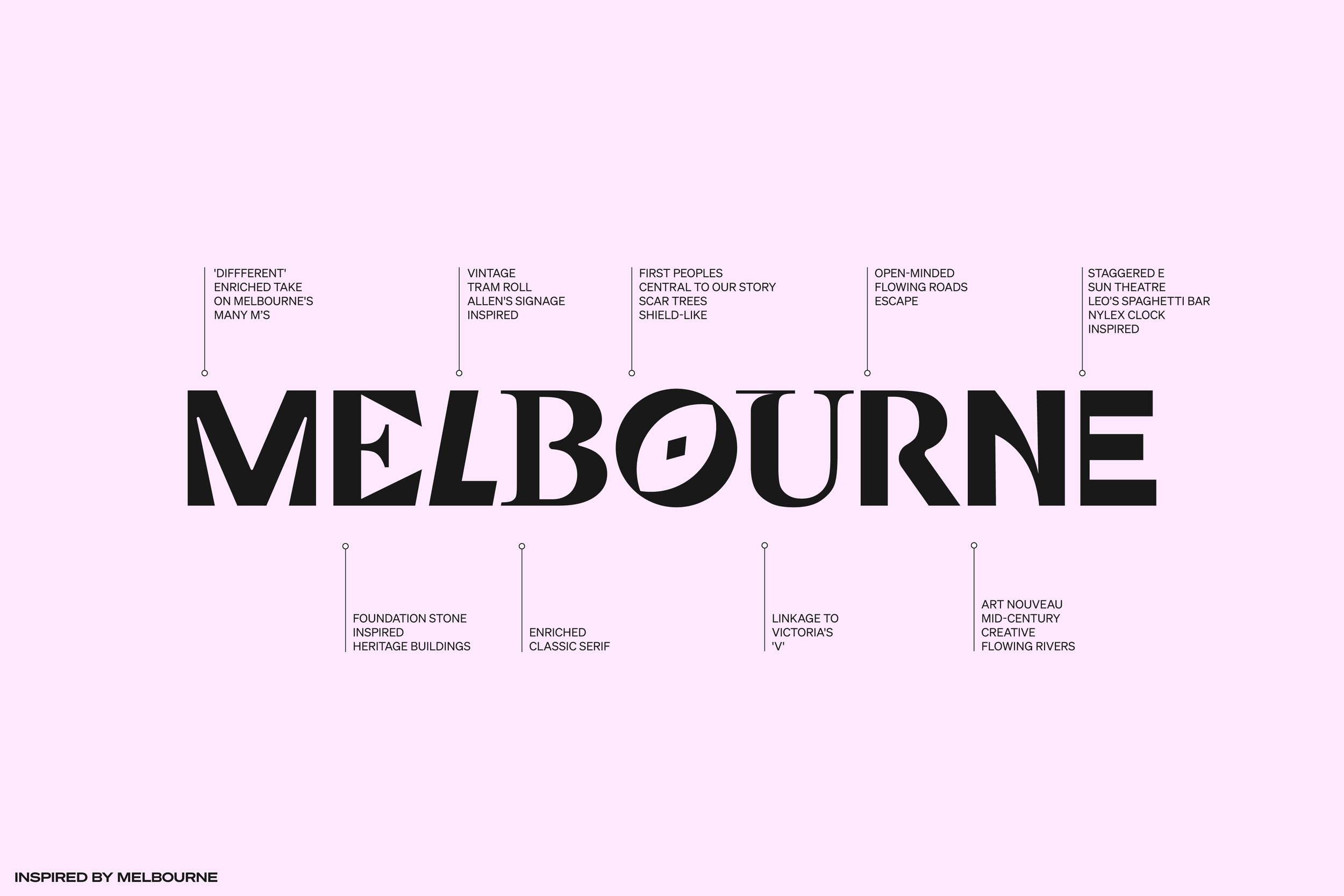
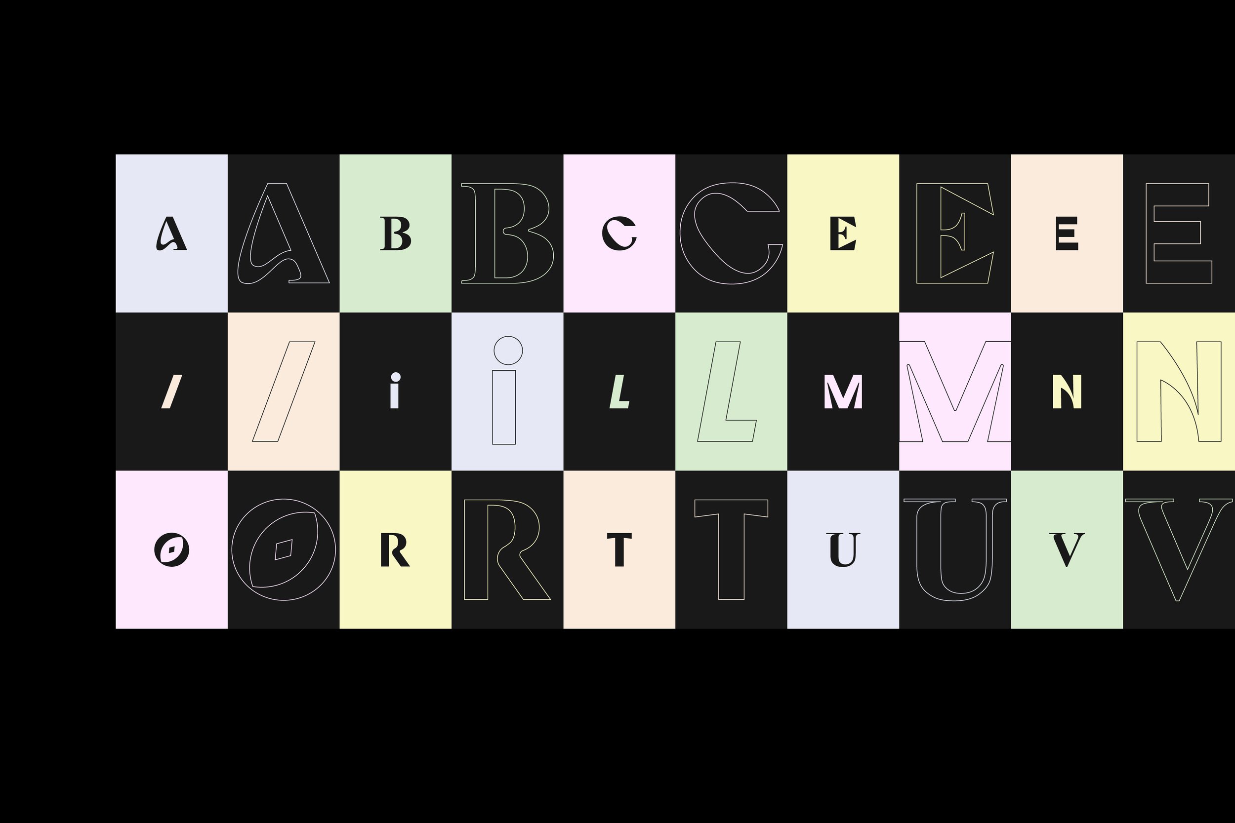
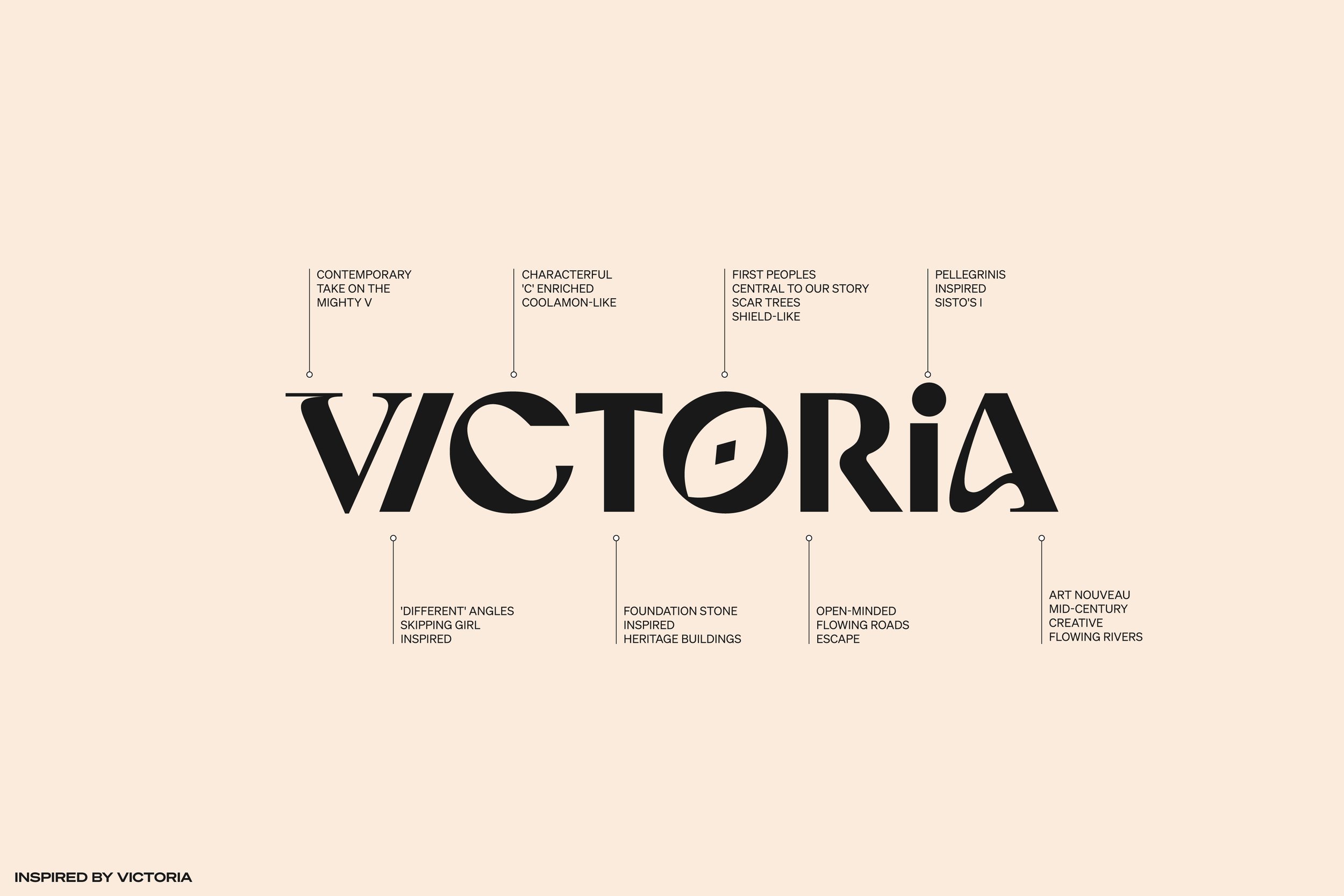
Visit Victoria needed a fresh, expressive and iconic visual identity to bring its ‘Every Bit Different’ brand platform to life. The new logos and identity system not only bring meaning to the brand platform, but take inspiration from the state’s much loved ‘Jigsaw’ logo of old, and its rich typographic history, with each logo letterform nodding to Victoria and Melbourne's diversity, passion, history and creativity.
-
The ‘Every Bit Different’ identity draws inspiration from the myriad experiences Victoria has to offer—reflecting its many moments and vast differences, diverse and eclectic but somehow cohesive. The design system bends traditional typographic principles blending differing letterform styles into a singular logo-mark inspired by Victoria and Melbourne's icons and typographic history. From the ‘R’ that evokes Victoria’s many winding touring roads, to the ‘O’ inspired by the markings of scar trees left by First Peoples’ carving shields from their bark, to the ‘I’ inspired by the iconic Pellegrini’s sign—pioneers of Melbourne and Victoria's coffee and cafe culture.
-
“There’s no doubt that creating a visual identity for a city and state is an incredibly challenging brief. The team delivered an exceptional outcome through strategic and creative rigour, and, more importantly, patience and collaboration. We’re extremely proud of the partnership and the work that has been created.”
Richard Price — Group Manager, Content & Creative Services

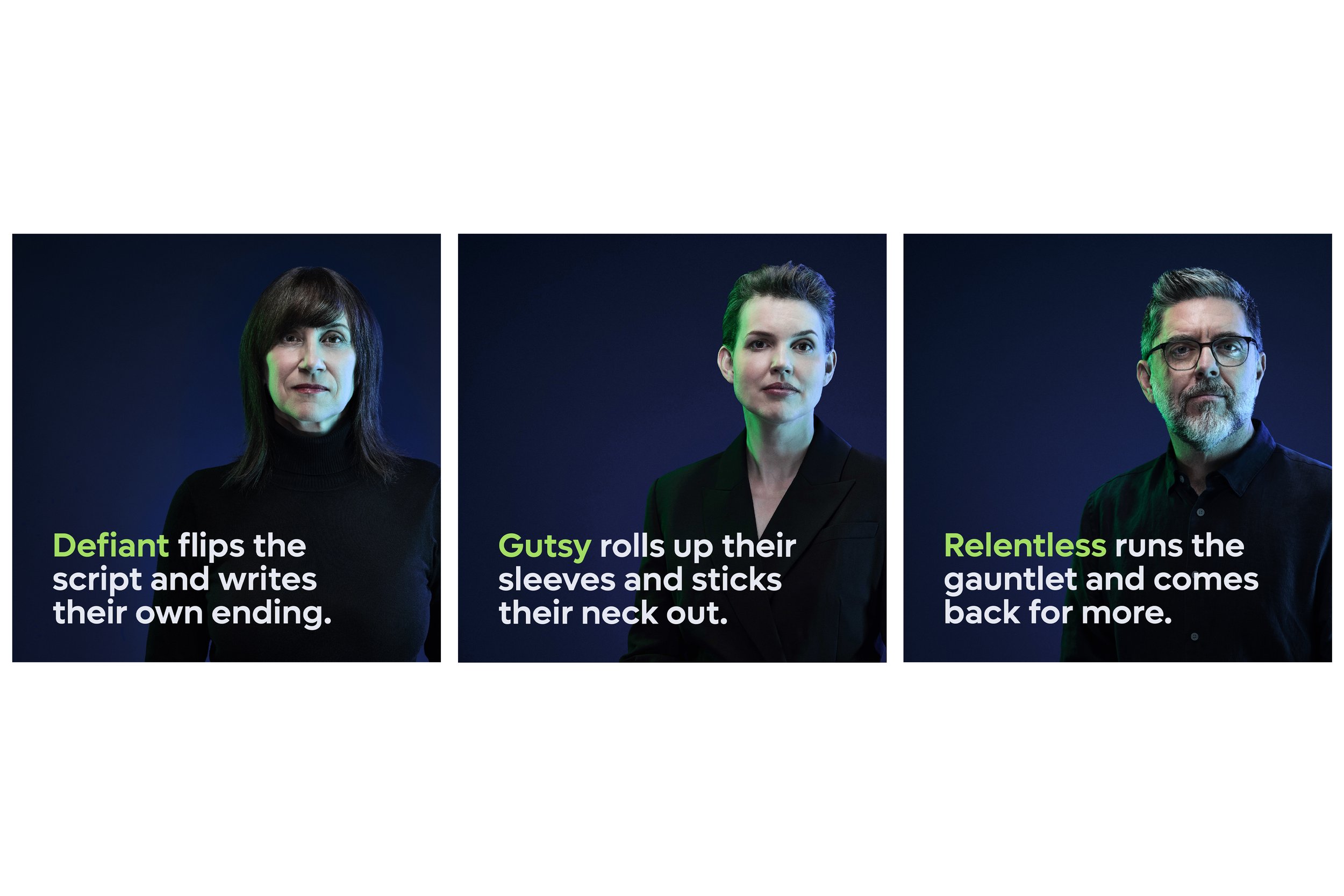
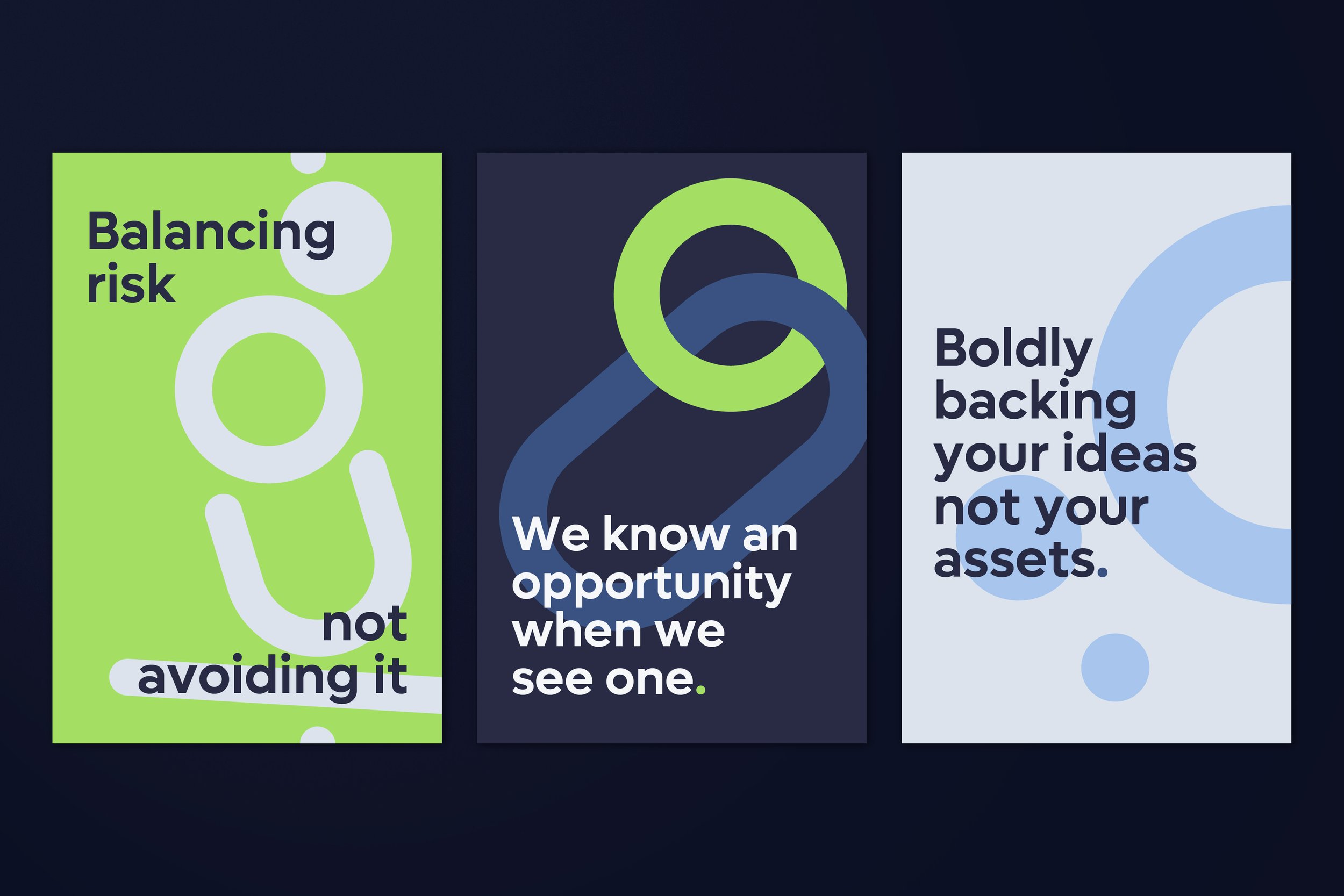
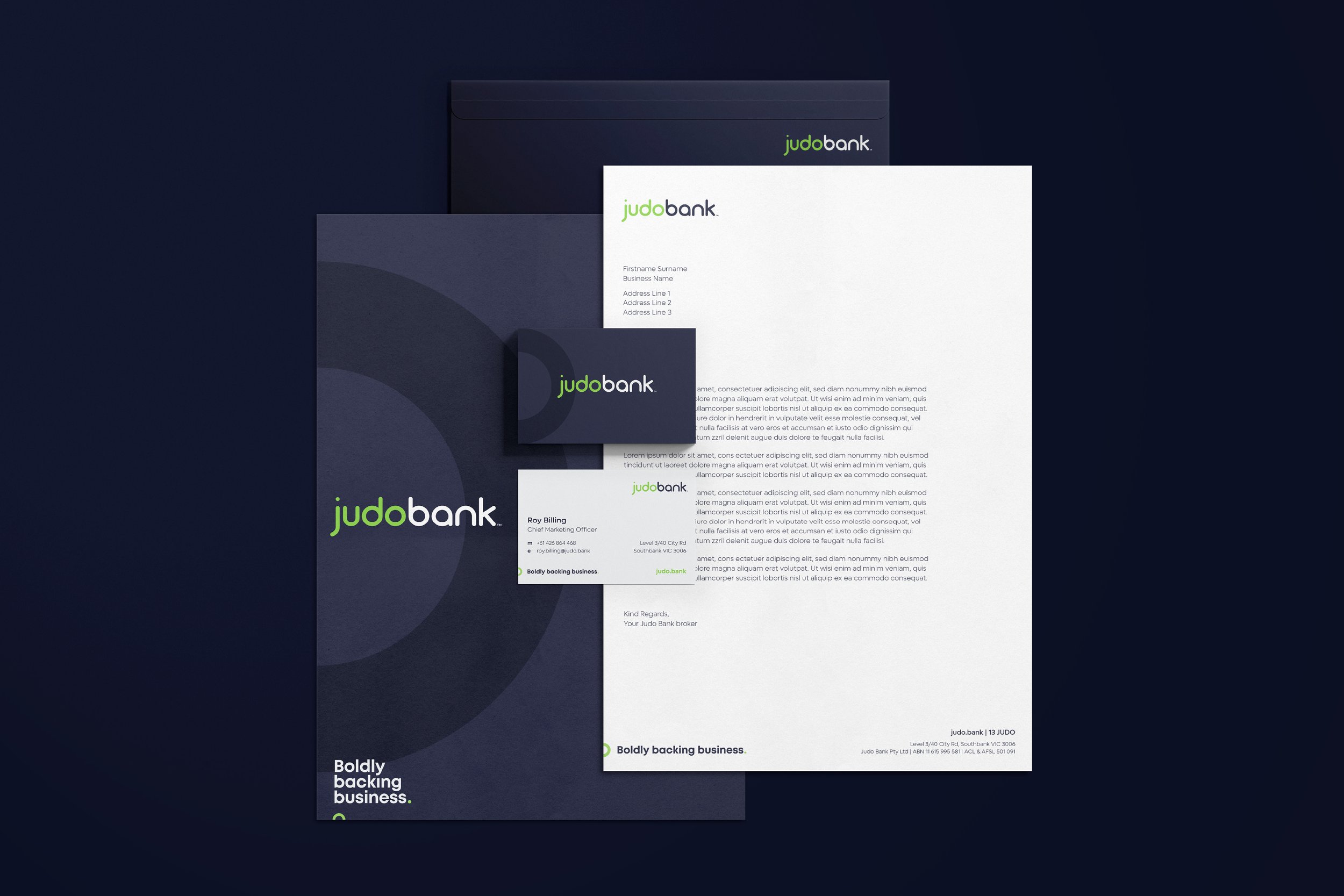
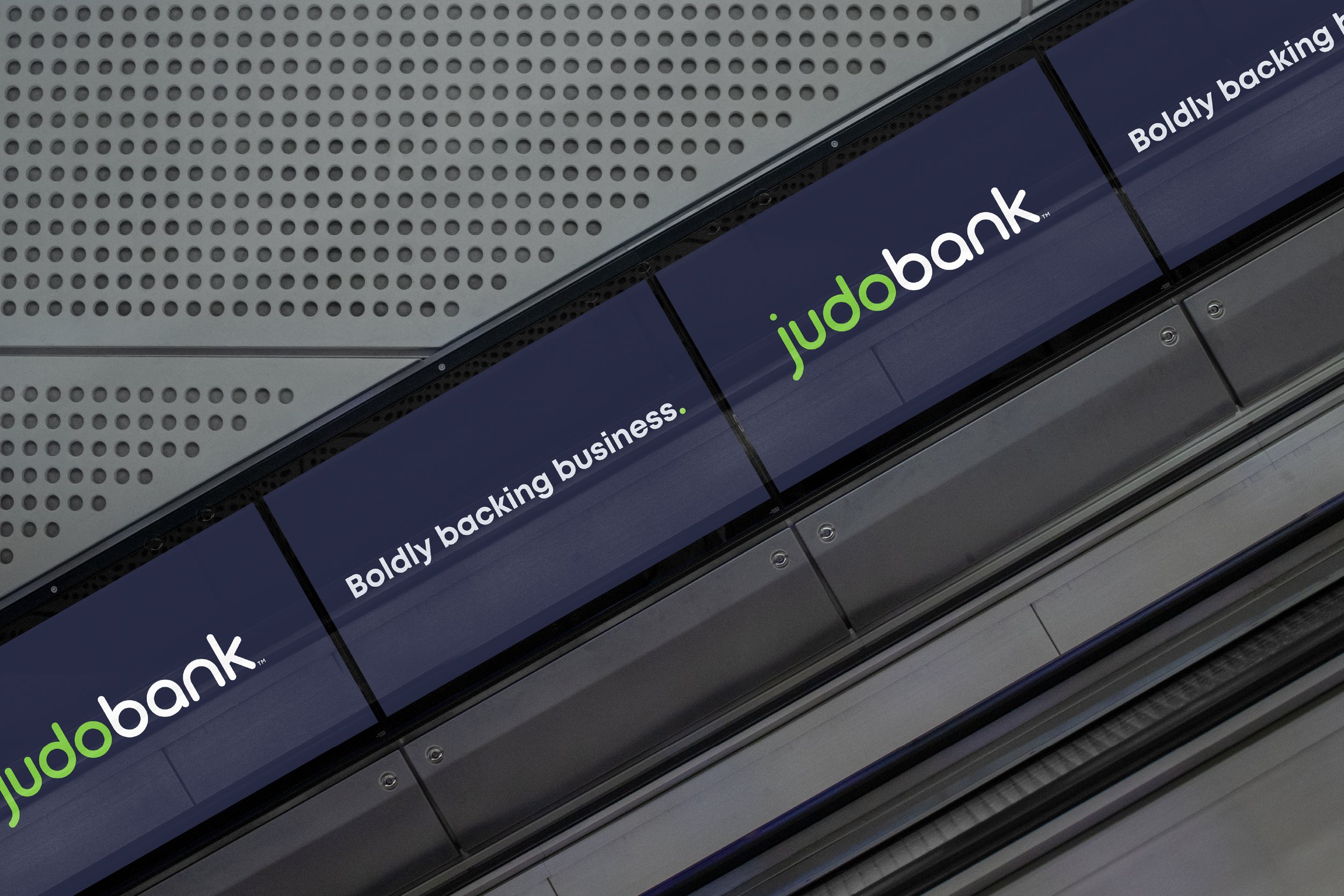
02_Judo Bank
Brand Evolution > Brand Identity > Brand Positioning > Advisory
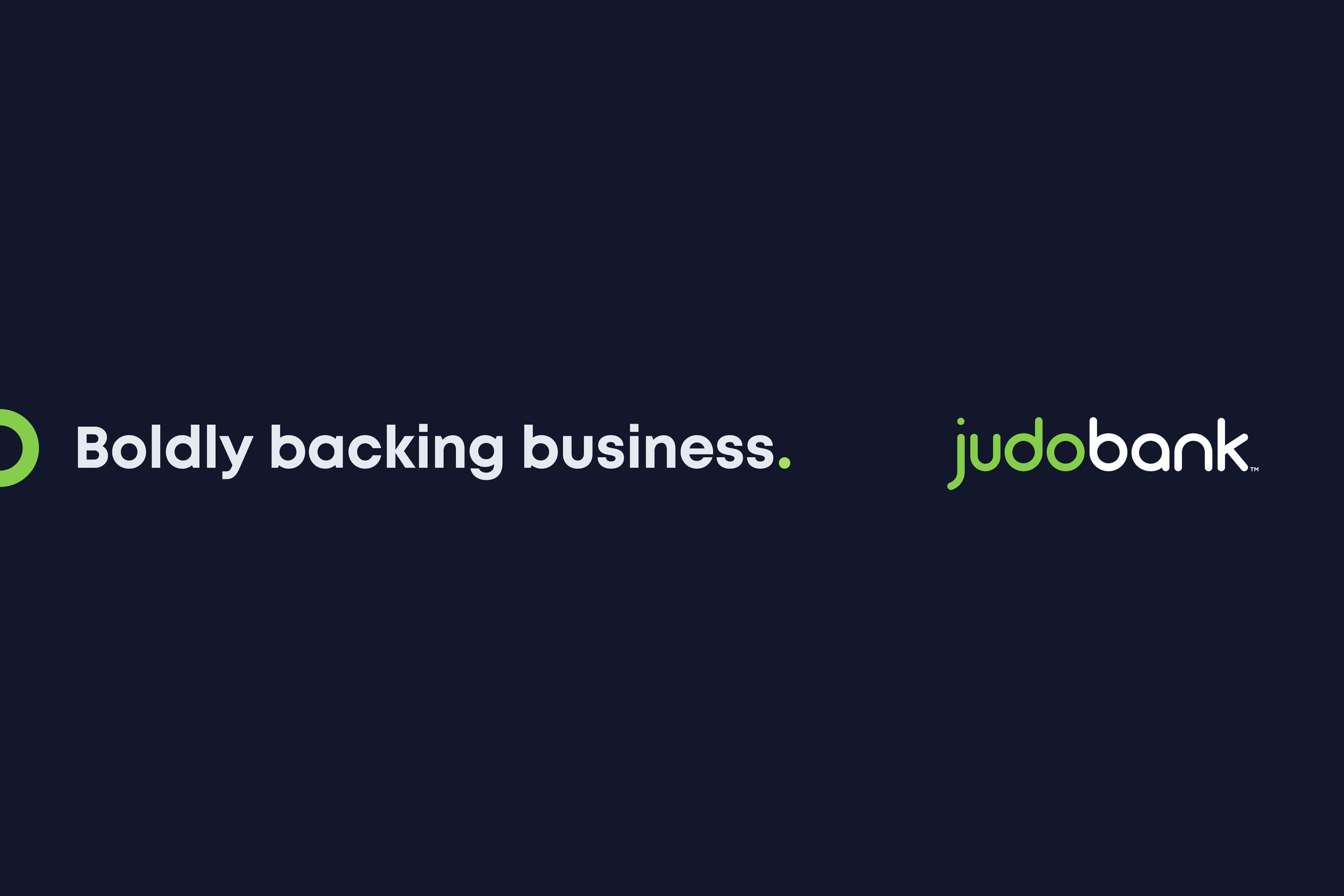
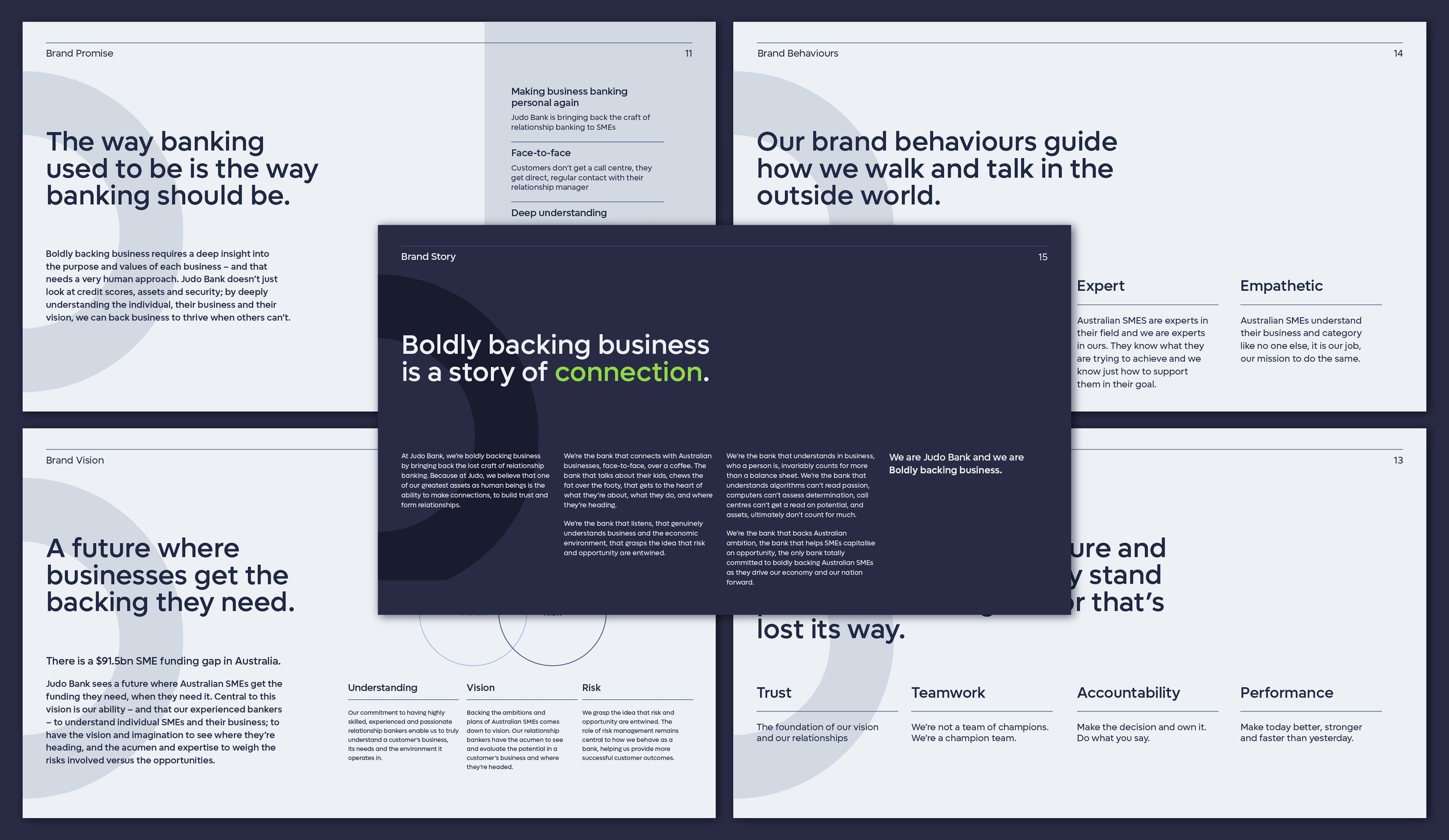
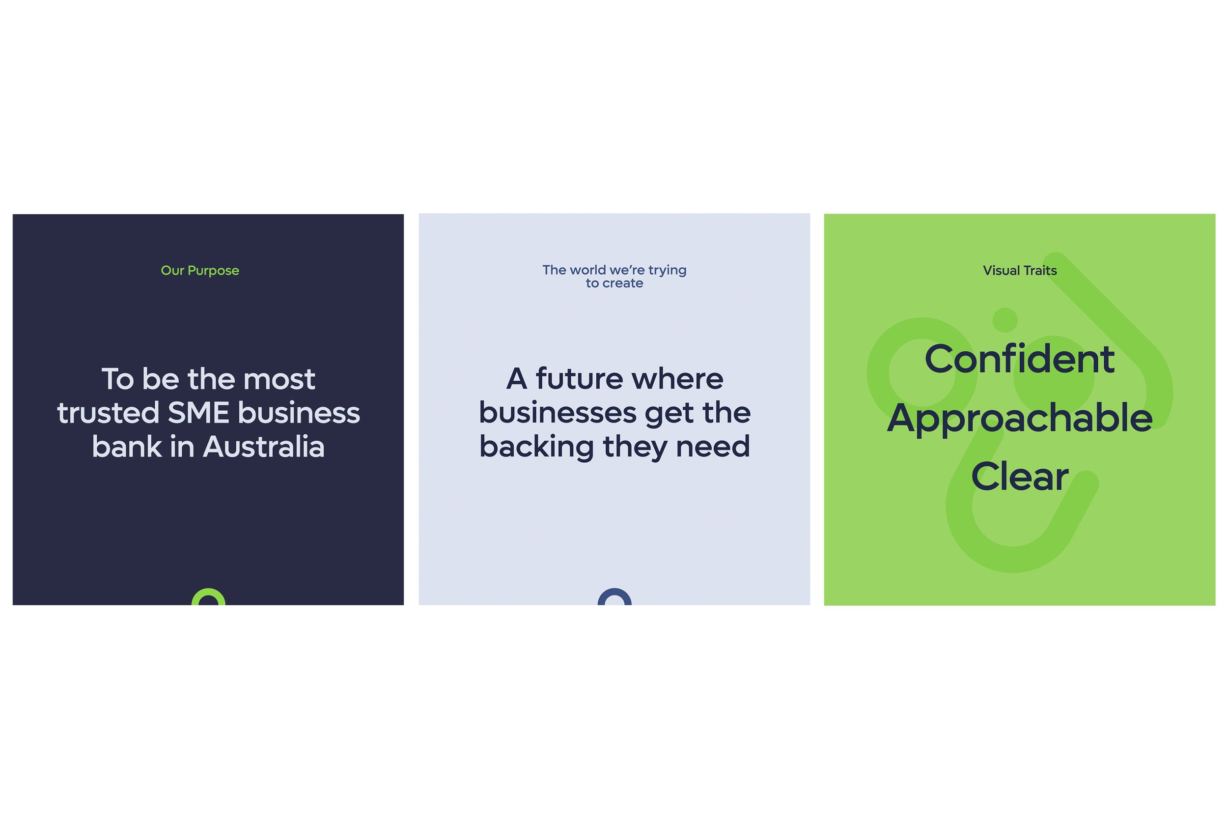
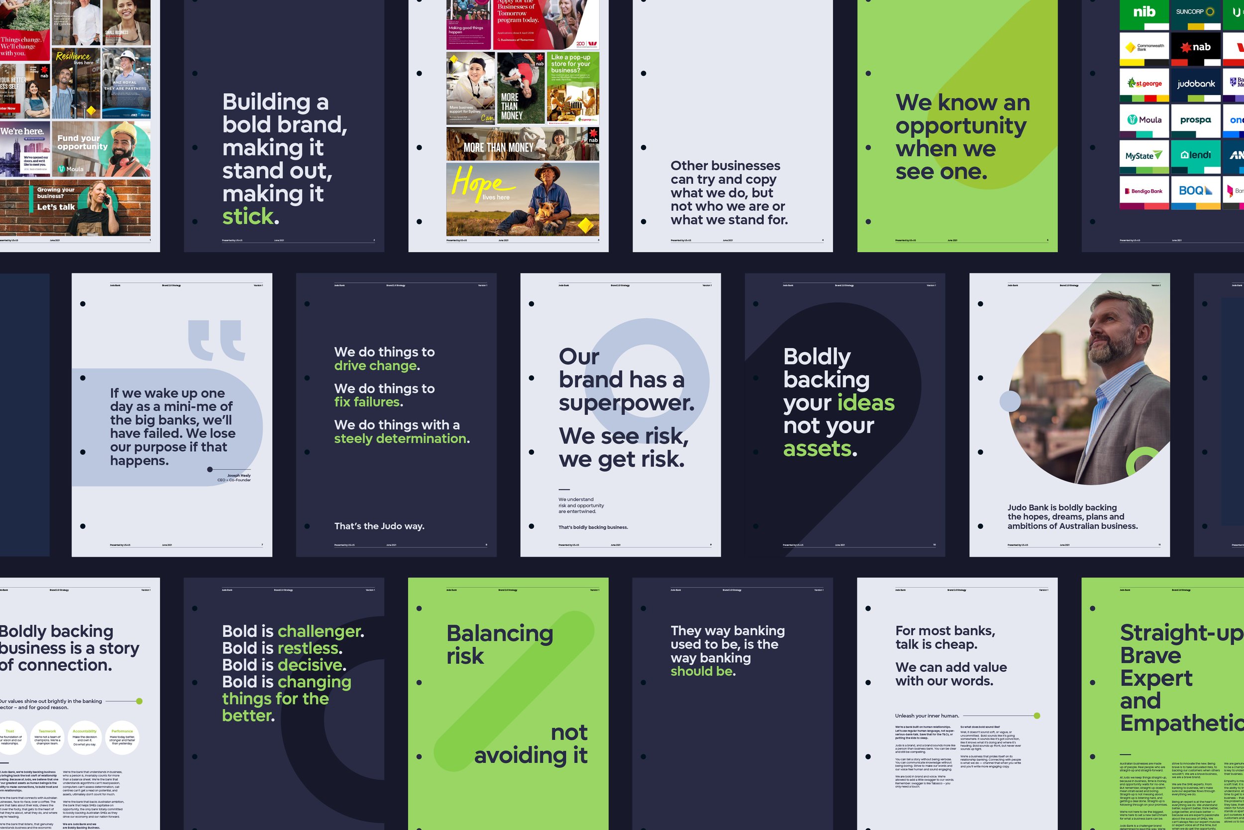
A bold brand for an SME Bank that’s boldly backing business
-
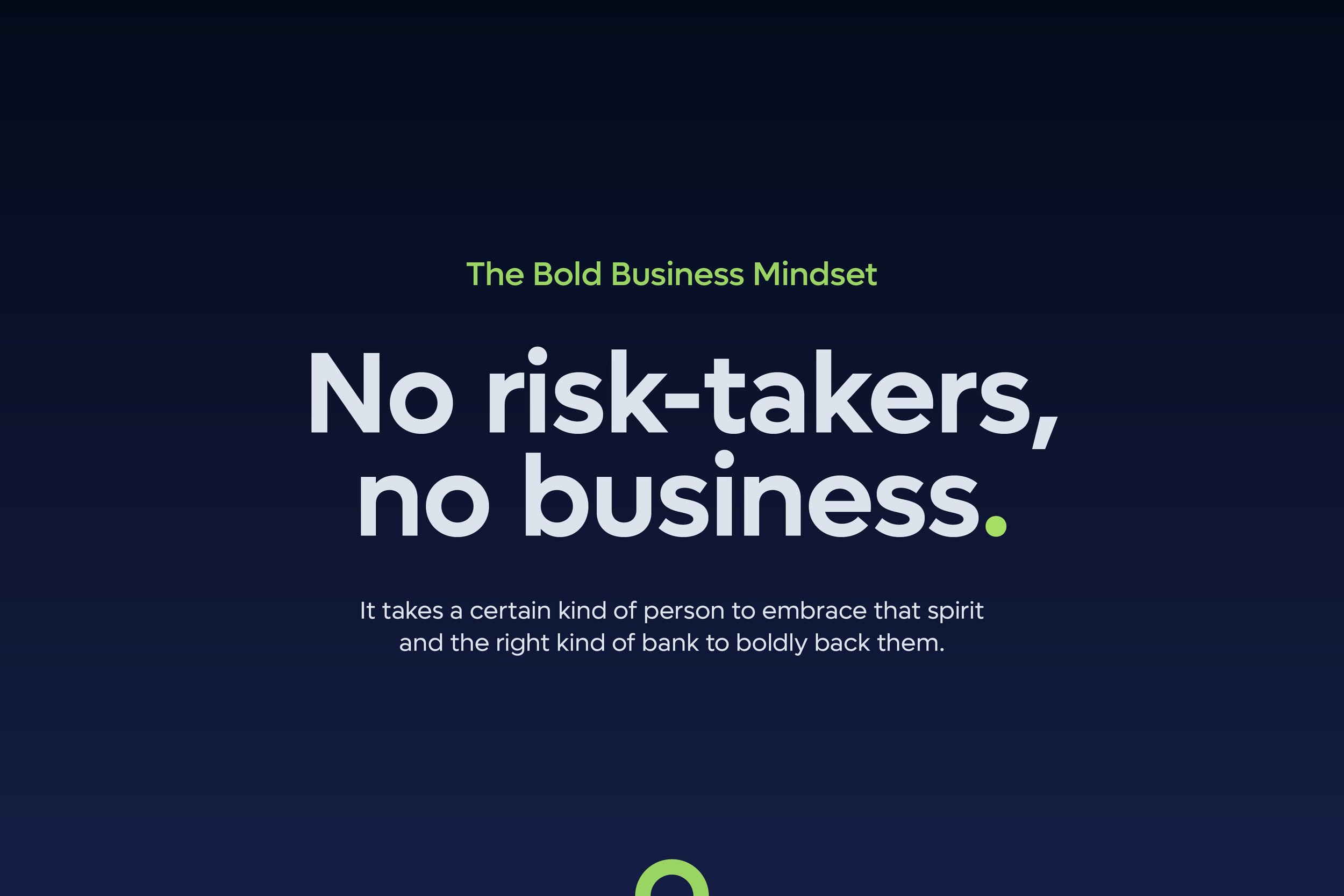
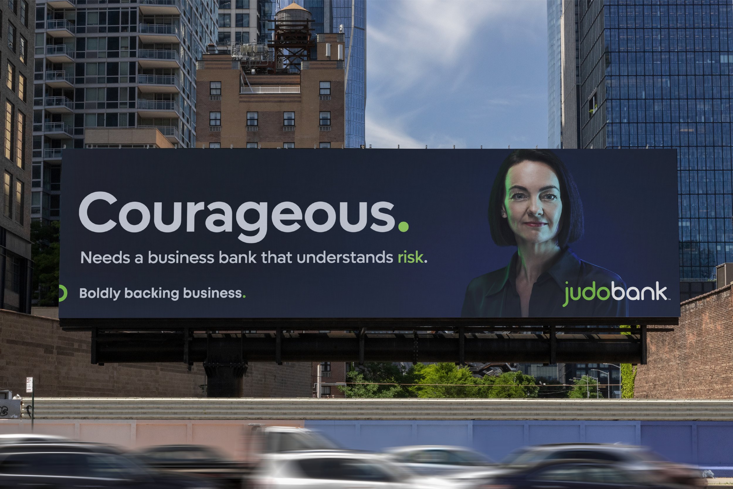
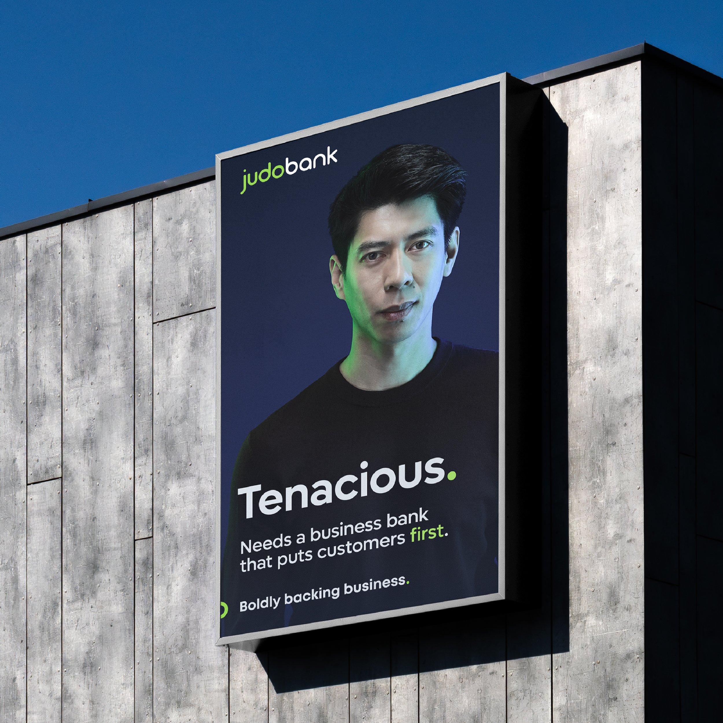
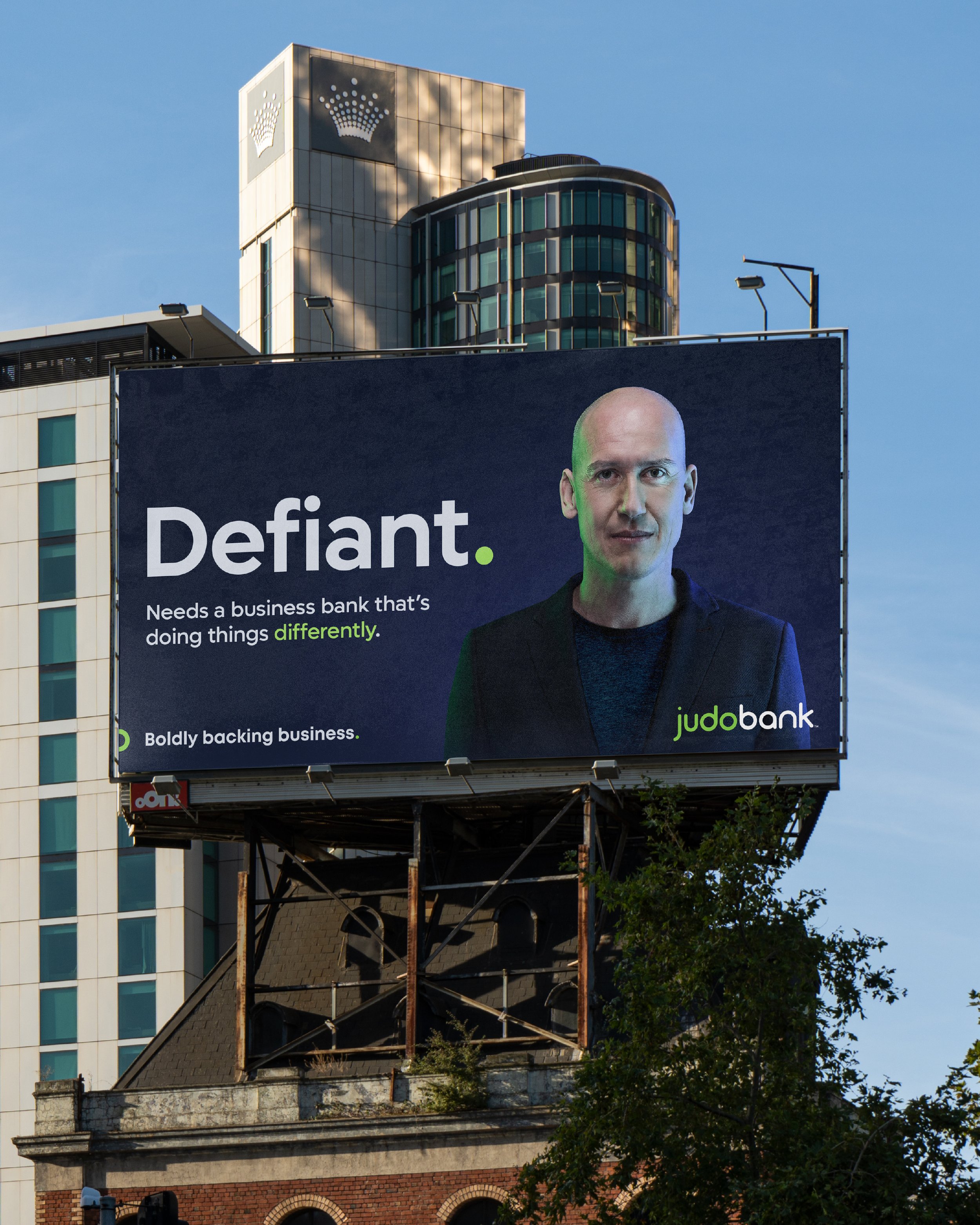
Judo Bank is Australia’s only bank purpose-built for SMEs. As a challenger business preparing for its ASX listing, Judo required a strategic brand alignment to consolidate its positioning, messaging, and identity into a clear and compelling proposition that investors and customers could put their money behind. The result is a bold, insight-driven positioning that authentically reflects Judo Bank’s people, purpose, and vision.
-
‘Boldly backing business’ embodies the expertise of Judo Bank’s business bankers, who evaluate risk, ideas, and opportunity—not just bank balances or assets—to provide the backing SMEs need. This bold positioning required a distinct and progressive identity that could stand out in-market and across paid and owned channels. The aligned brand conveys trust and professionalism, underpinning Judo Bank’s reputation as a challenger-brand, while the visual identity, with its structured typographic system and vibrant, digital-first colour palette, communicates confidence and modernity.
-
“The partner-first approach from Jim is a breath of fresh air. Access to the right experience and expertise, creating the right work – as and when you need it.”
Kevin Ramsdale – Chief Marketing Officer

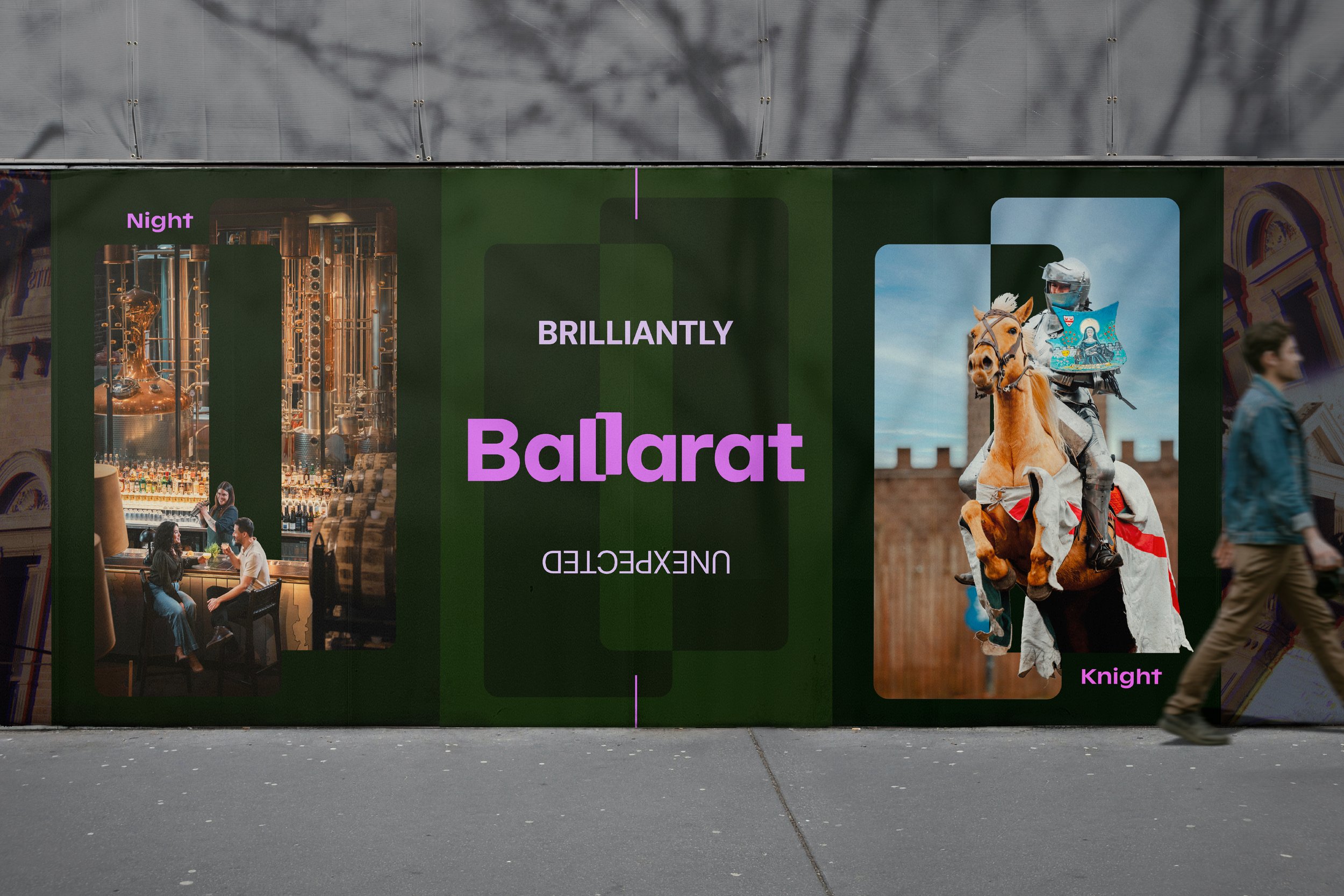
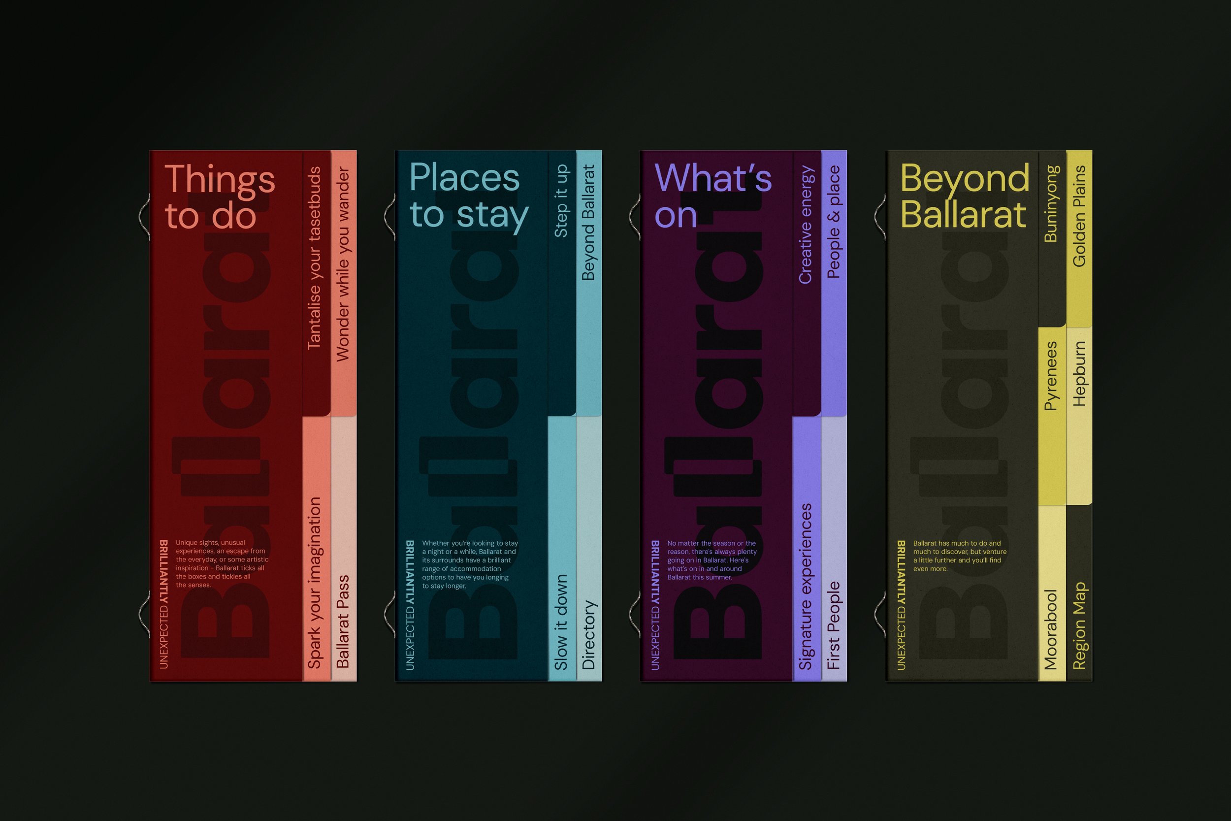
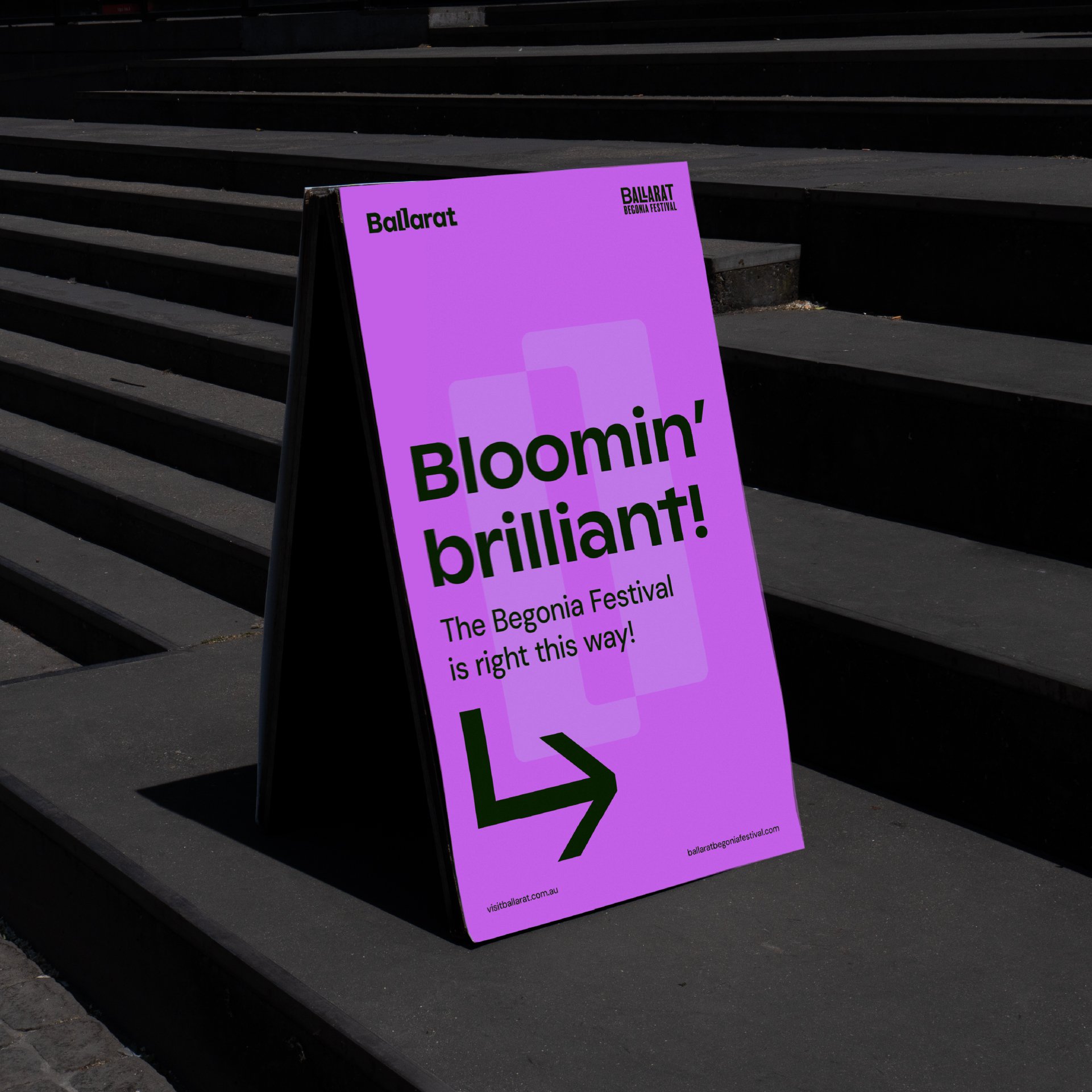
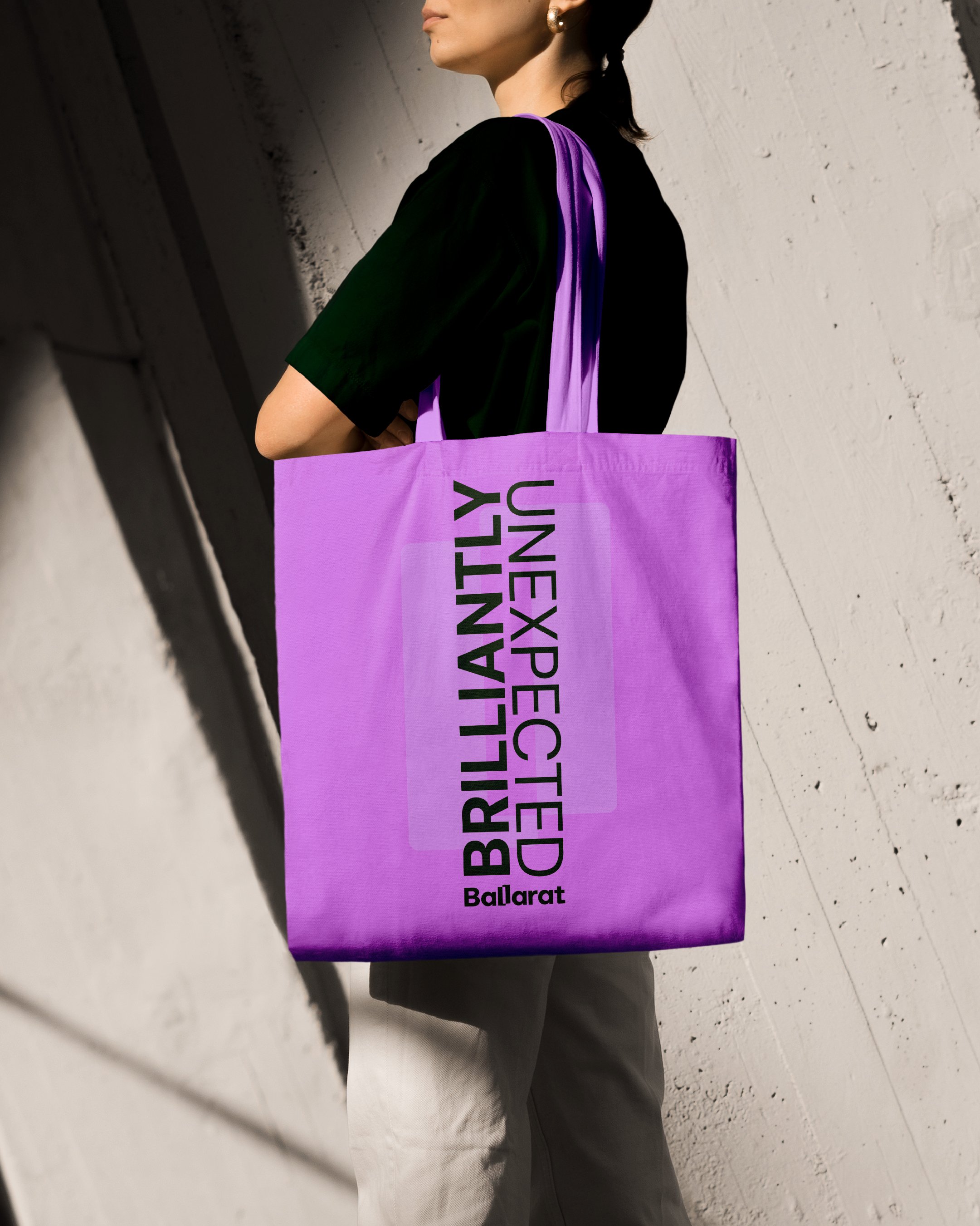
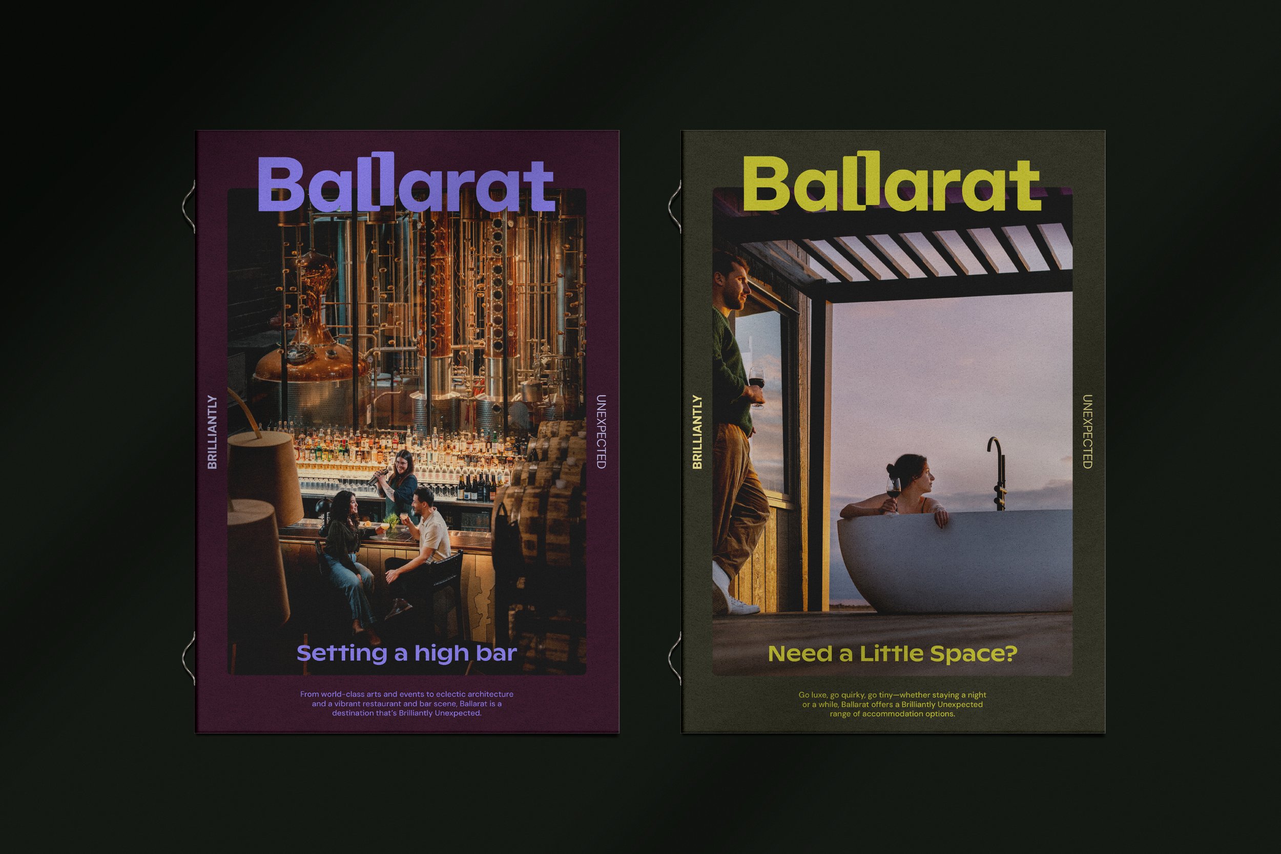
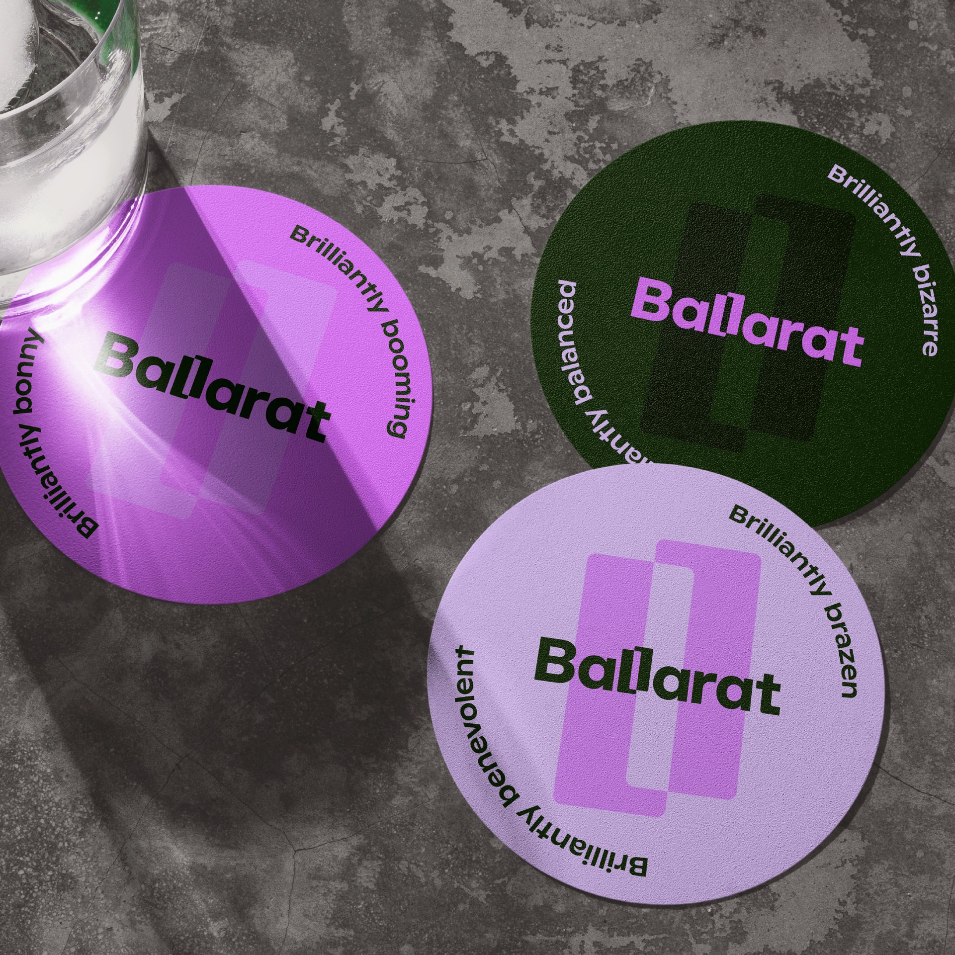
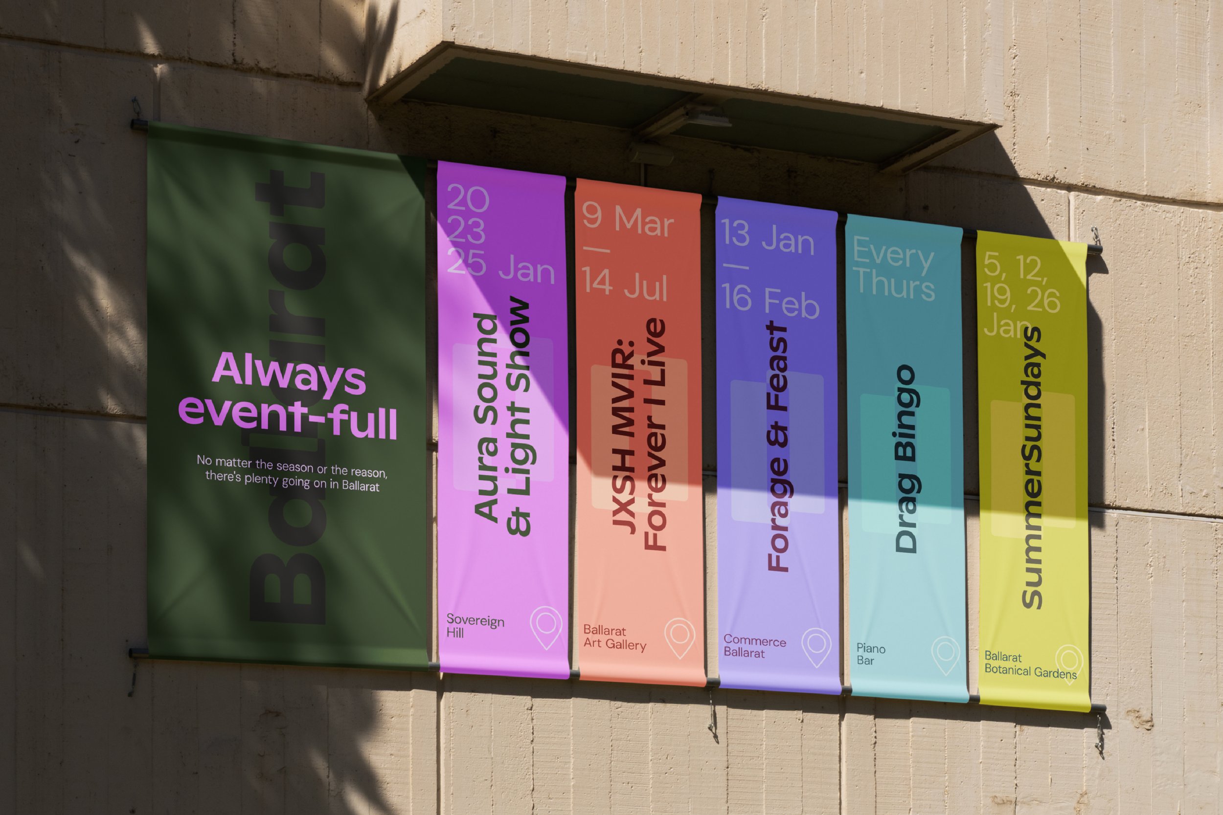
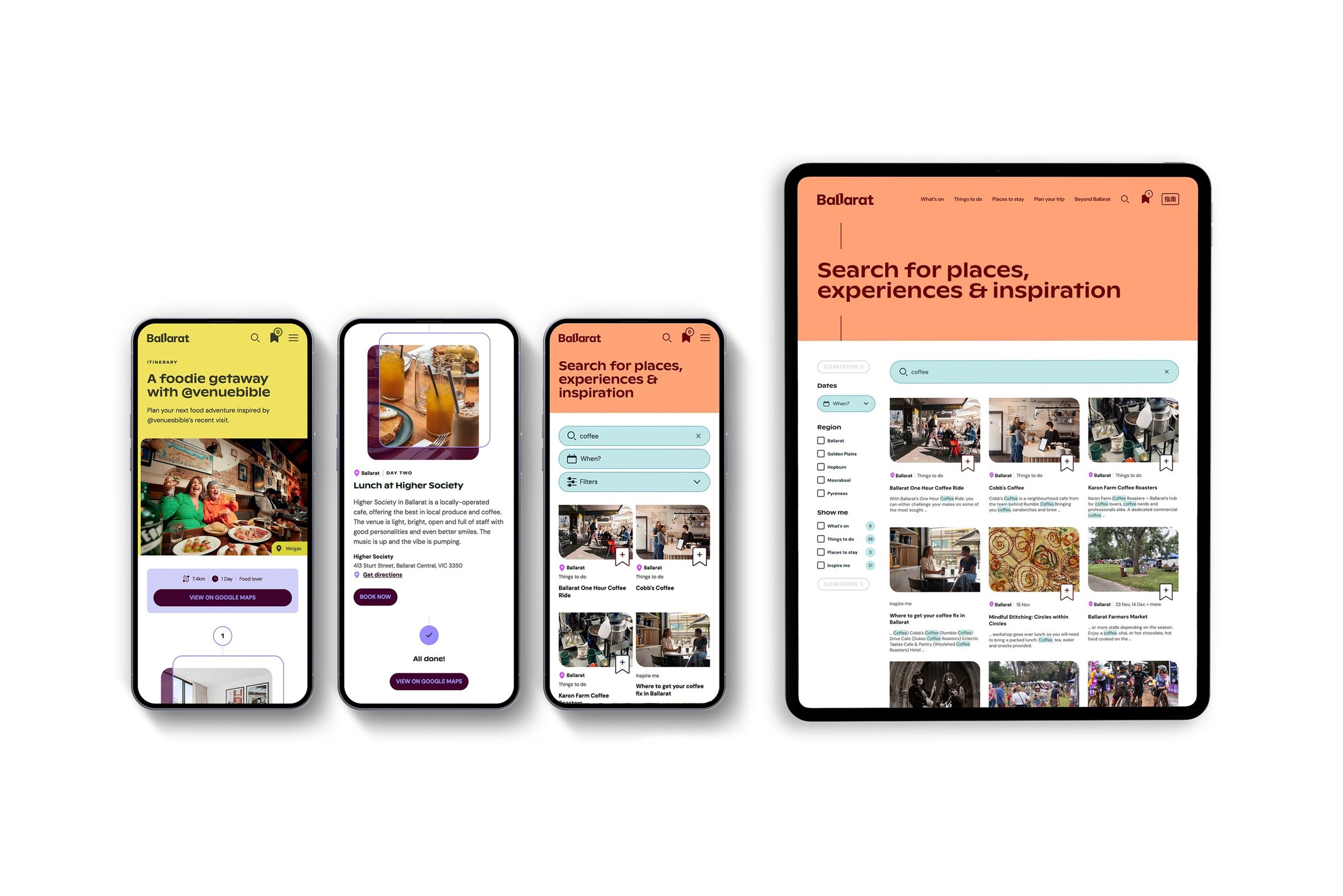
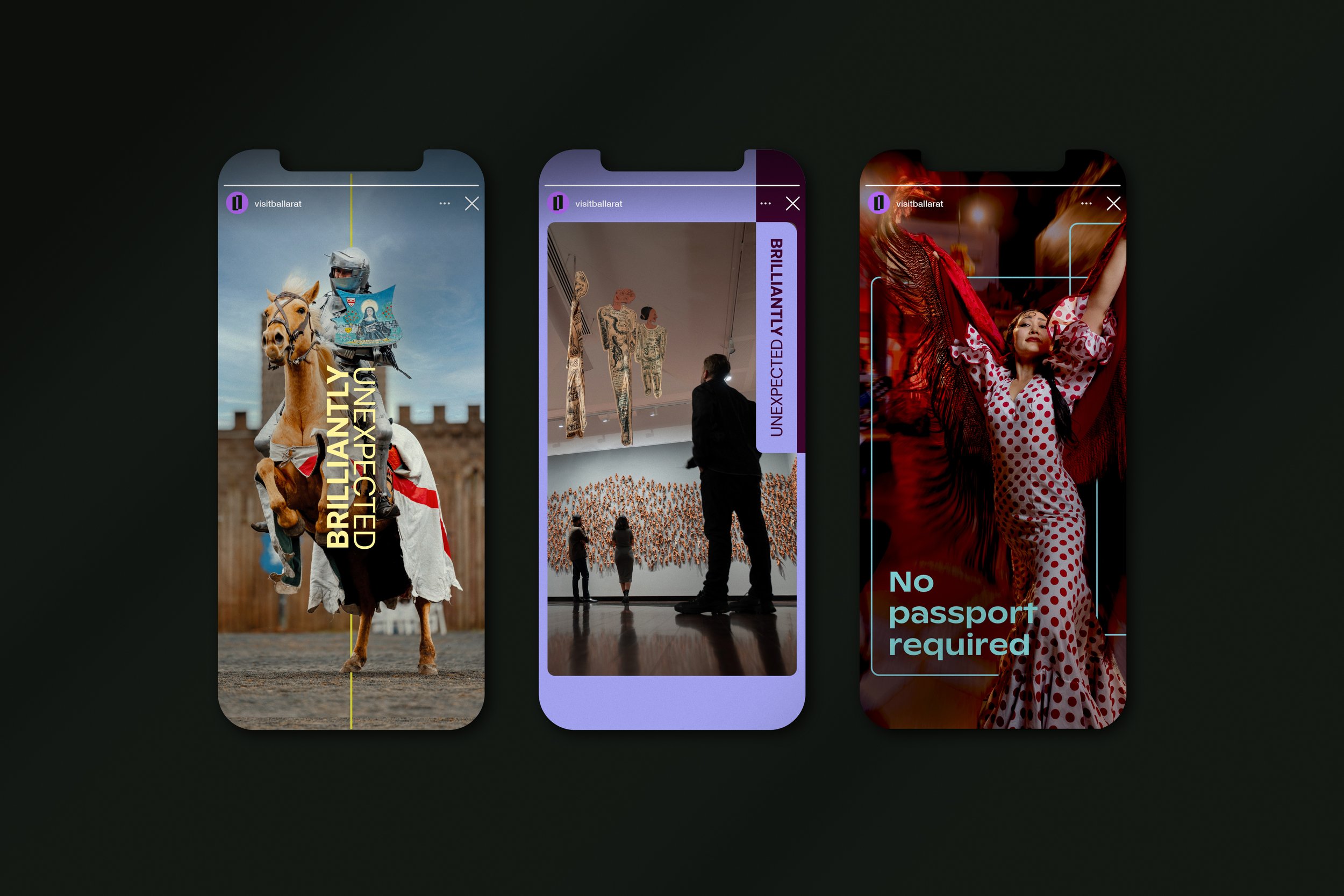
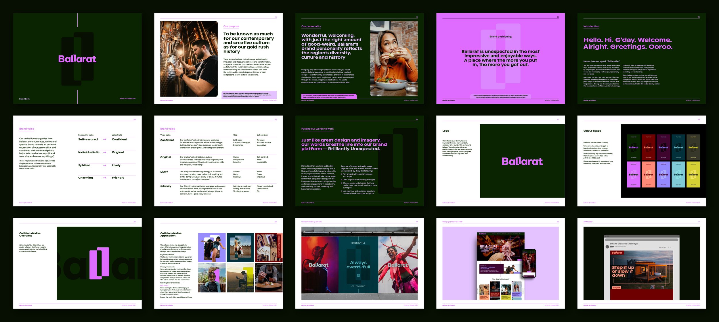
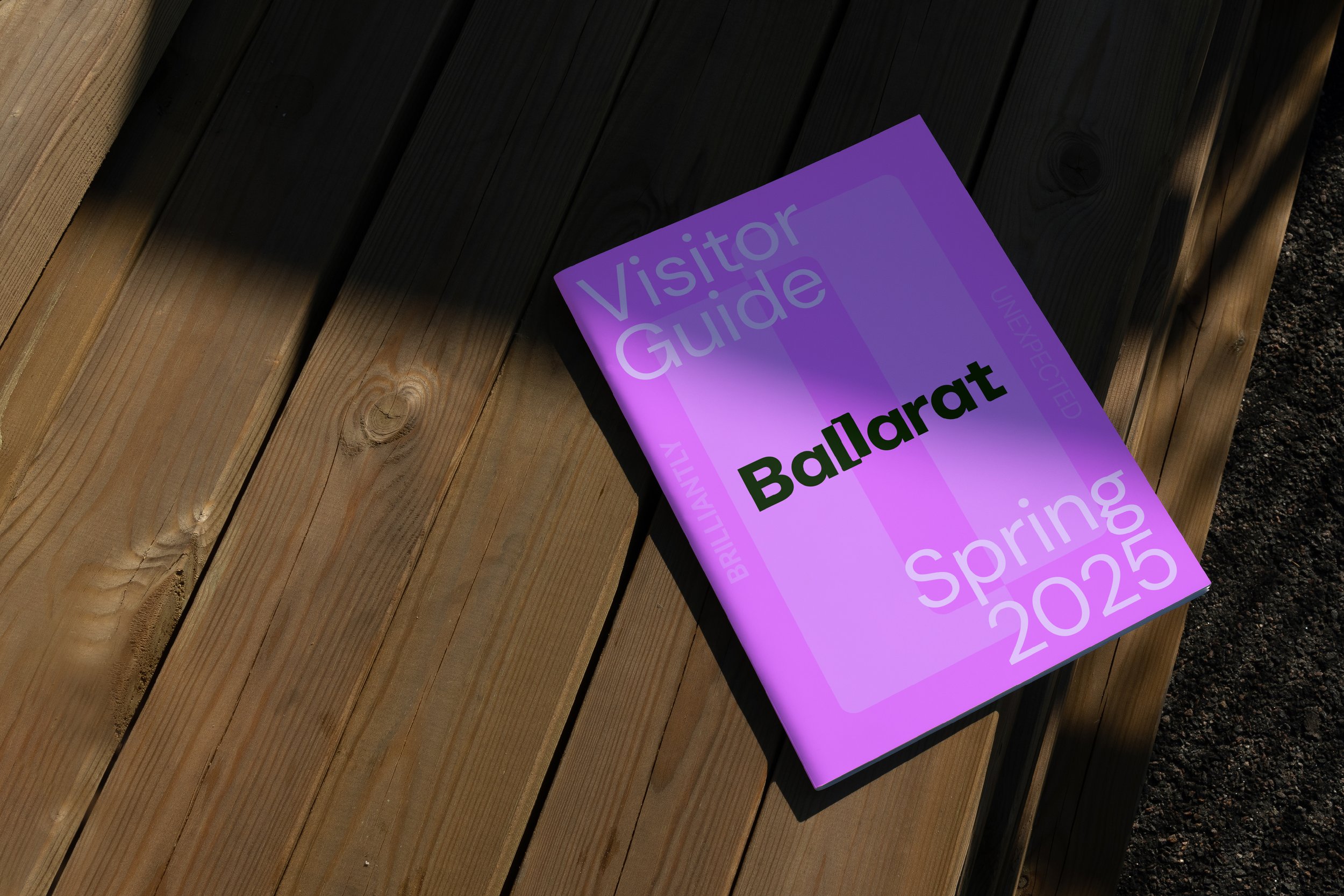
03_Ballarat
Brand Creation > Destination Brand Identity > CVP > Messaging
An unexpected brand inspired by the region’s unique character
-
For years, Ballarat has been seen as ‘old, gold, and cold’. Brilliantly Unexpected is a bold new brand positioning, identity, and campaign platform designed to reframe how people view Victoria’s largest inland city. Rooted in truth, the brand celebrates the many contrasts and contradictions that define Ballarat — where the past and present, tradition and creativity always seem to collide in unexpected and harmonious ways.
-
The vibrant and uniquely Ballarat identity embodies the many ‘Brilliantly Unexpected’ experiences the region offers. At the heart of the identity system are Ballarat’s inherent contradictions, reflected in the wordmark’s two contrasting Ls, which form a distinctive device flowing through the entire visual identity system. The Ballarat colour palette reflects the abundance of contrasts and diversity in the region, while the verbal identity celebrates the original and lively ‘Ballaratian’ personality, giving a voice to the Brilliantly Unexpected brand platform.
-
“The ‘Brilliantly Unexpected’ brand platform and new identity truly highlight our region’s distinct essence and personality. At every step, the team has stayed true to the vision, ensuring our brand platform is as distinctive and compelling as the people and places it represents.”
John Pandazopoulos — Chair, Tourism Midwest (Victoria)
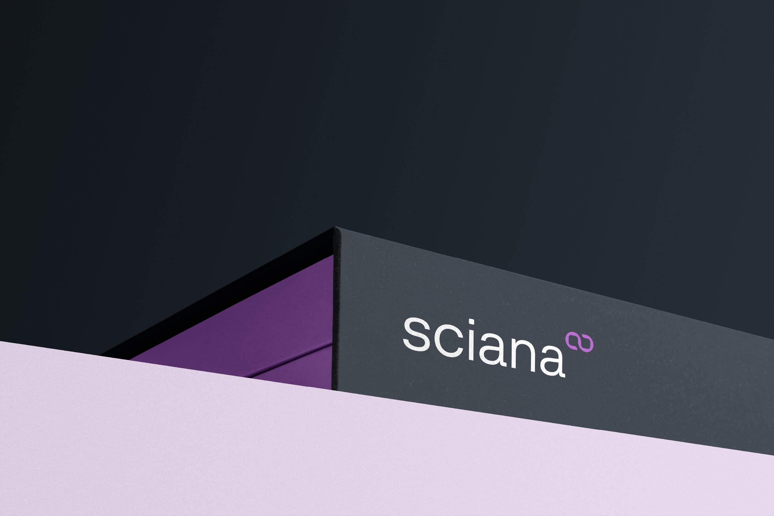
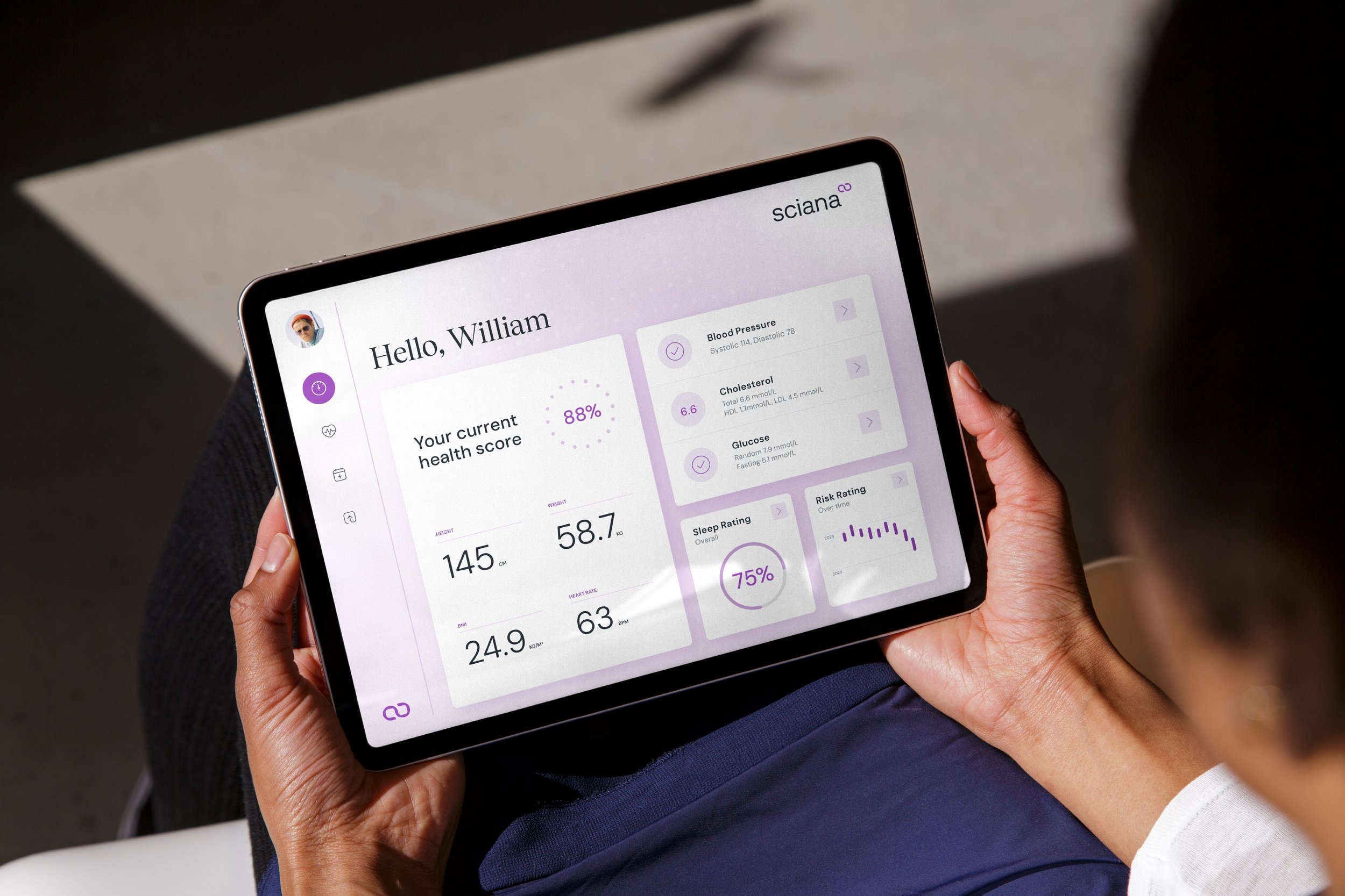
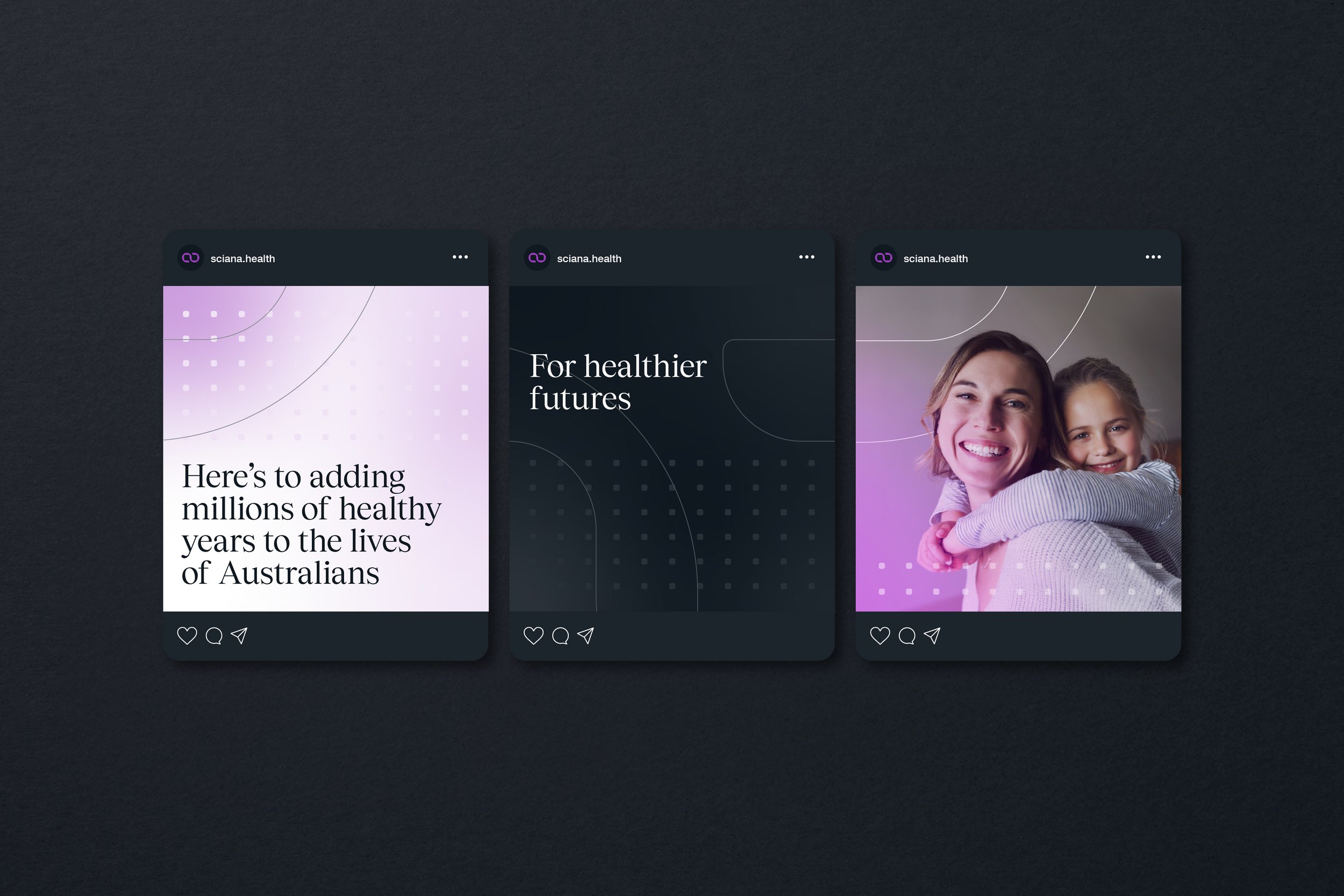
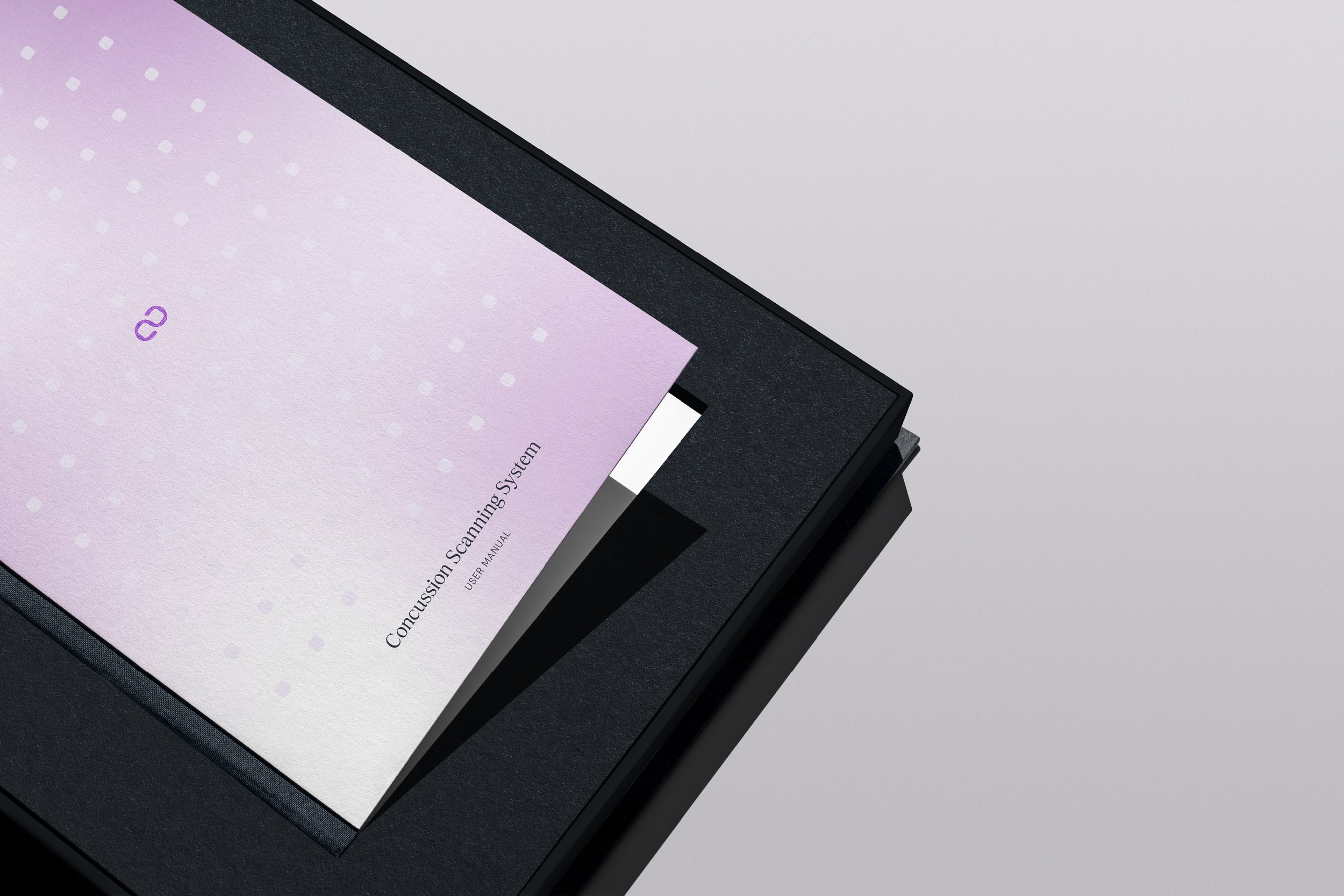
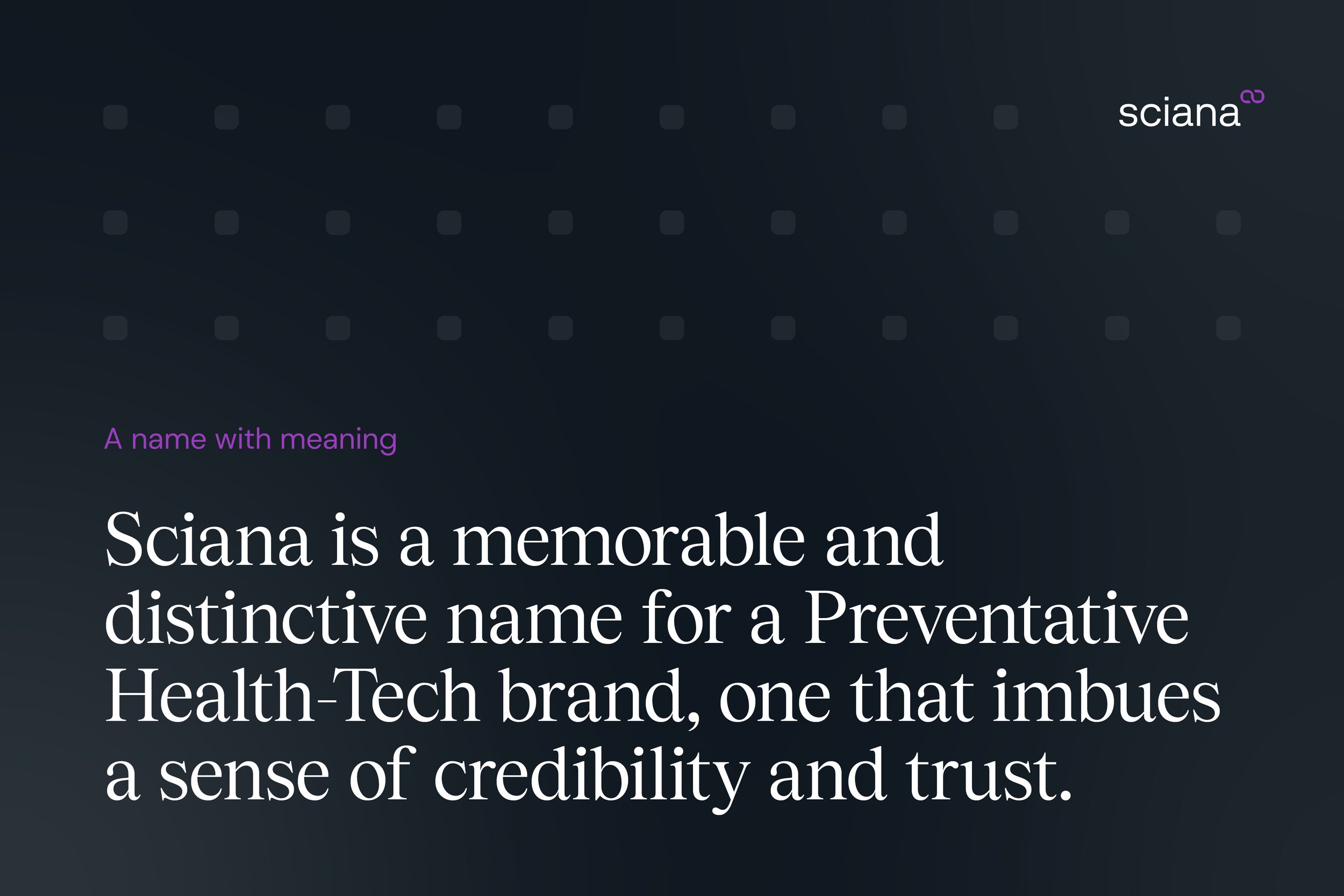
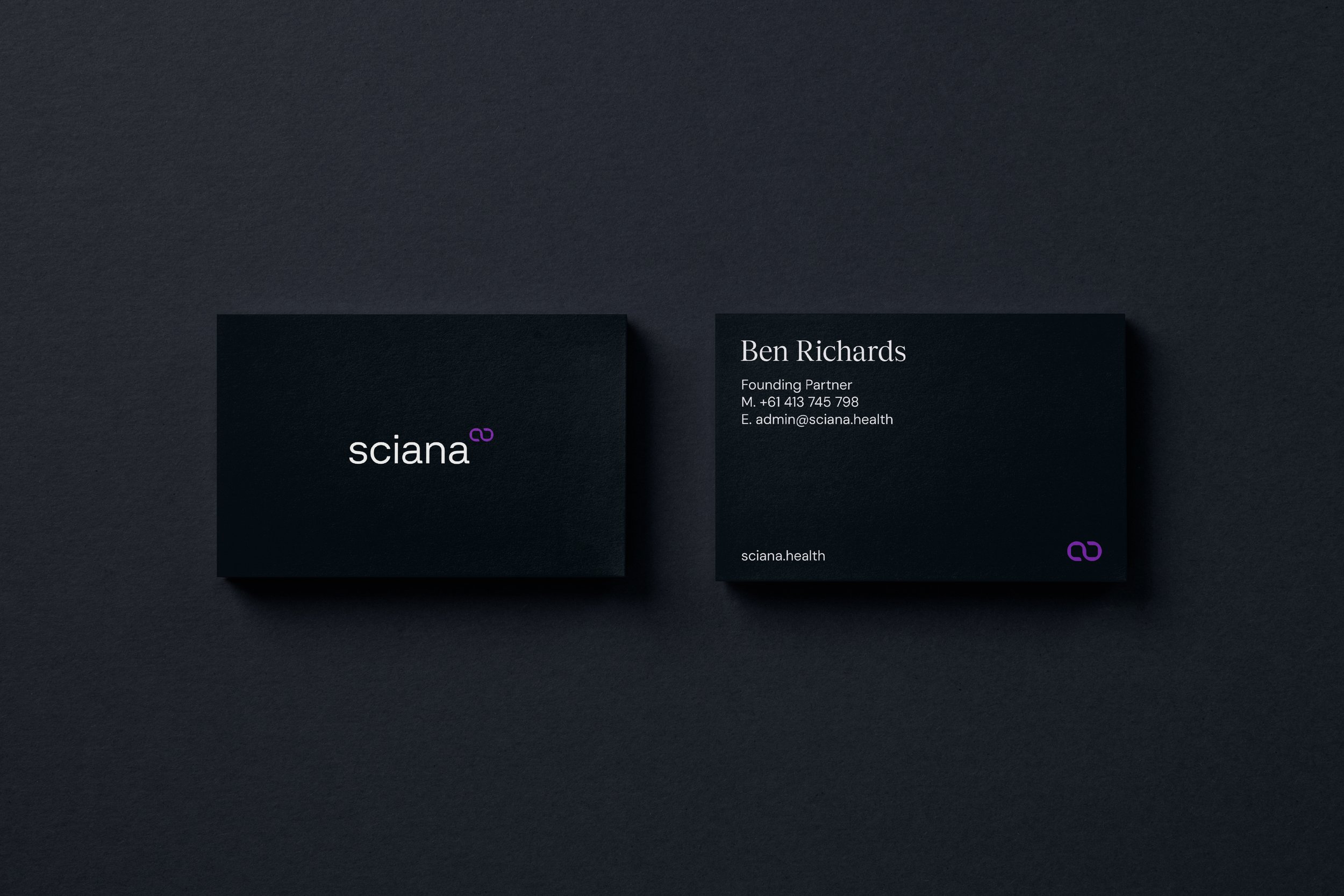
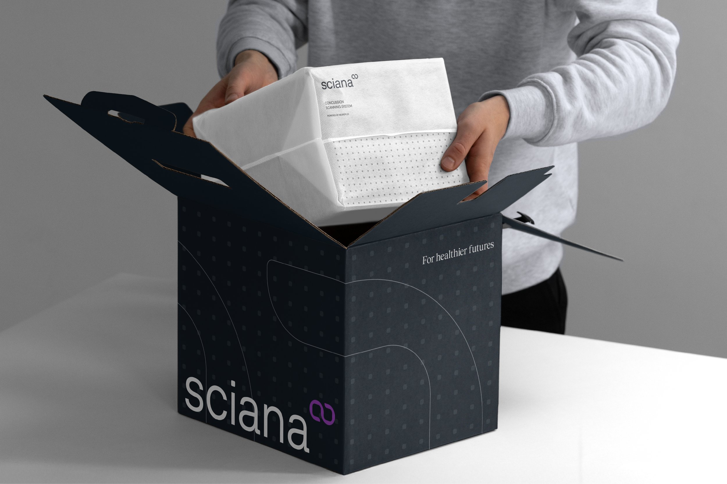
04_Sciana
Brand Creation > Naming > Brand Platform > Identity > CVP
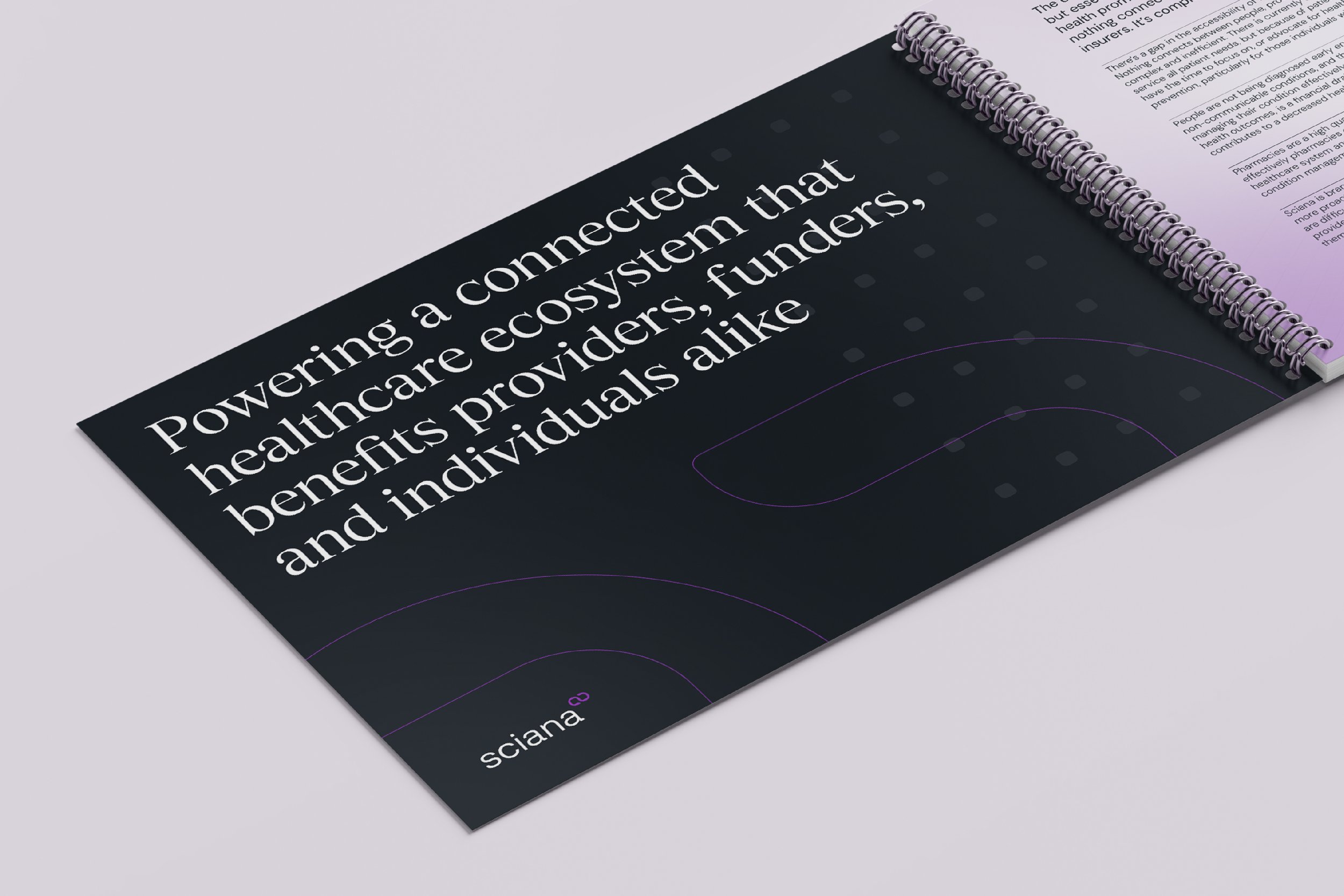
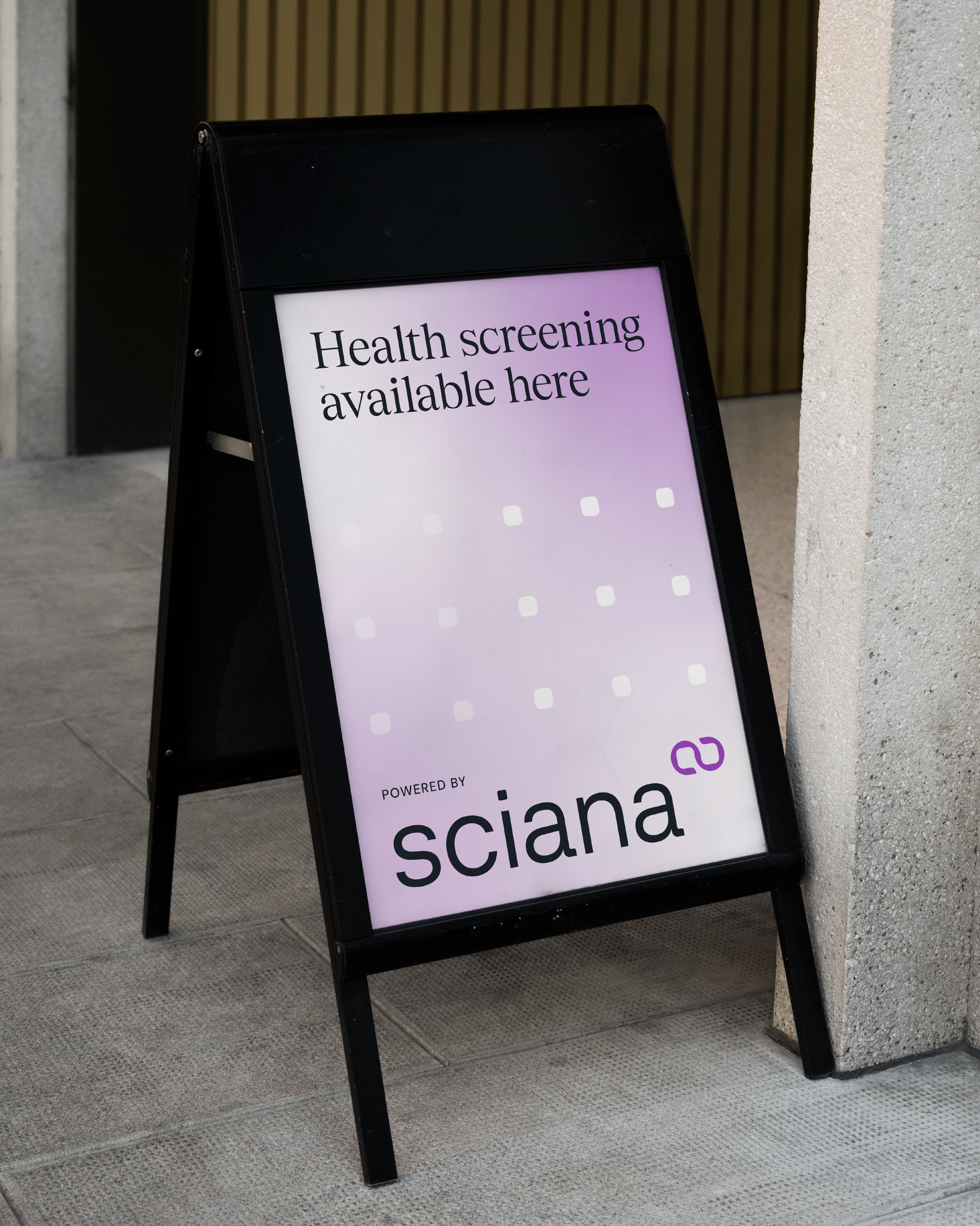
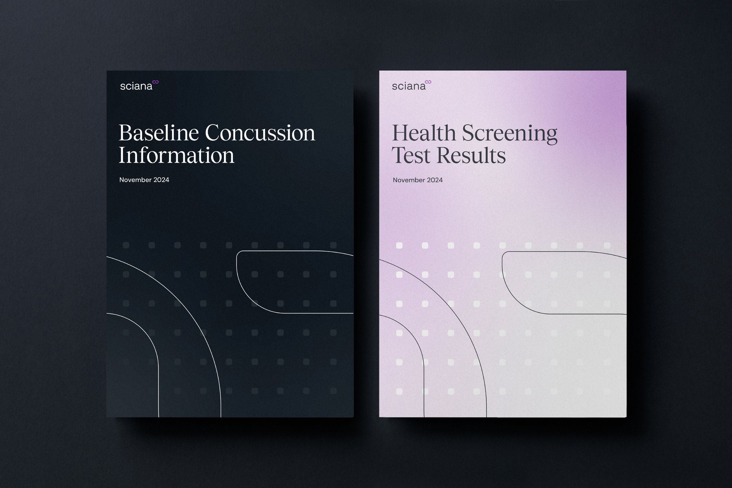
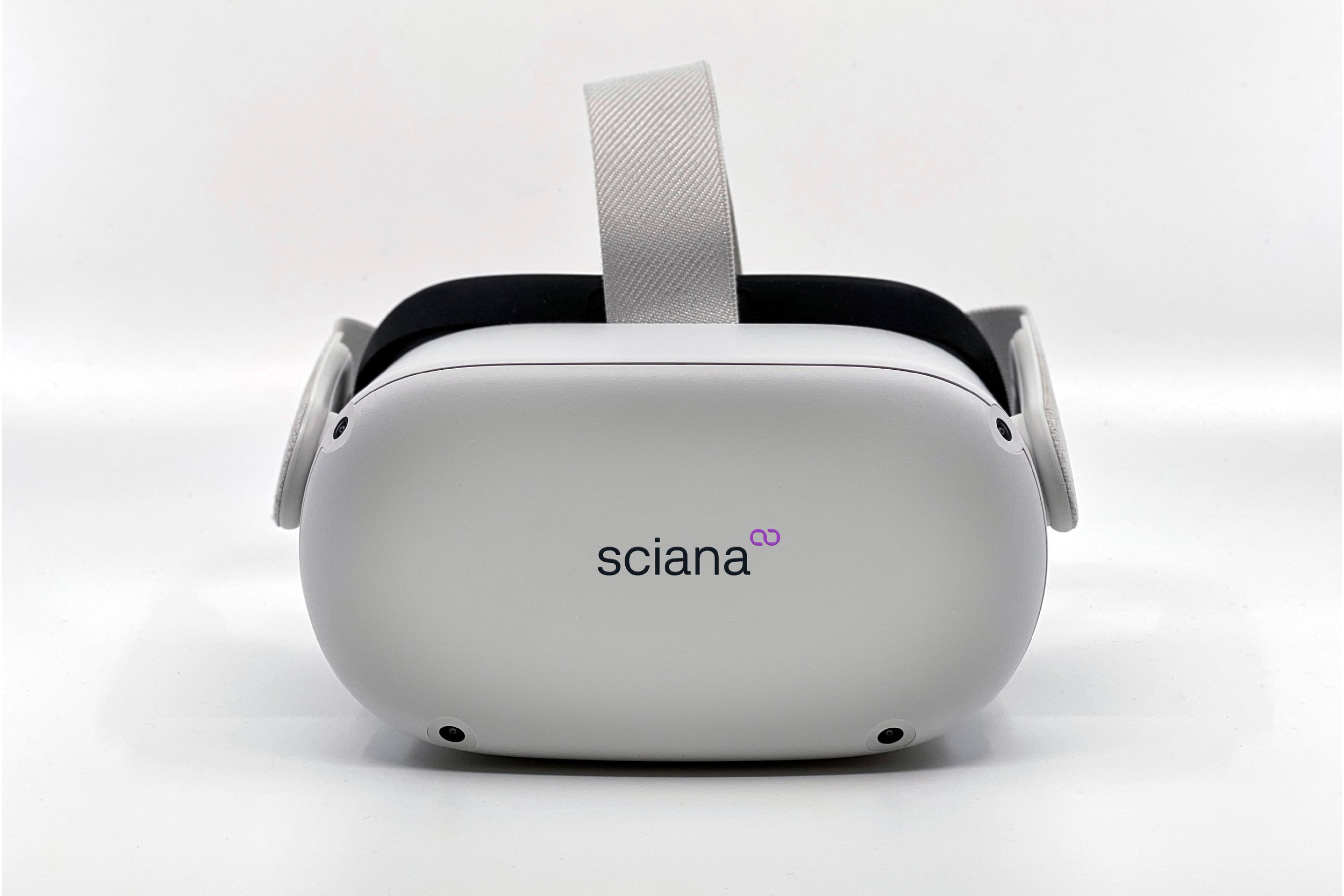
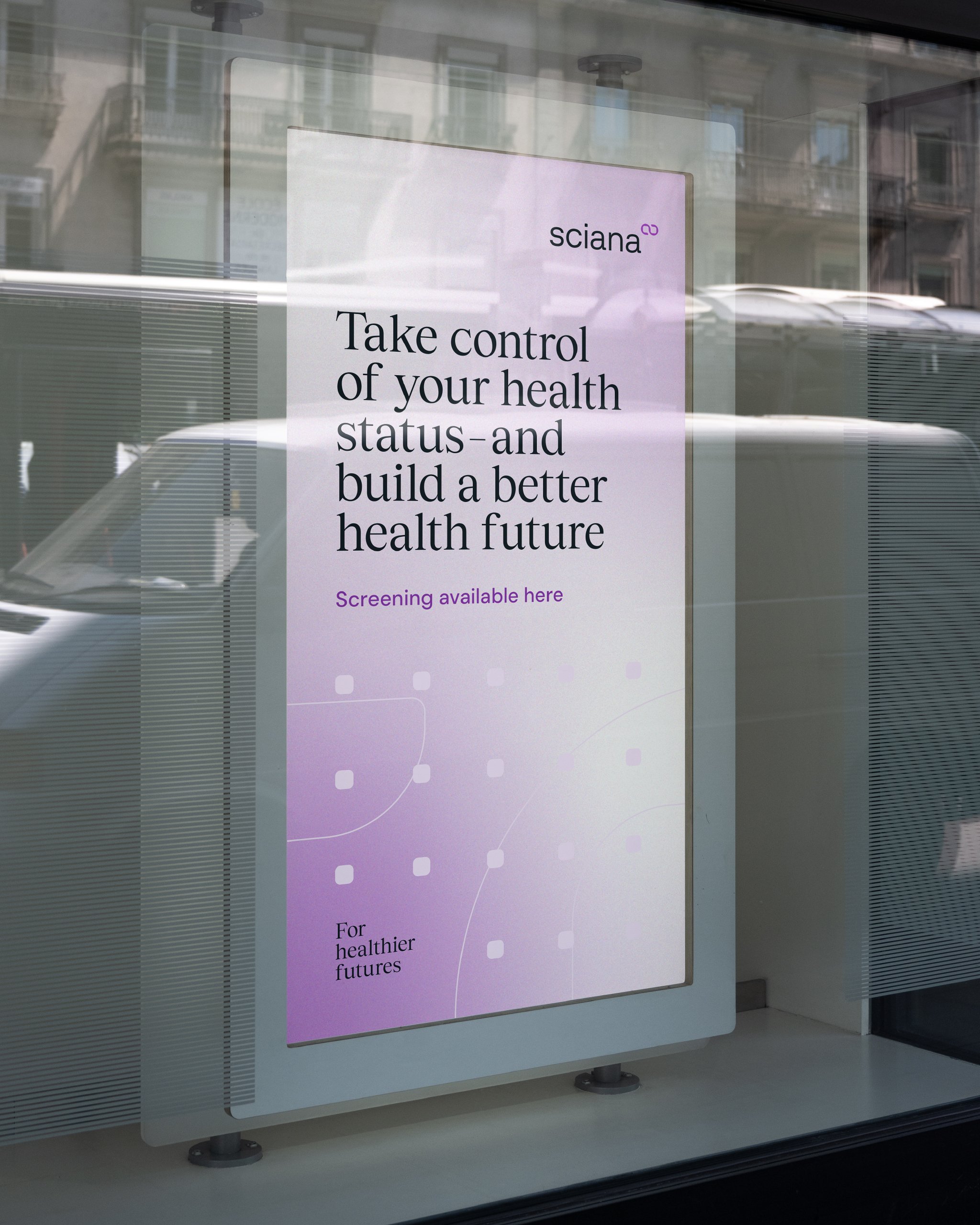
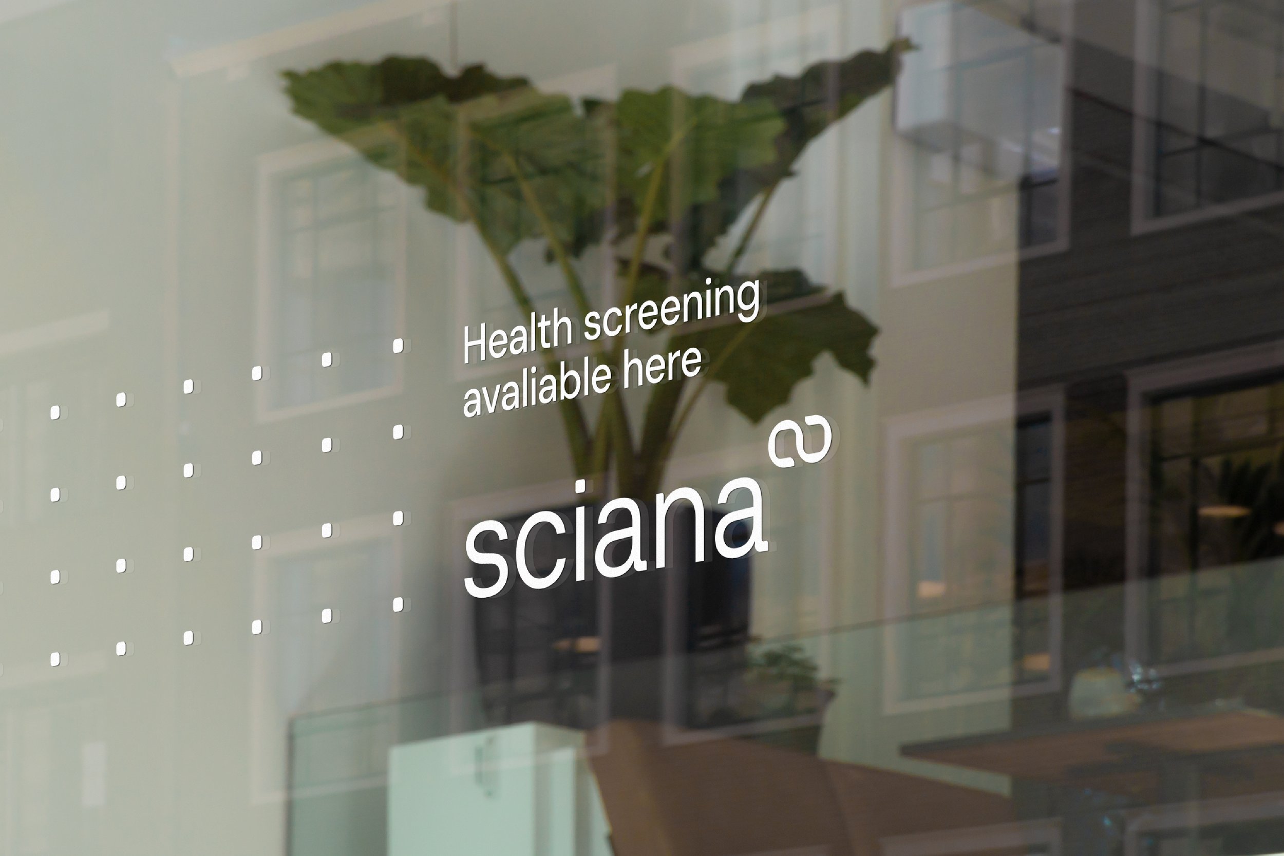
A preventative health-tech brand here to create healthier futures
-
Sciana, formerly HealthyRX, needed a new name, brand identity, and clear positioning to reflect its ambition to become a leading and trusted health-tech brand. The name is a portmanteau of Lancisicana, the world’s first medical library, and Scientia, the Latin root for scan, whilst the identity draws inspiration from medical data points and the health continuum central to Sciana’s approach.
-
‘Here for healthier futures’ neatly captures Sciana’s ambition to promote early detection of health conditions and encourage preventative care by bringing healthcare funders, providers and patients together. The Sciana visual identity and wordmark has a refined quality with strong vertical forms and soft curved edges designed to represent a continuum of care. A contemporary aesthetic, the use of a single typeface, restrained colour palette and sharp, minimal layouts reinforce Sciana’s commitment to a quality over quantity approach to health-tech.
-
“The team truly focused on who we are and what we are trying to achieve – refreshingly different to other agency partners we’ve worked with in the past.”
Dr. Craig Nossel — Co-Founder


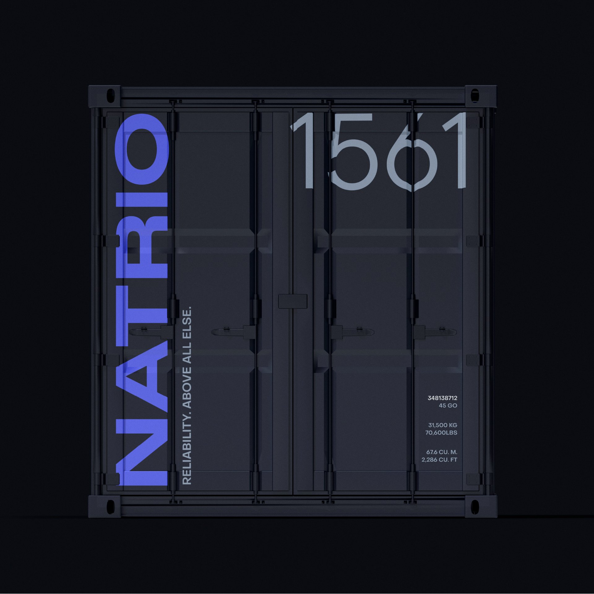
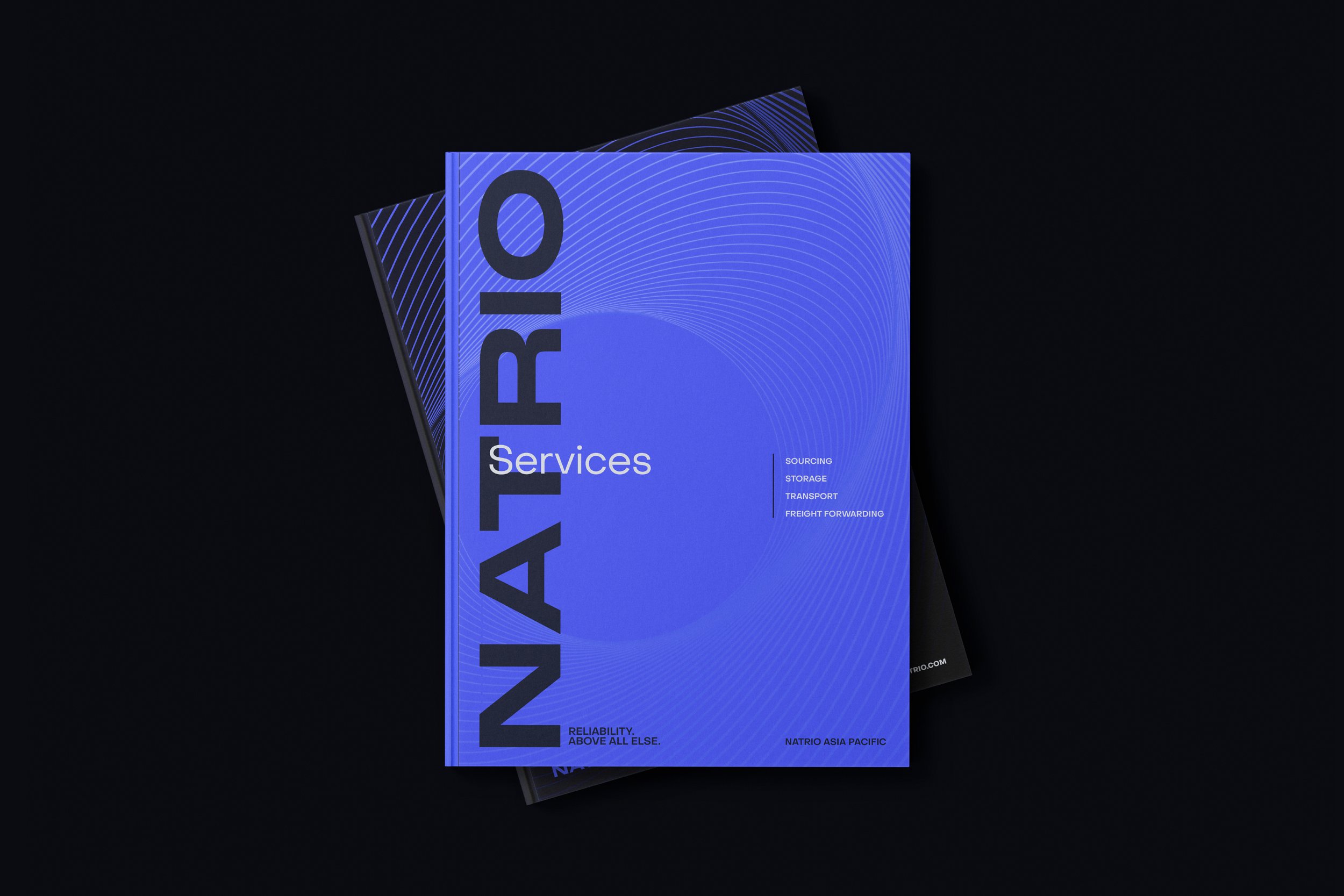
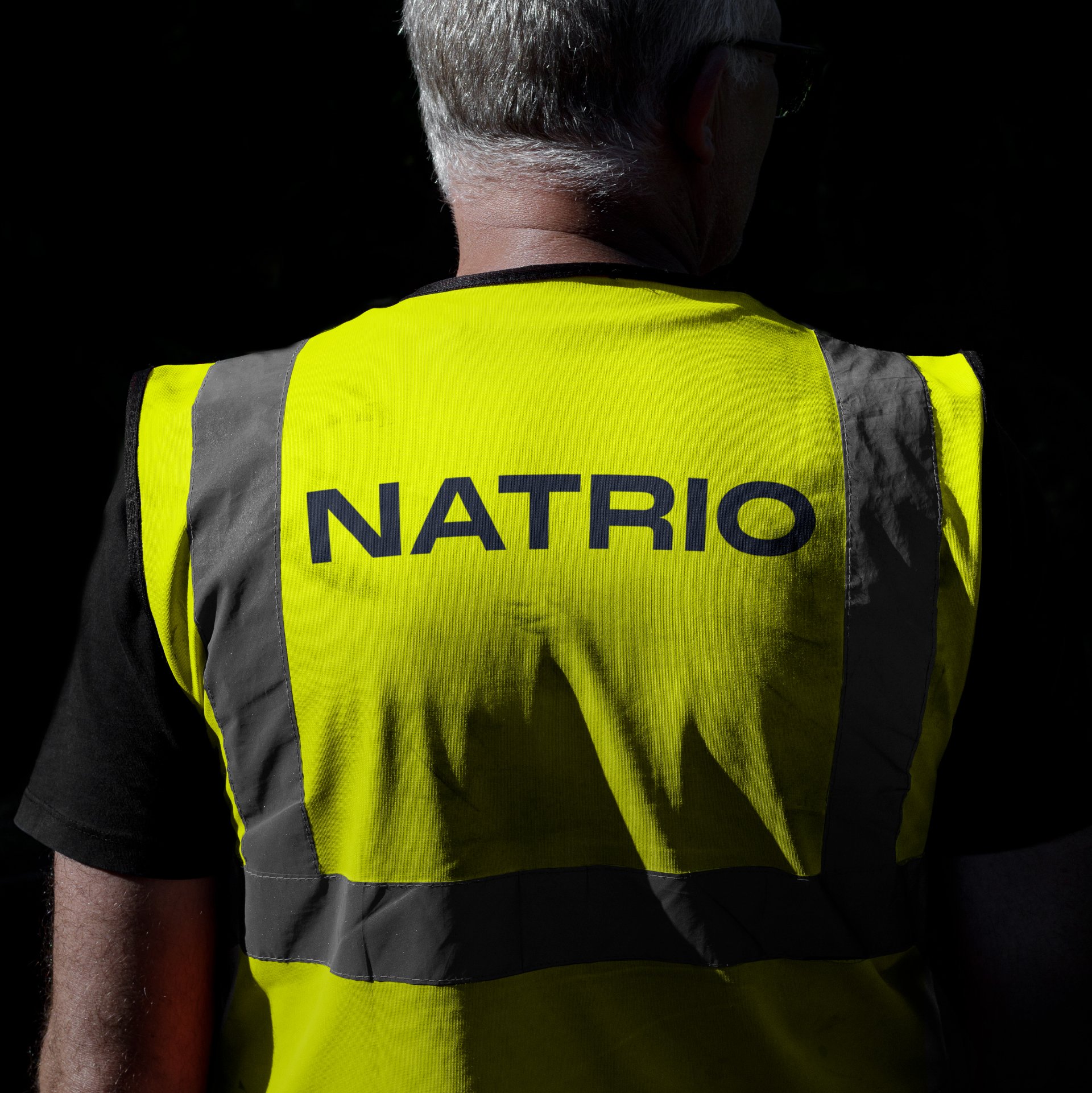
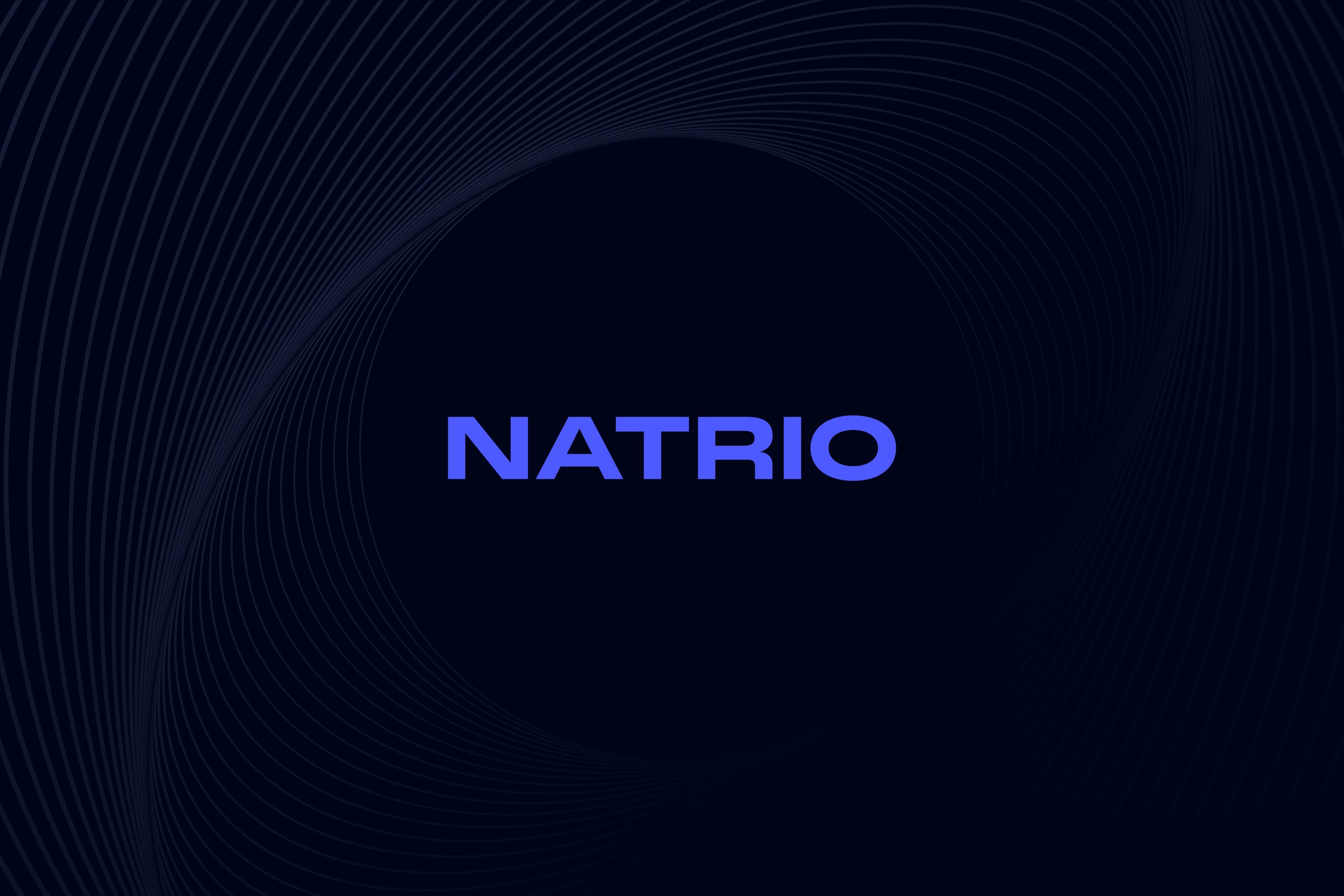
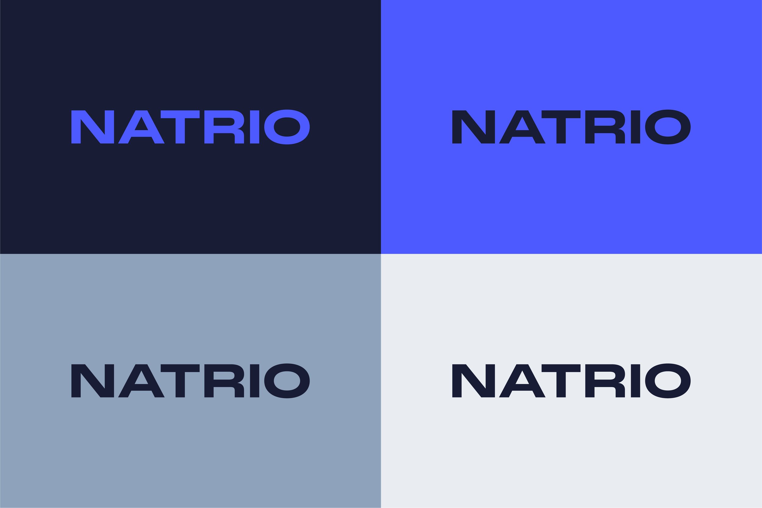
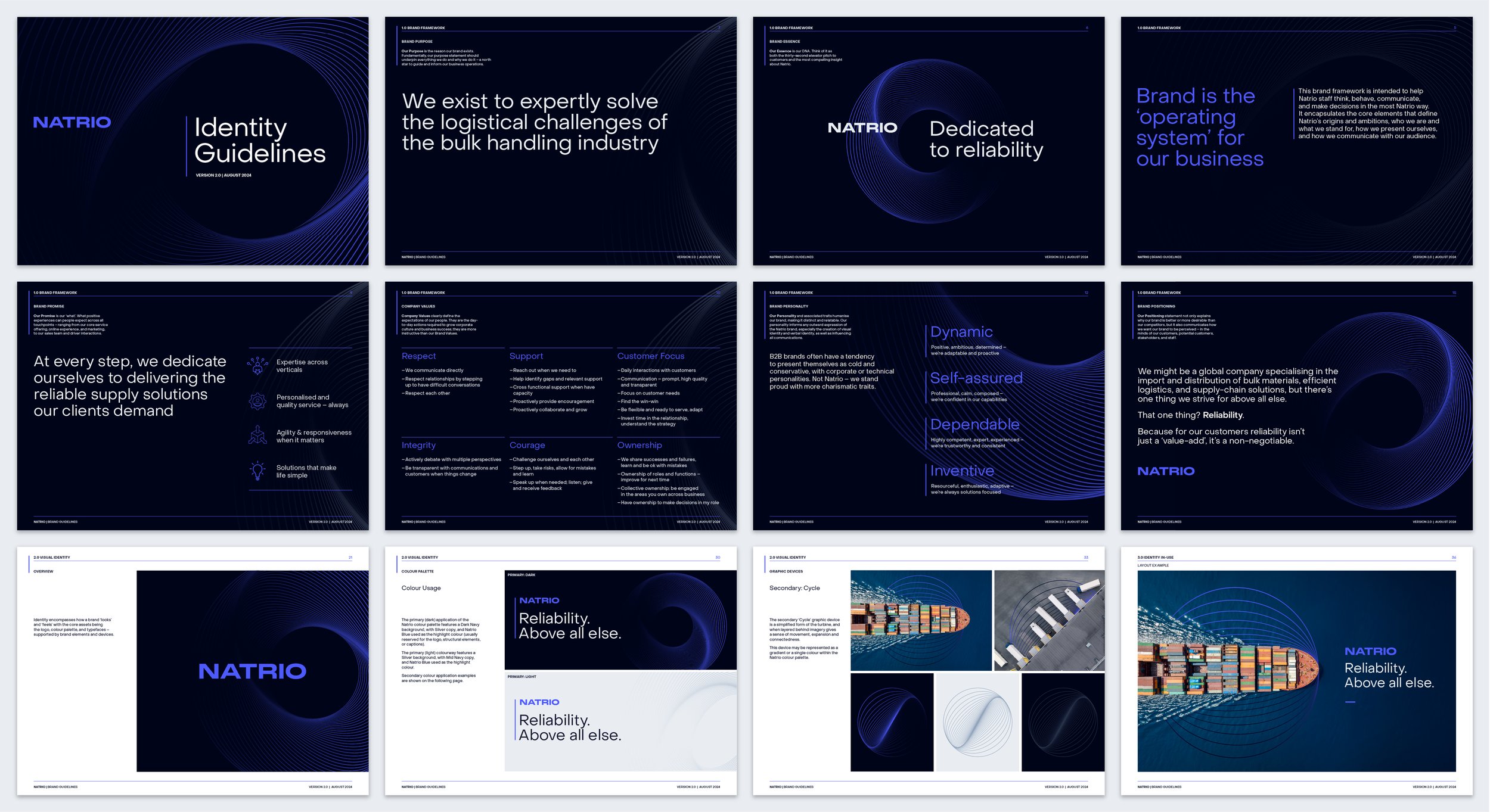
05_Natrio
Brand Alignment > Workshop > Brand Strategy > Brand Identity > CVP
A global logistics firm transforms into a brand dedicated to reliability
-
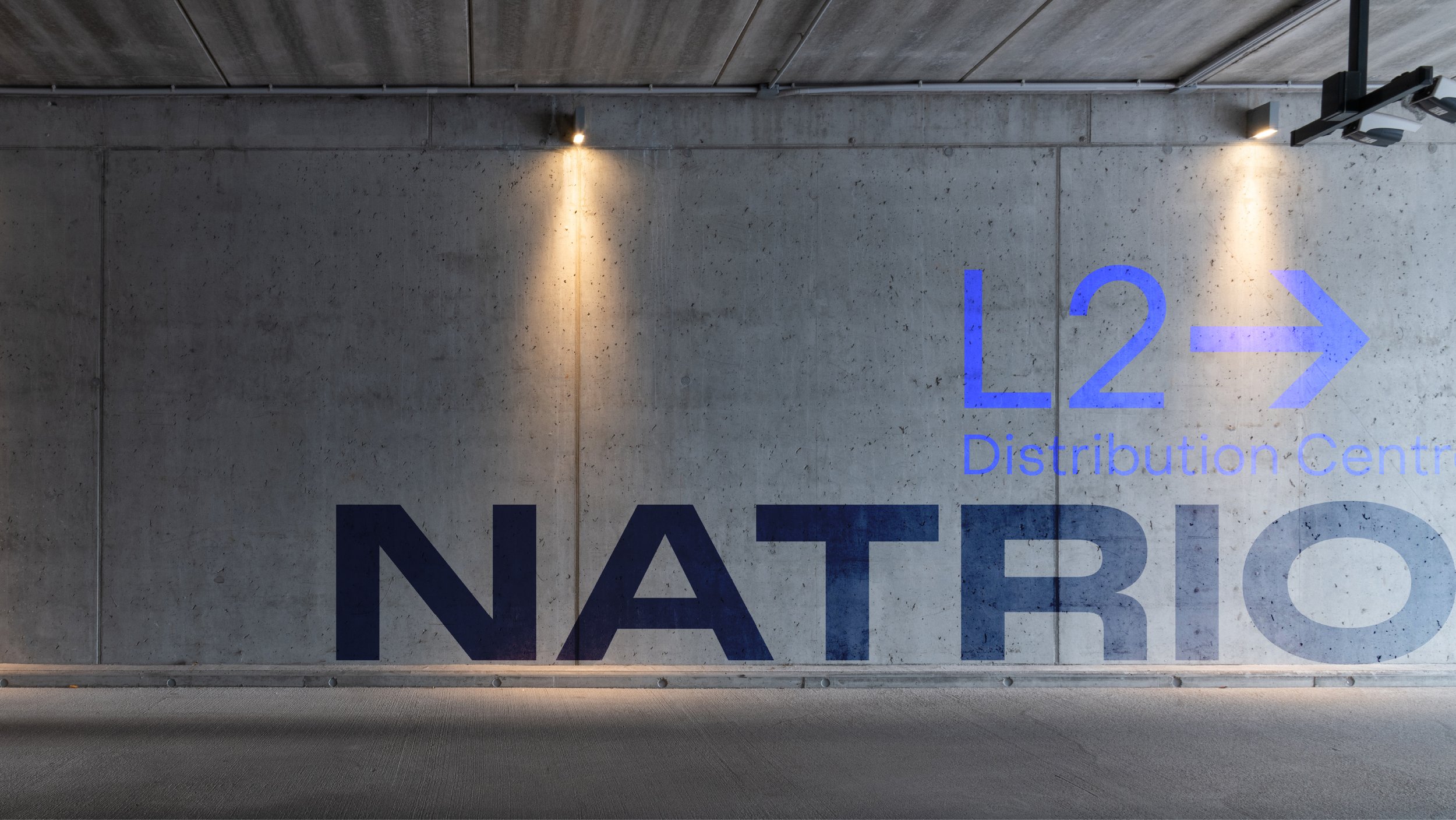
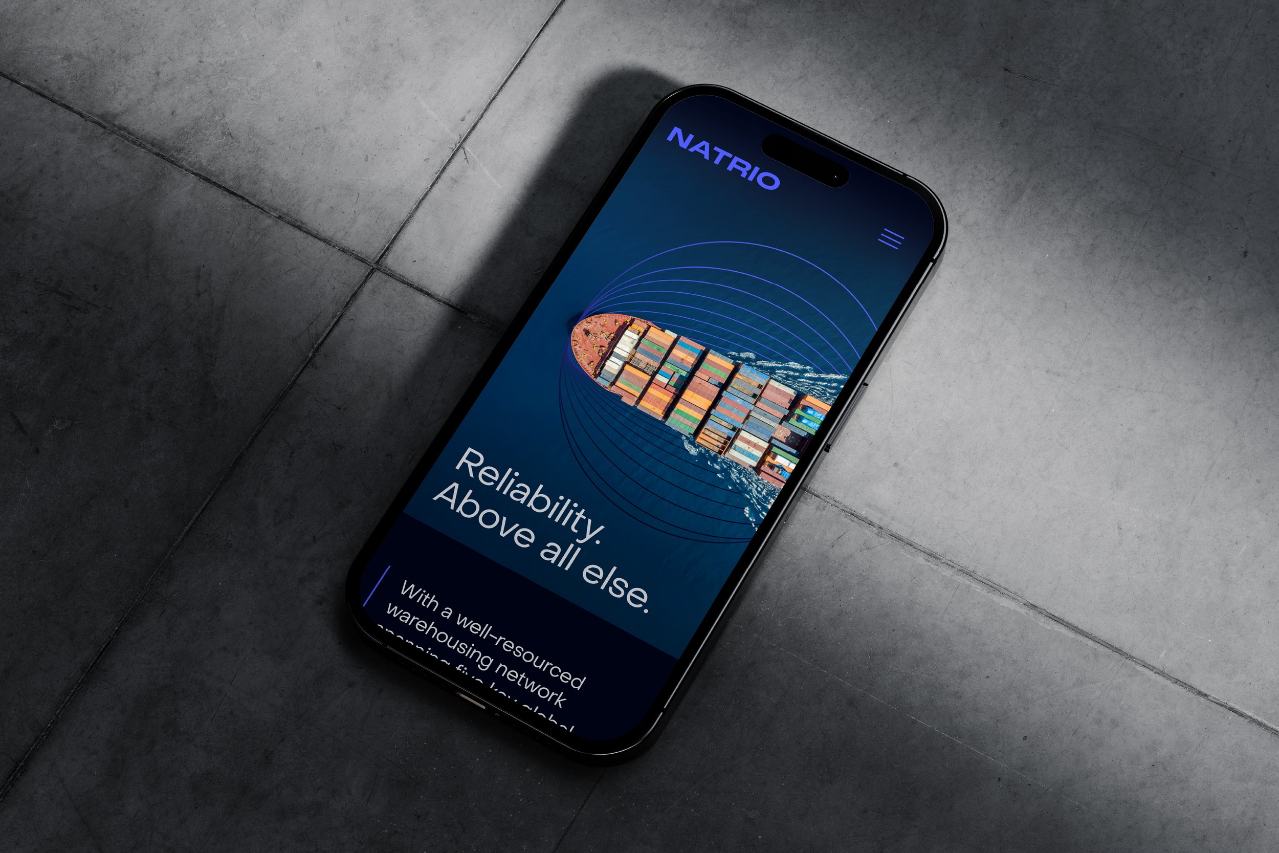
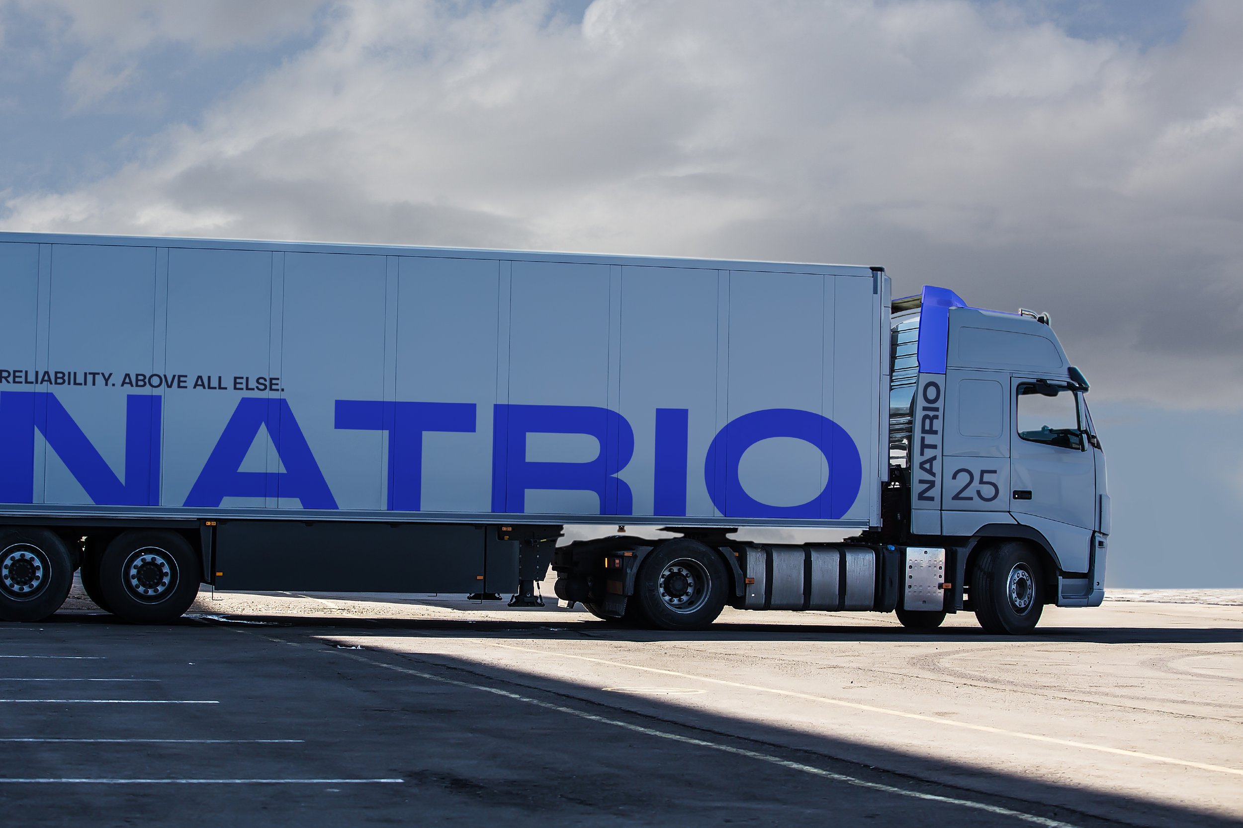
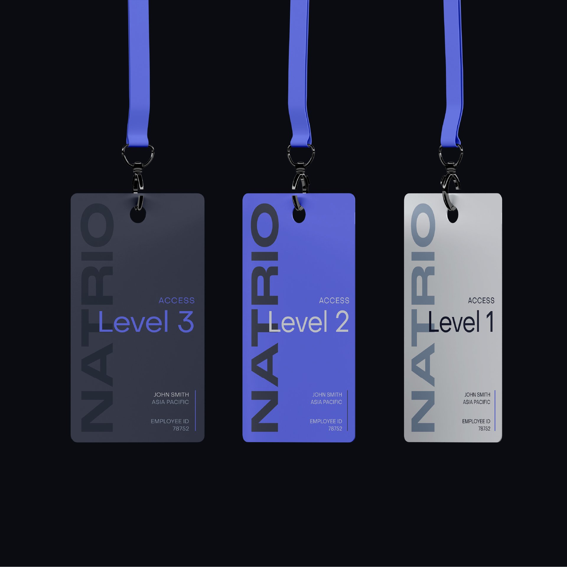
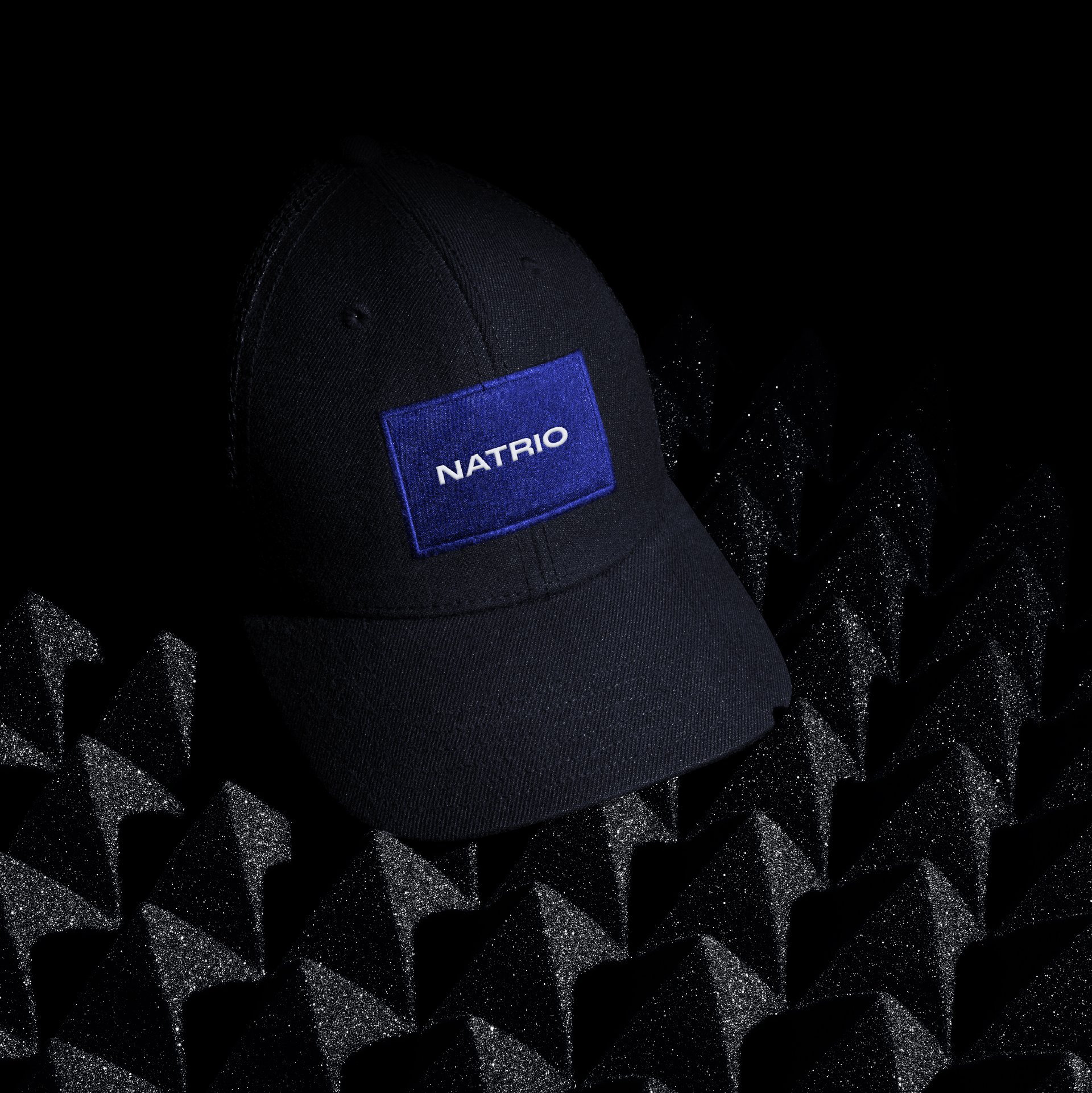
Global logistics company, Natrio specialises in the import and distribution of bulk materials and supply-chain solutions. As Natrio expanded into new markets it needed to more clearly define who it was, who it was for, and what value it offered. A new brand positioning, identity, and proposition were developed to establish Natrio as a trusted partner — a brand defined by its unwavering commitment to reliability.
-
‘Reliability above all else’, was uncovered to be the essence of the Natrio brand, a core truth expressed in its CVP, and across collateral, branded communication, and the website. The refreshed identity has three tenets: modernity and motion, distancing itself from static competitors; structure and clarity, prioritising quality over complexity; and novelty and distinction, standing out rather than blending into category. Finally, the turbine device – referencing Natrio’s original identity – has been reimagined into a dynamic linear form, symbolising progress, dependability and connectedness.
-
“The team did a fantastic job of helping us understand what we stand for, and the true value we offer our customers. From there, they developed an outstanding identity that positions us perfectly for the next stage of our business development.”
Bryce Cameron — EGM Sales & Marketing, Asia Pacific


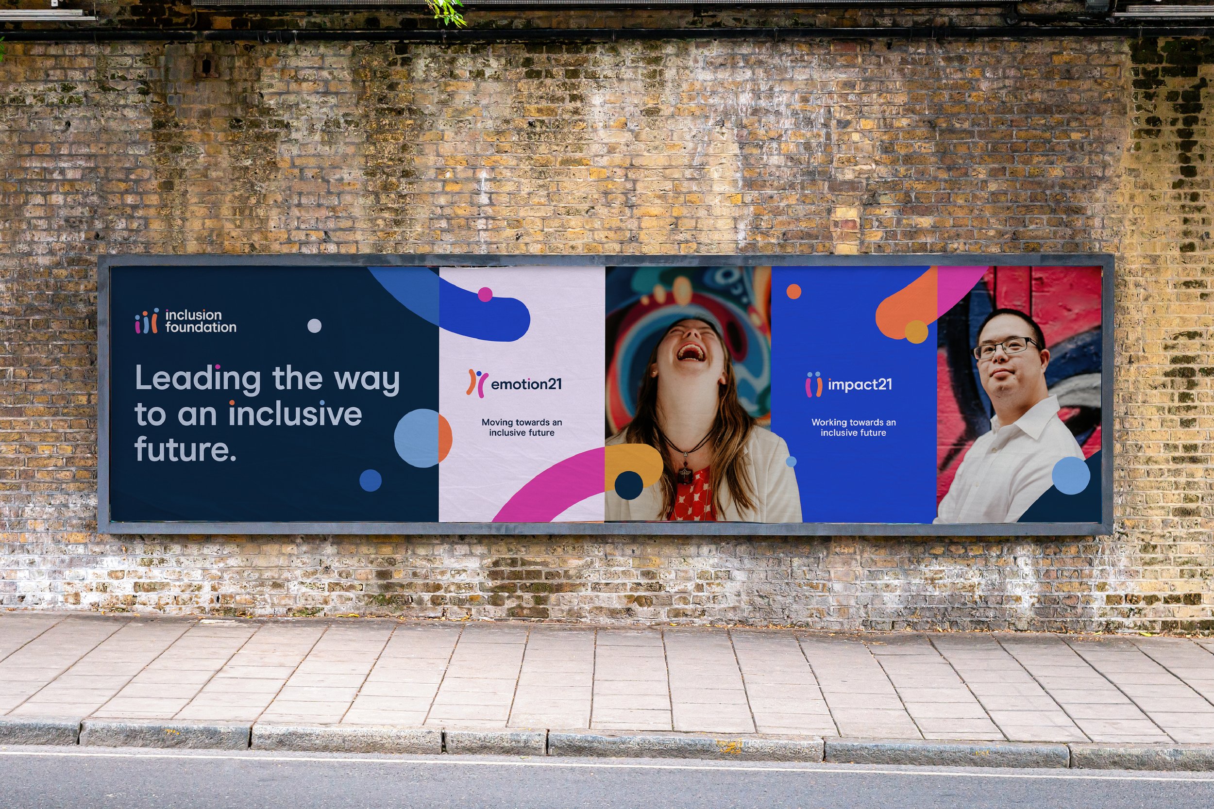
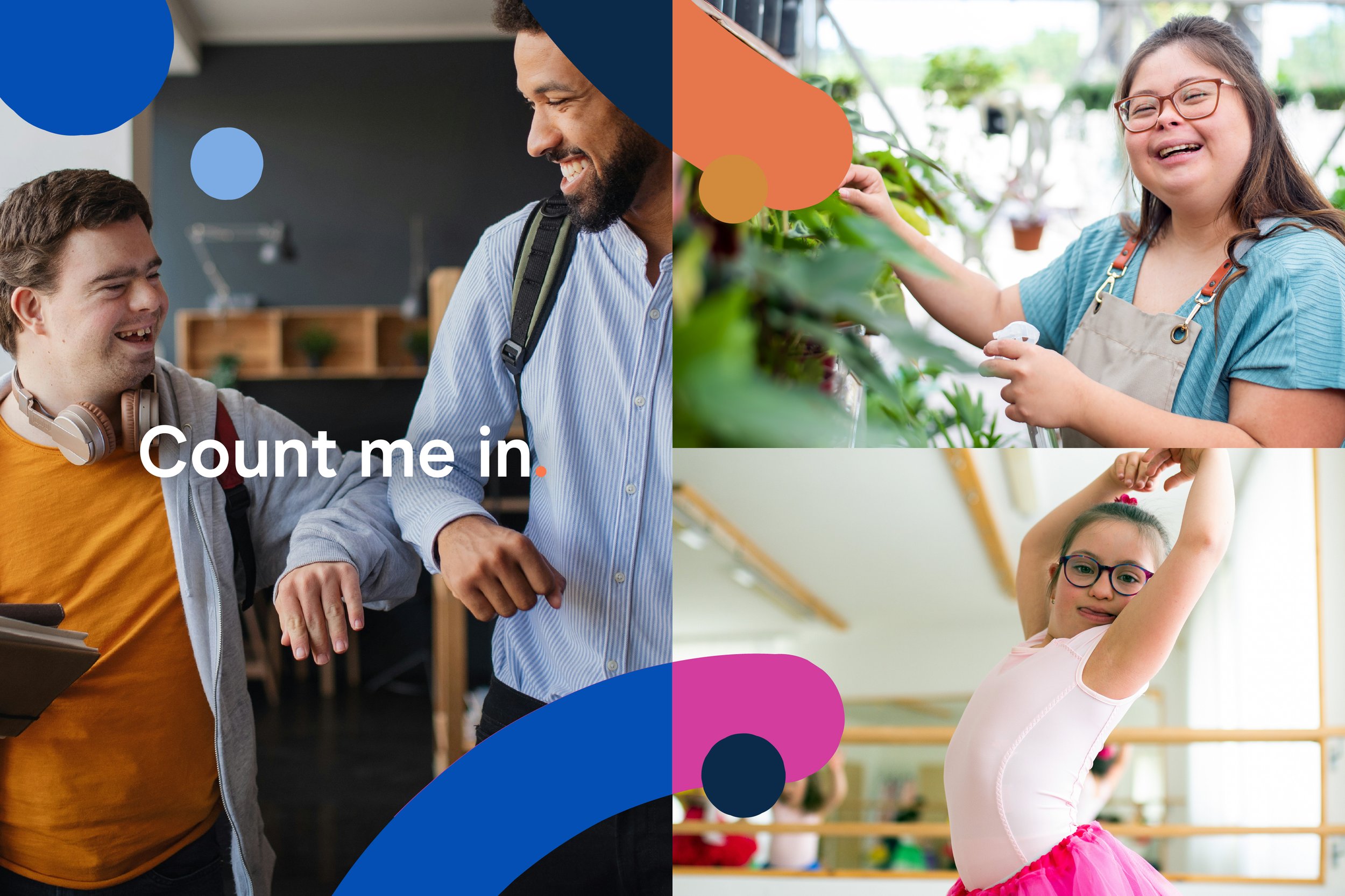
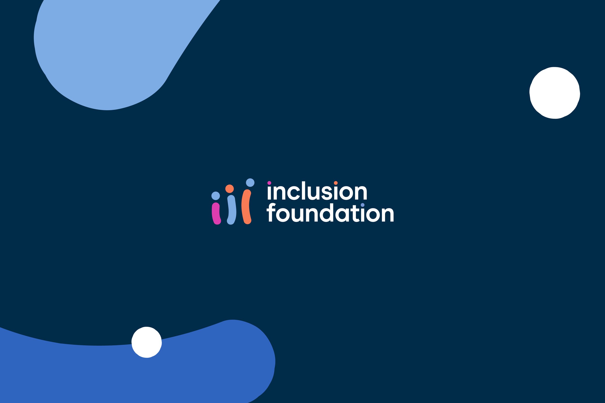
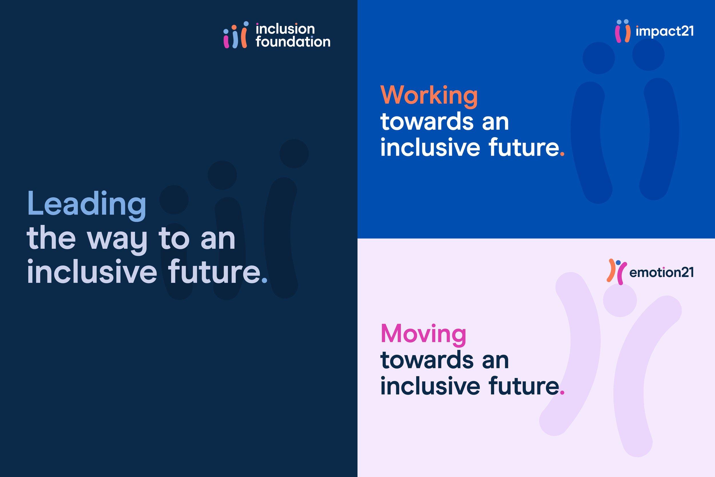
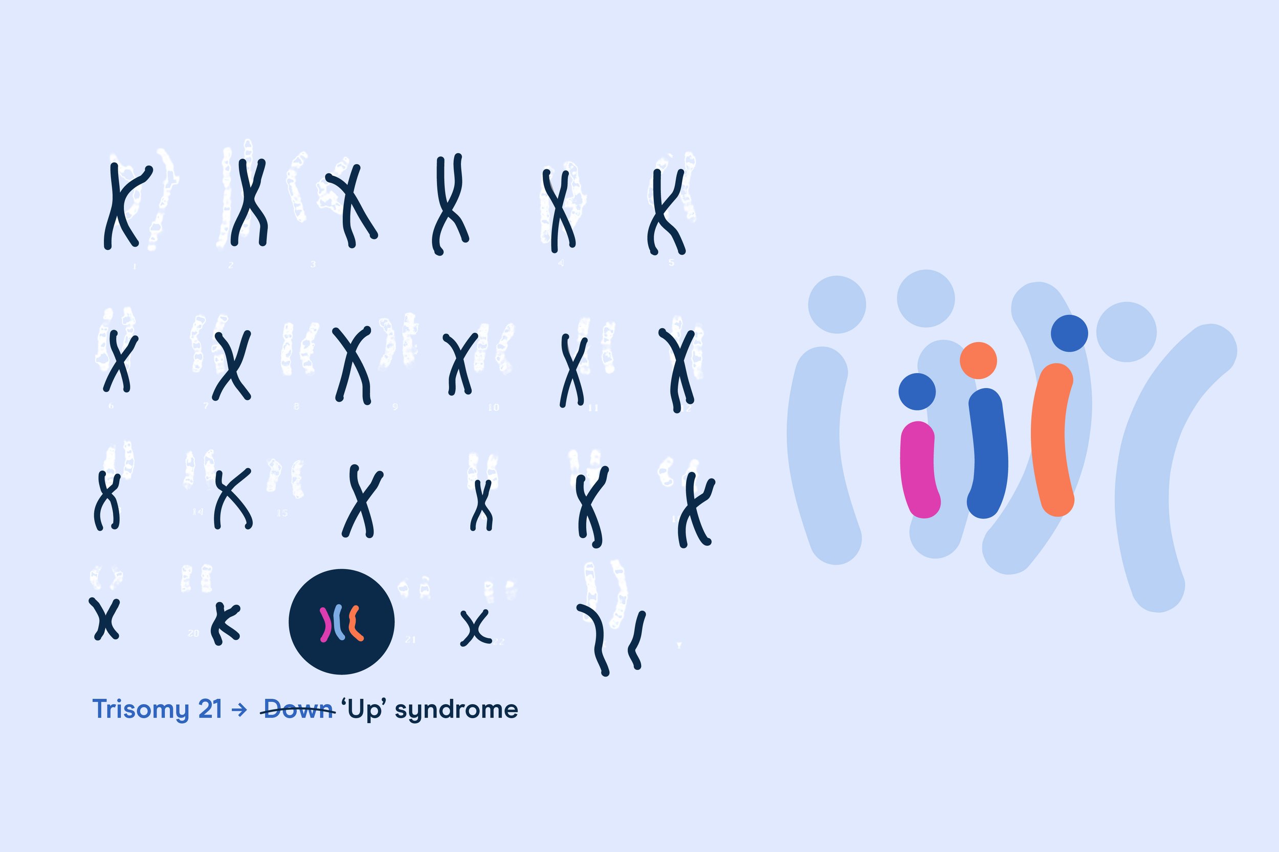
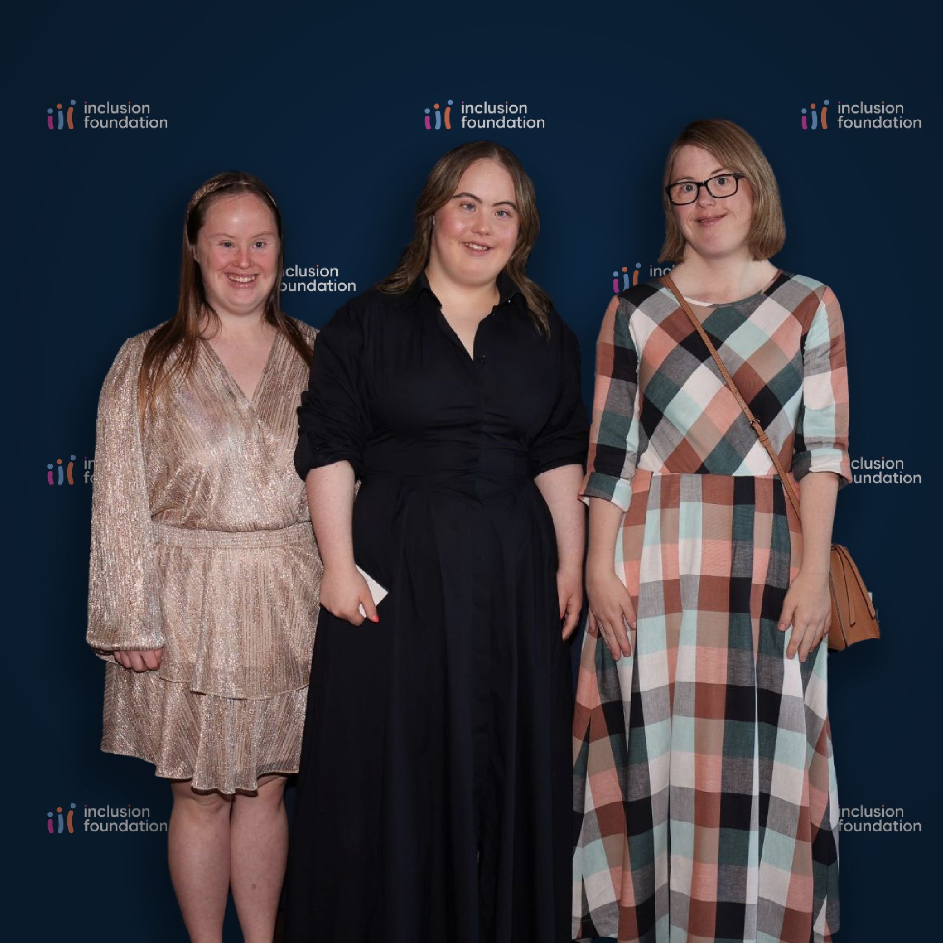
06_Inclusion Foundation
Brand Alignment > Strategy > Architecture > Positioning > Identity
An inclusive brand championing people with Down syndrome
-
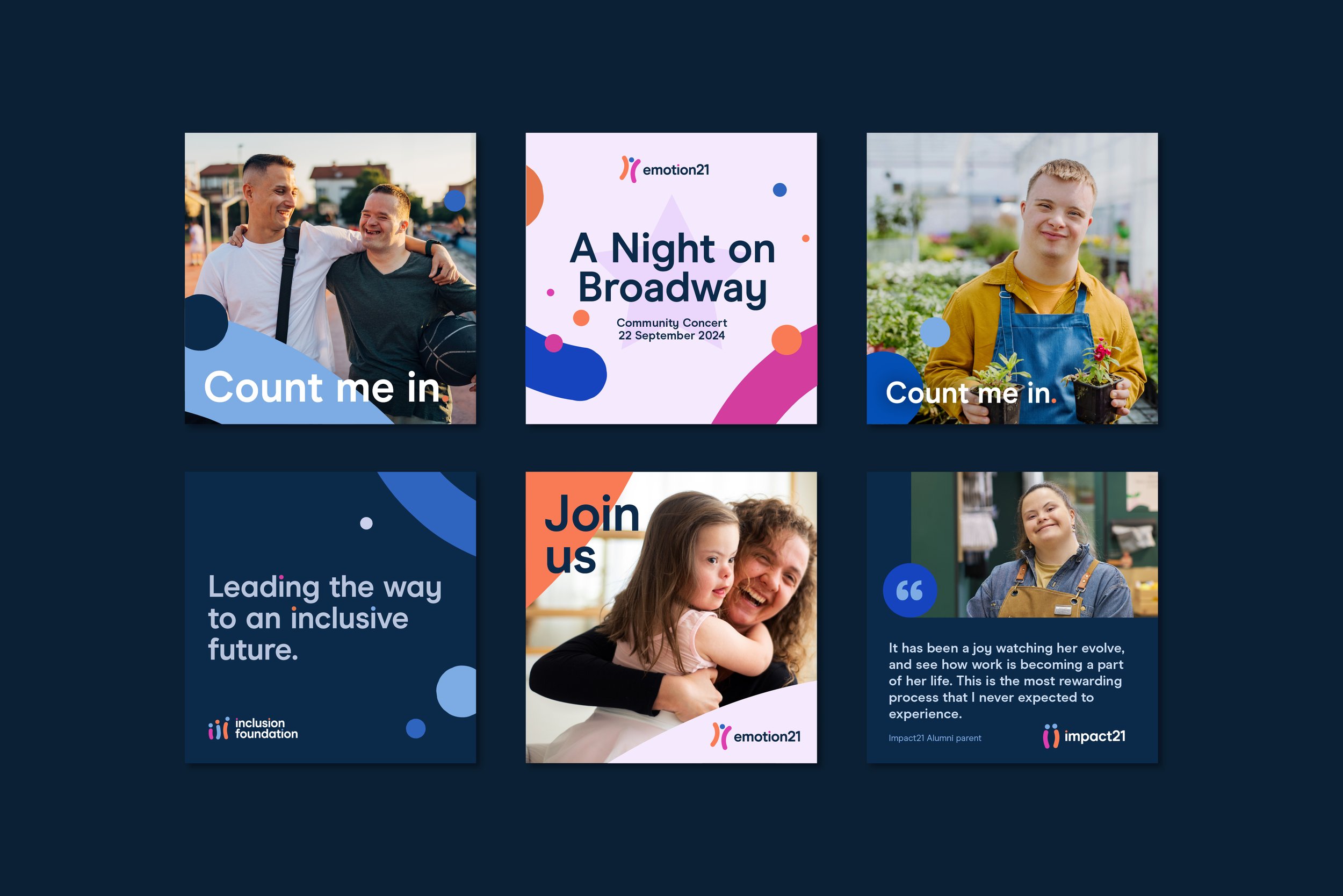
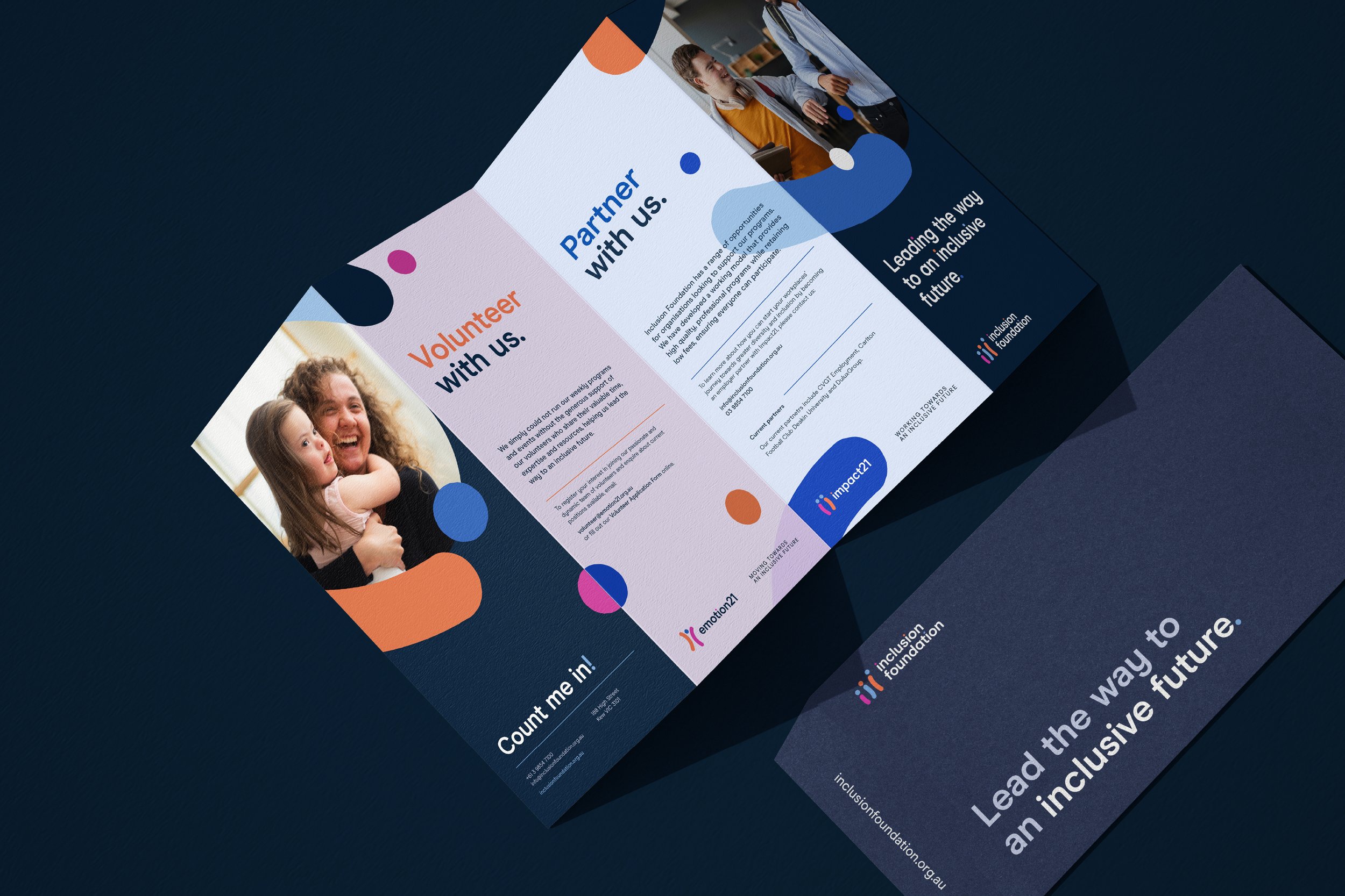
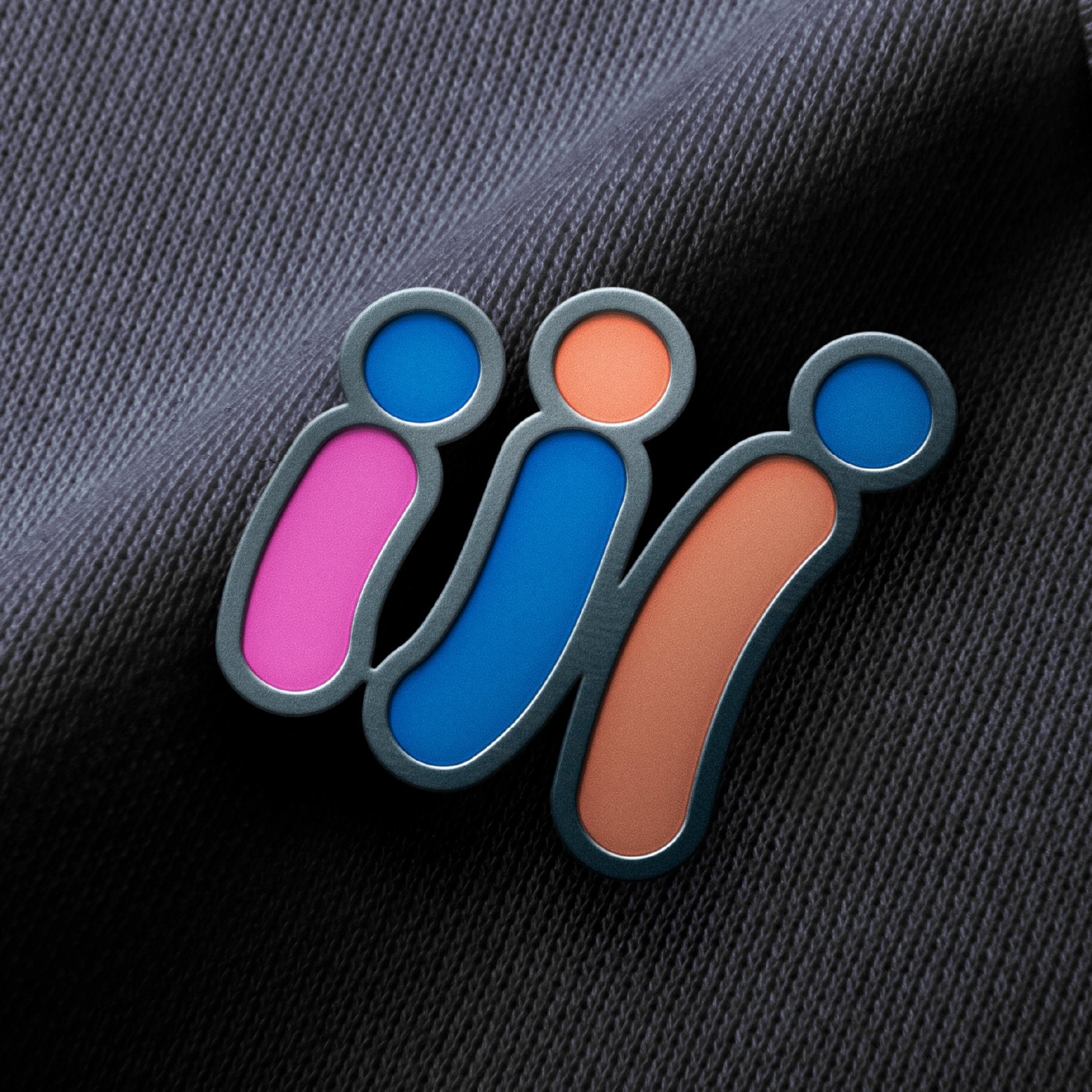
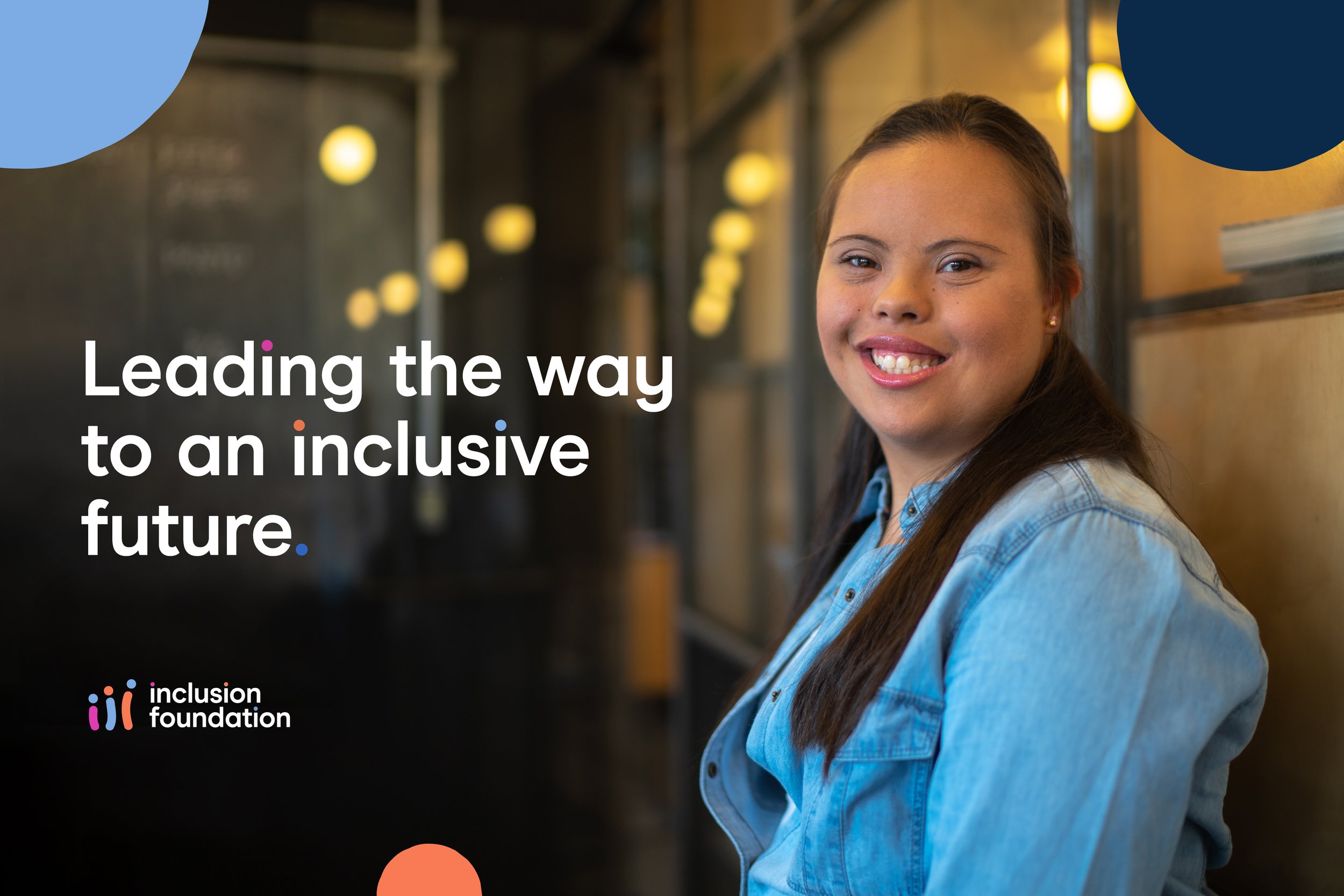
The Inclusion Foundation advocates for people with Down syndrome as equal and respected members of society. With programs emotion21 and Impact21, it provides opportunities in dance, fitness and wellness, and employment. To support its vision of changing how the world views and values people with Down syndrome, the organisation required an empowering and cohesive branded house to unite the foundation and its programs.
-
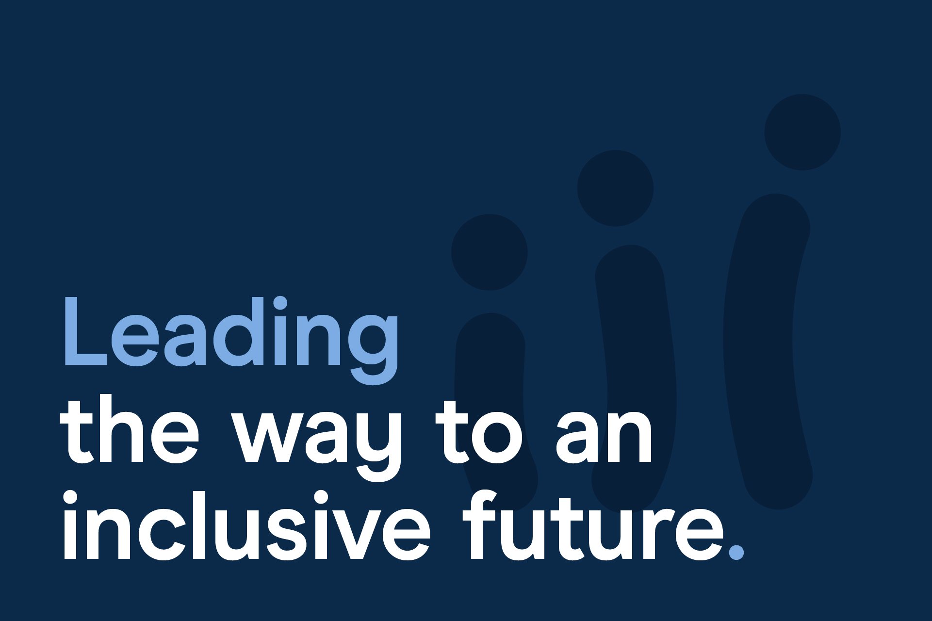
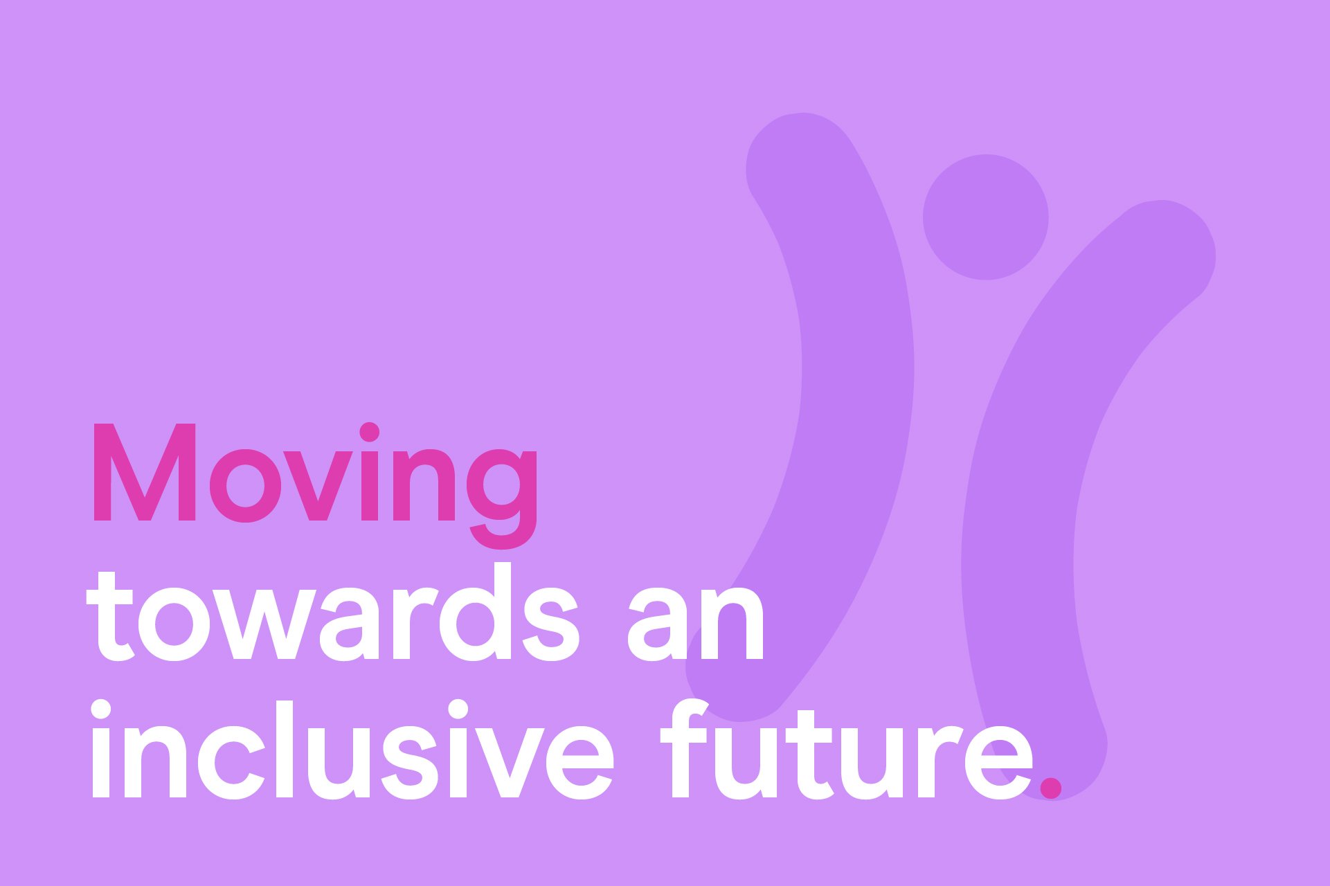
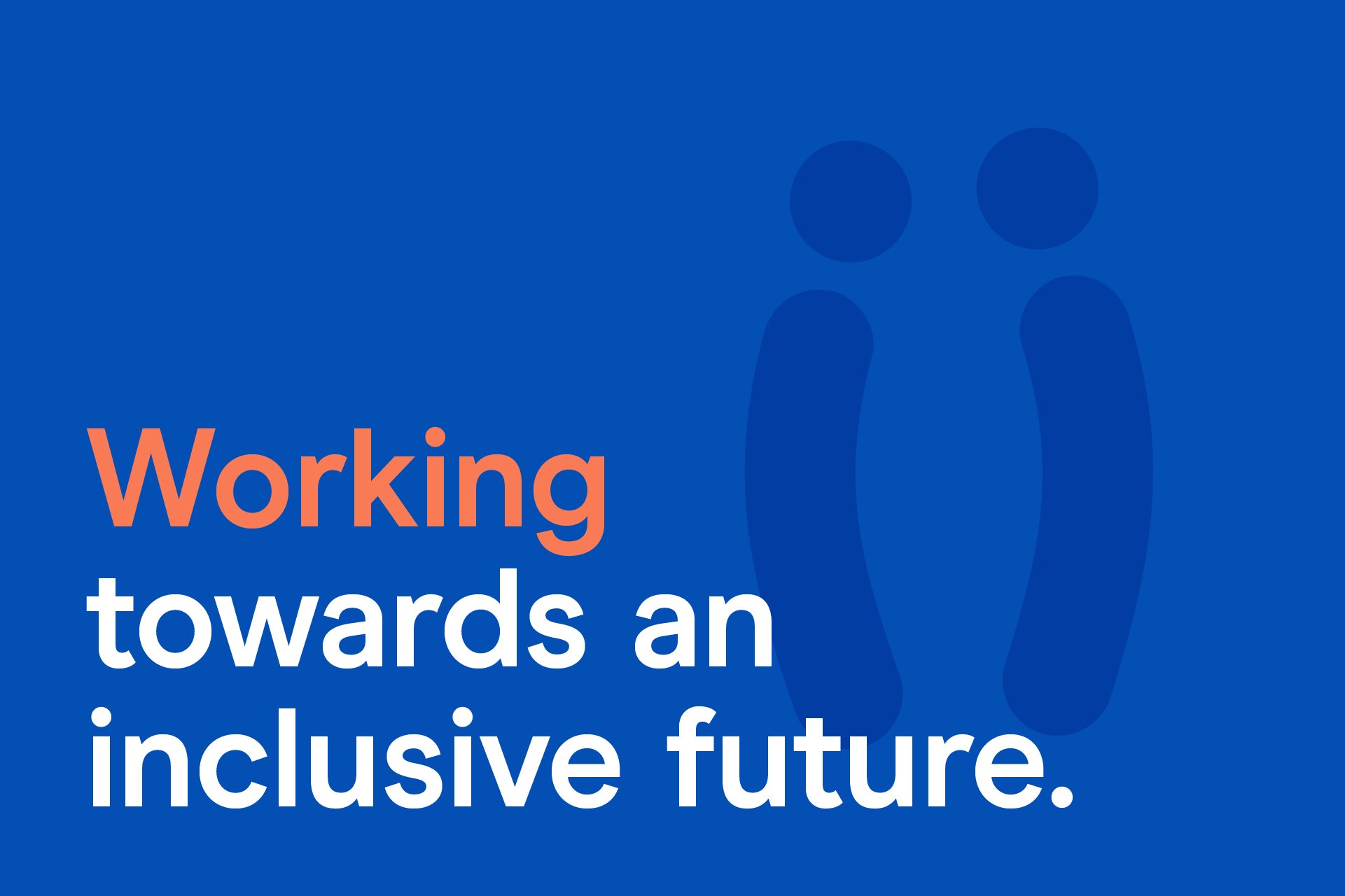
With its rallying cry ‘Count Me In’, the Inclusion Foundation seeks to empower and inspire people with Down syndrome. The visual identity is inspired by chromosome 21—the genetic marker of Down syndrome—and features three logo devices that evoke chromosomal and humanoid forms. These logos proudly celebrate the difference and individuality of people with Down syndrome. The broader identity and colour palette is warm and approachable, helping it connect with its core audience, while also being confident and professional, supporting its advocacy and fundraising efforts.
-
“I am sincerely appreciative of all the time, energy and passion that has gotten us here. The creative talents and passion of the team is amazing. A massive thanks for making this happen.”
Cate Sayers — Founder & Director

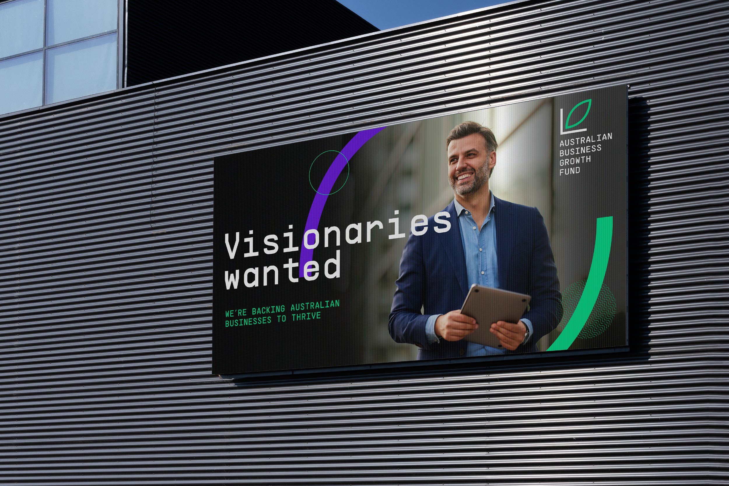
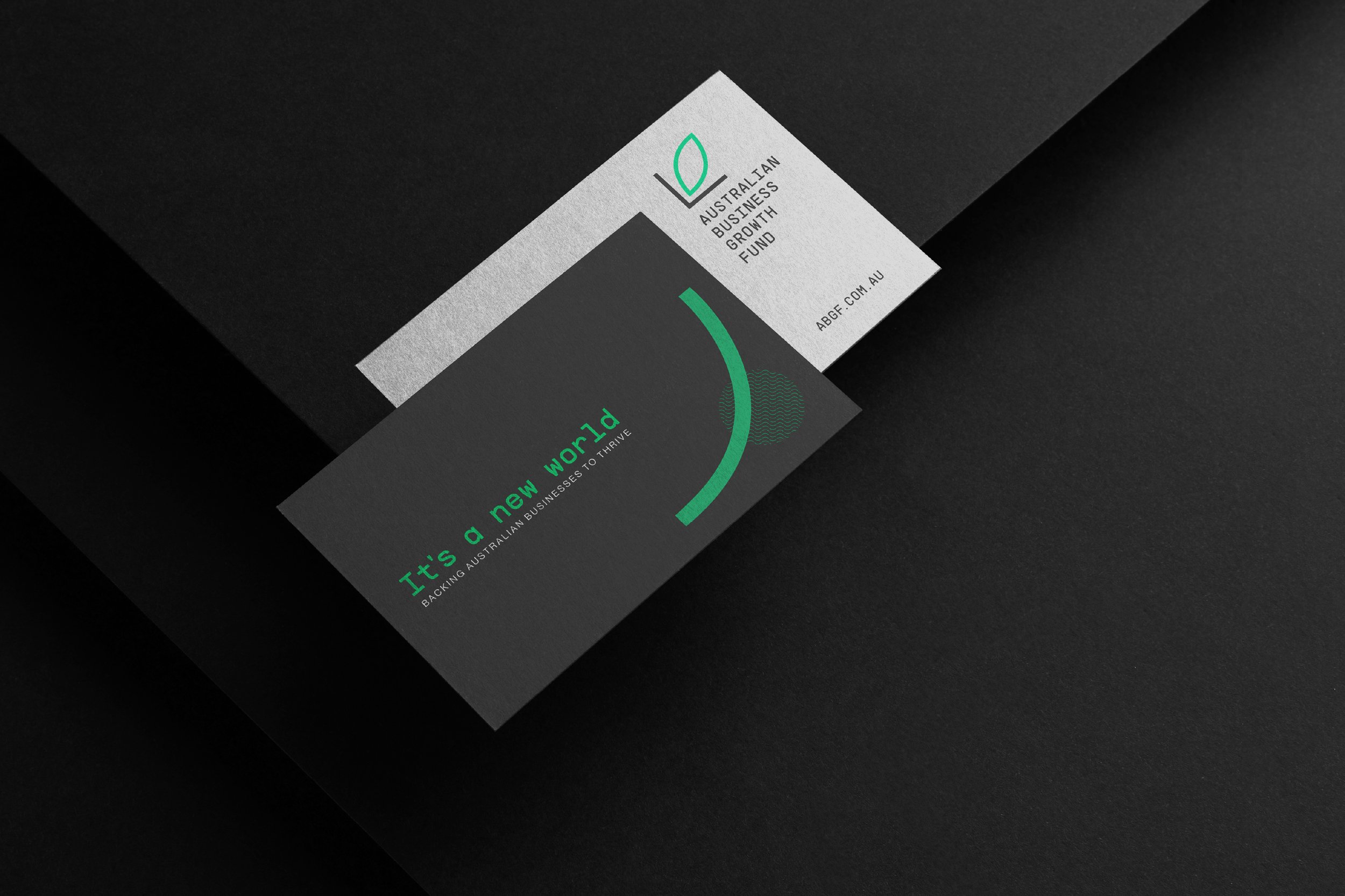
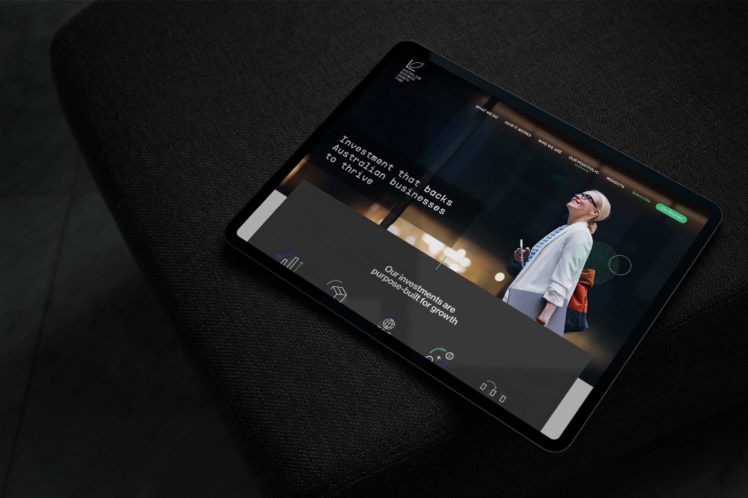
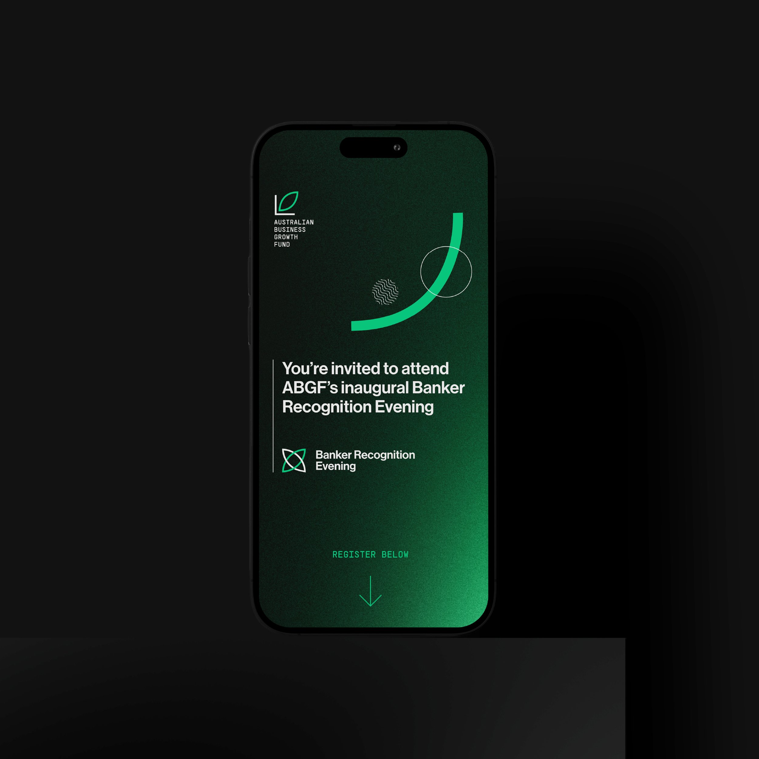
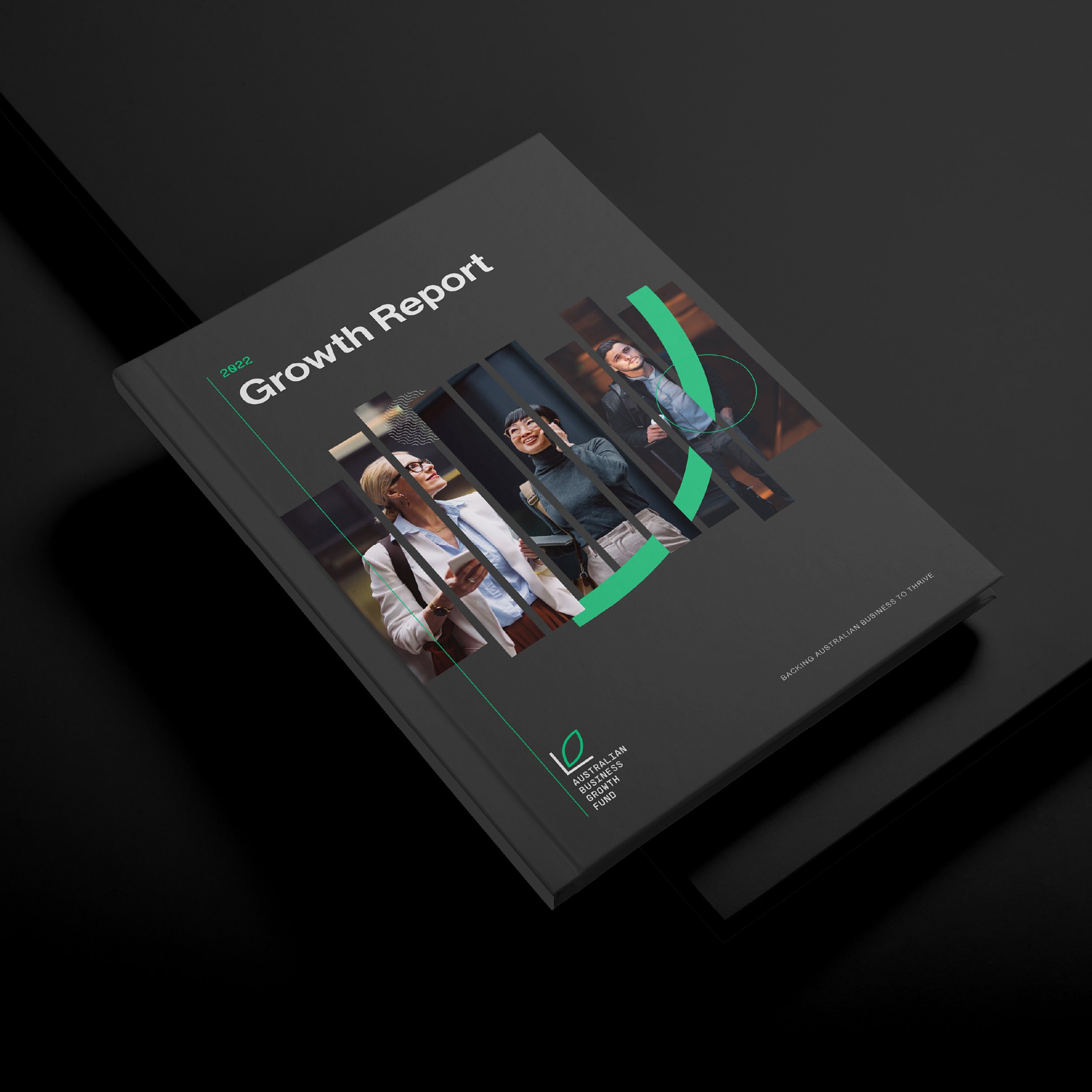
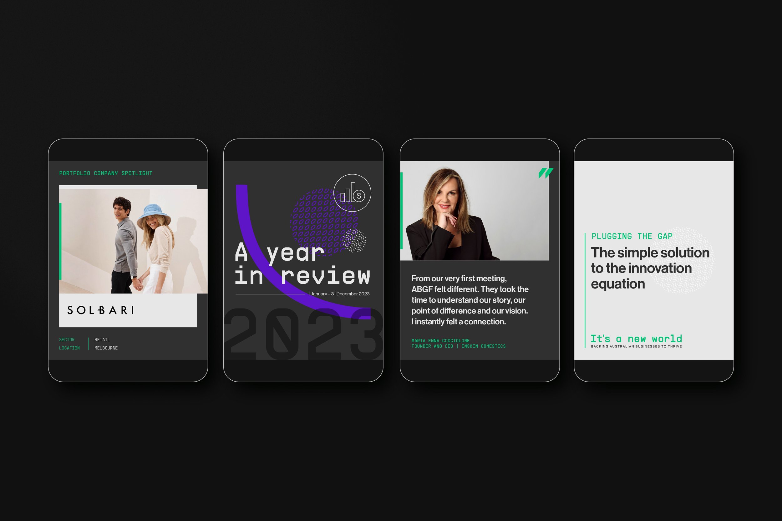
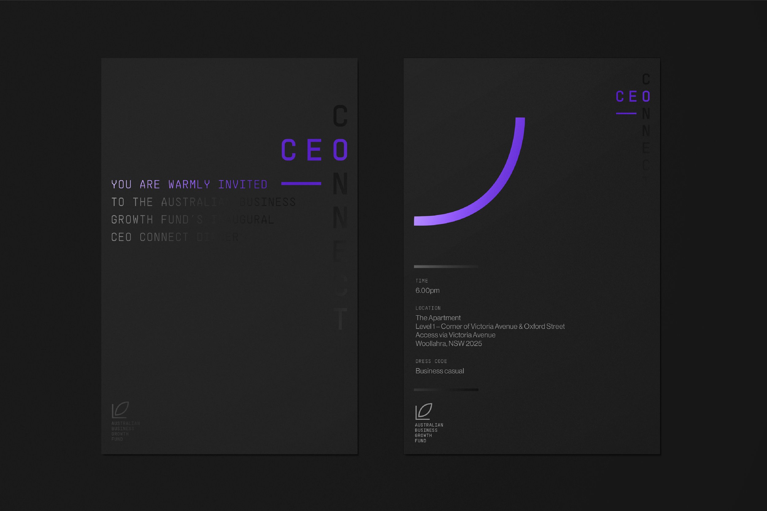
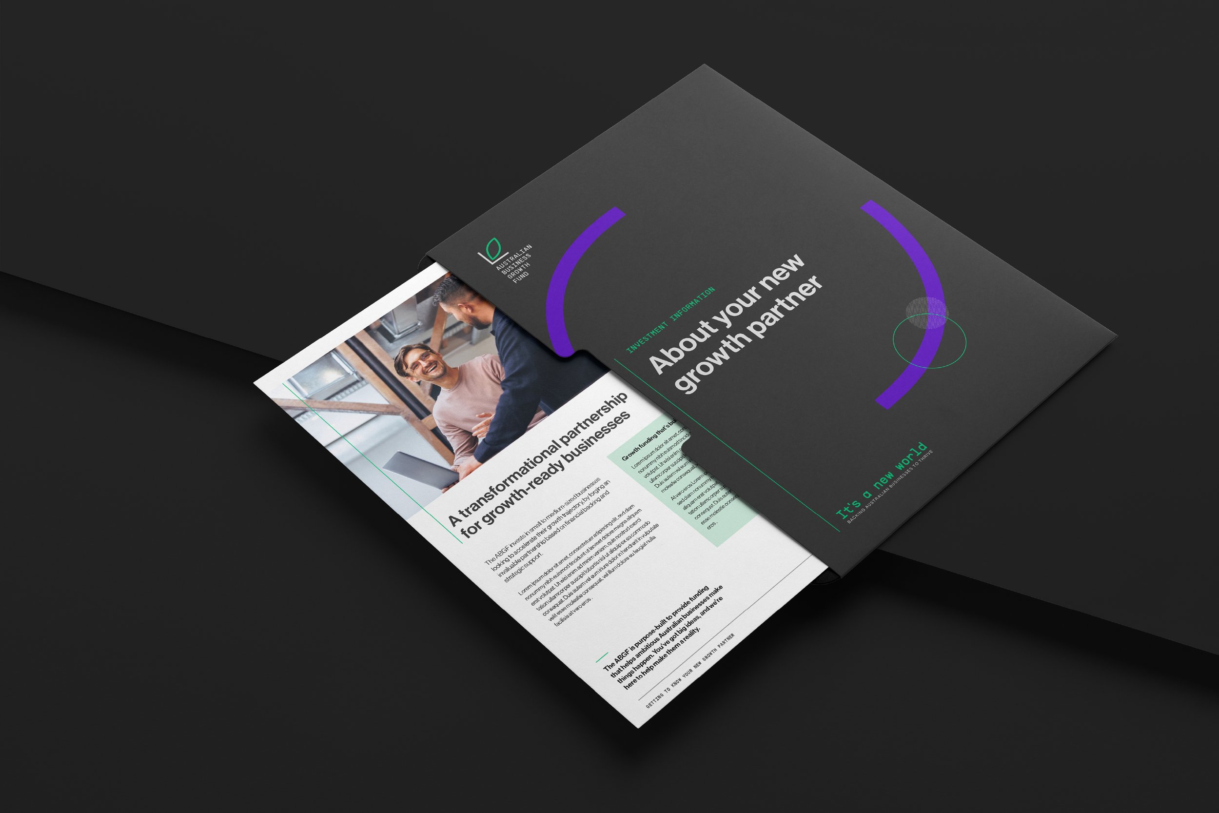
07_ABGF
Brand Creation > Brand Strategy > Brand Identity > CVP
A foundational brand for Australia’s first Business Growth Fund
-
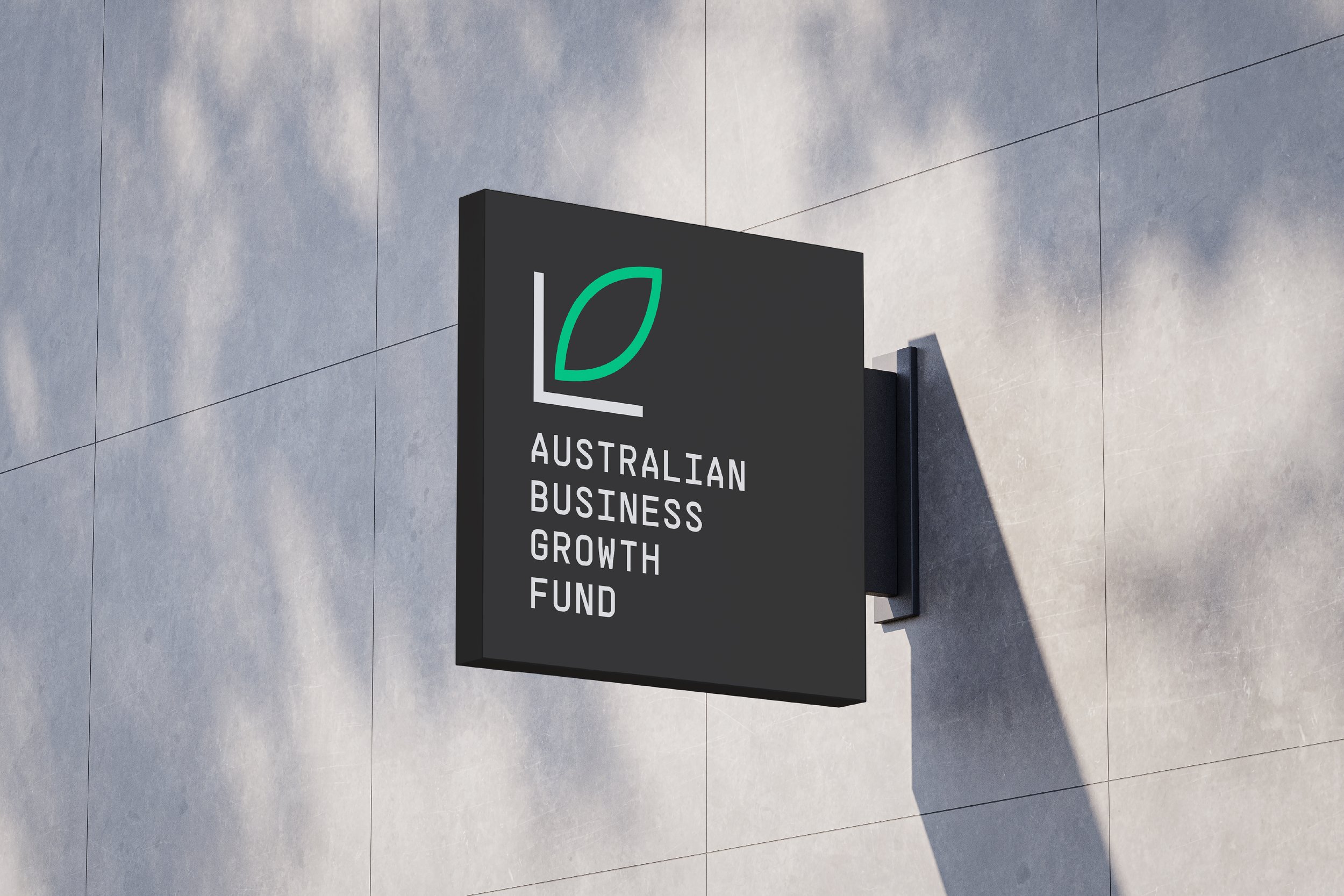
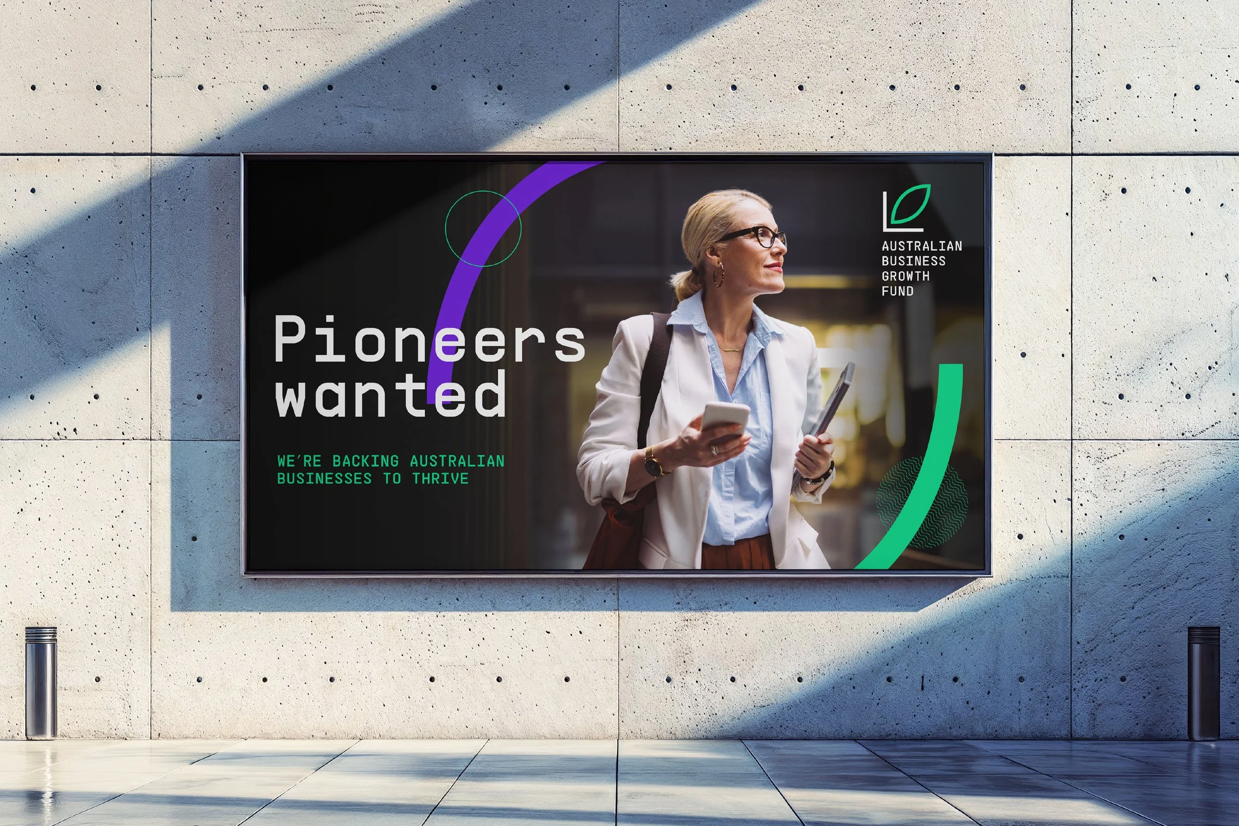
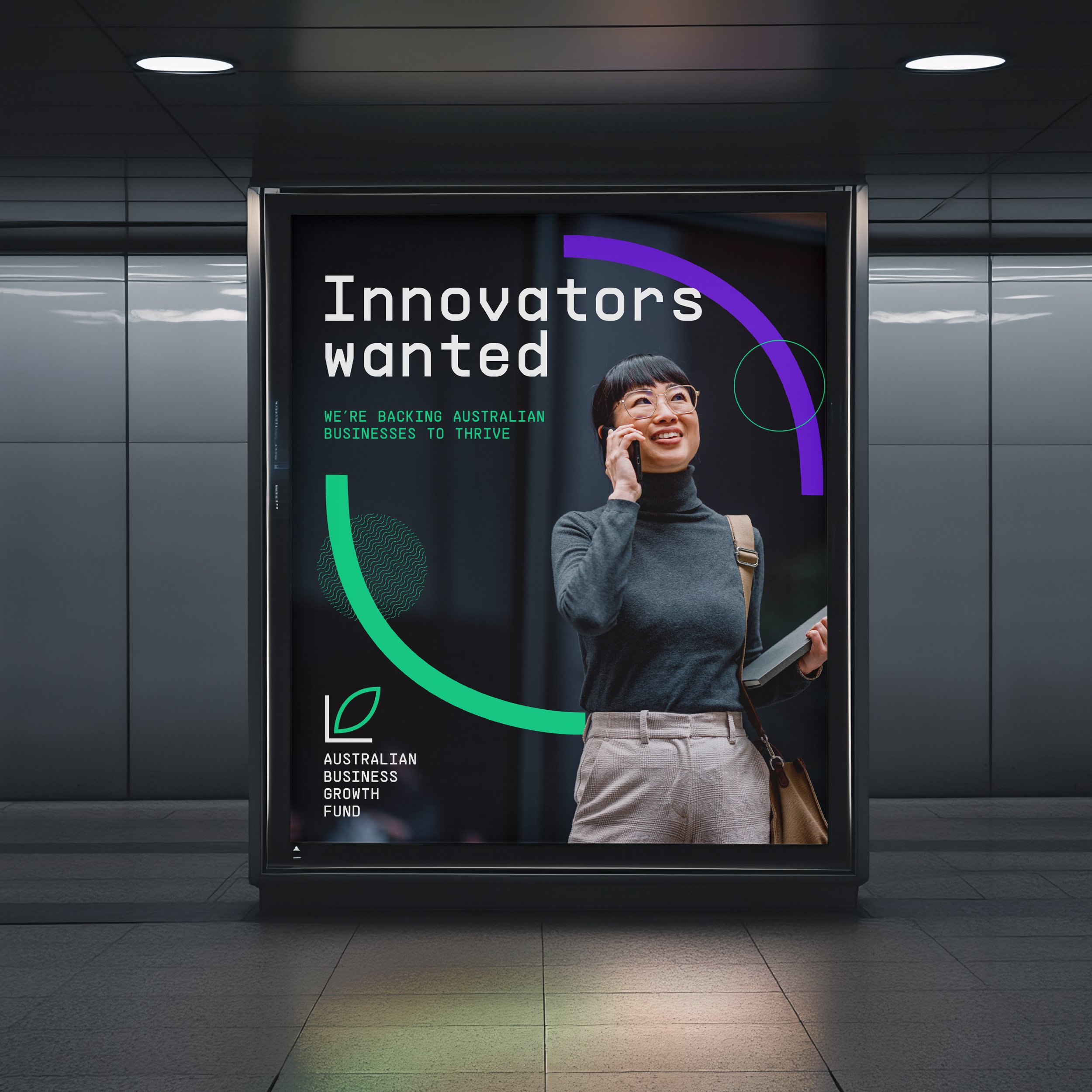
The Australian Business Growth Fund (ABGF) is a groundbreaking, government and major bank-backed entity providing an alternative to traditional loans and private equity for Australian SMEs. As a brand-new organisation, the fund required a deeply considered brand capable of spanning every single aspect of its operation – including brand strategy and values, corporate logo and identity system, verbal identity, brand guidelines, and website.
-
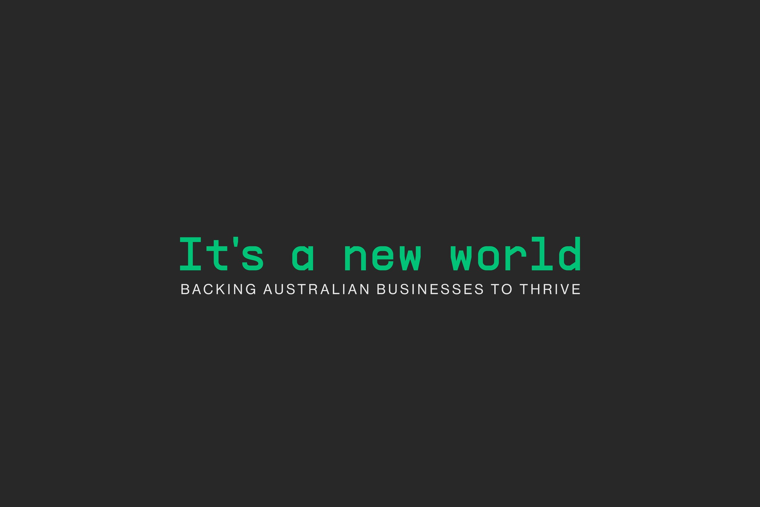
‘Backing business to thrive’ encapsulates ABGF’s mission to help Australian SMEs realise opportunity through intelligent funding and expertise. The visual identity centres on a bold, modern logo featuring a leaflet or bud, formed by exponential and logarithmic curves that symbolise growth and potential. These curves extend across the identity system, complemented by bold typography and a vibrant, high-contrast colour palette. Together, they convey confidence and forward-thinking, ensuring ABGF stands out in the traditionally conservative business finance landscape.
-
“It’s been great working with the team over the last 12 months to create the ABGF brand. Awesome creative work, flexible and straight talking – and great fun to work with.”Anthony Healy — CEO & Managing Partner


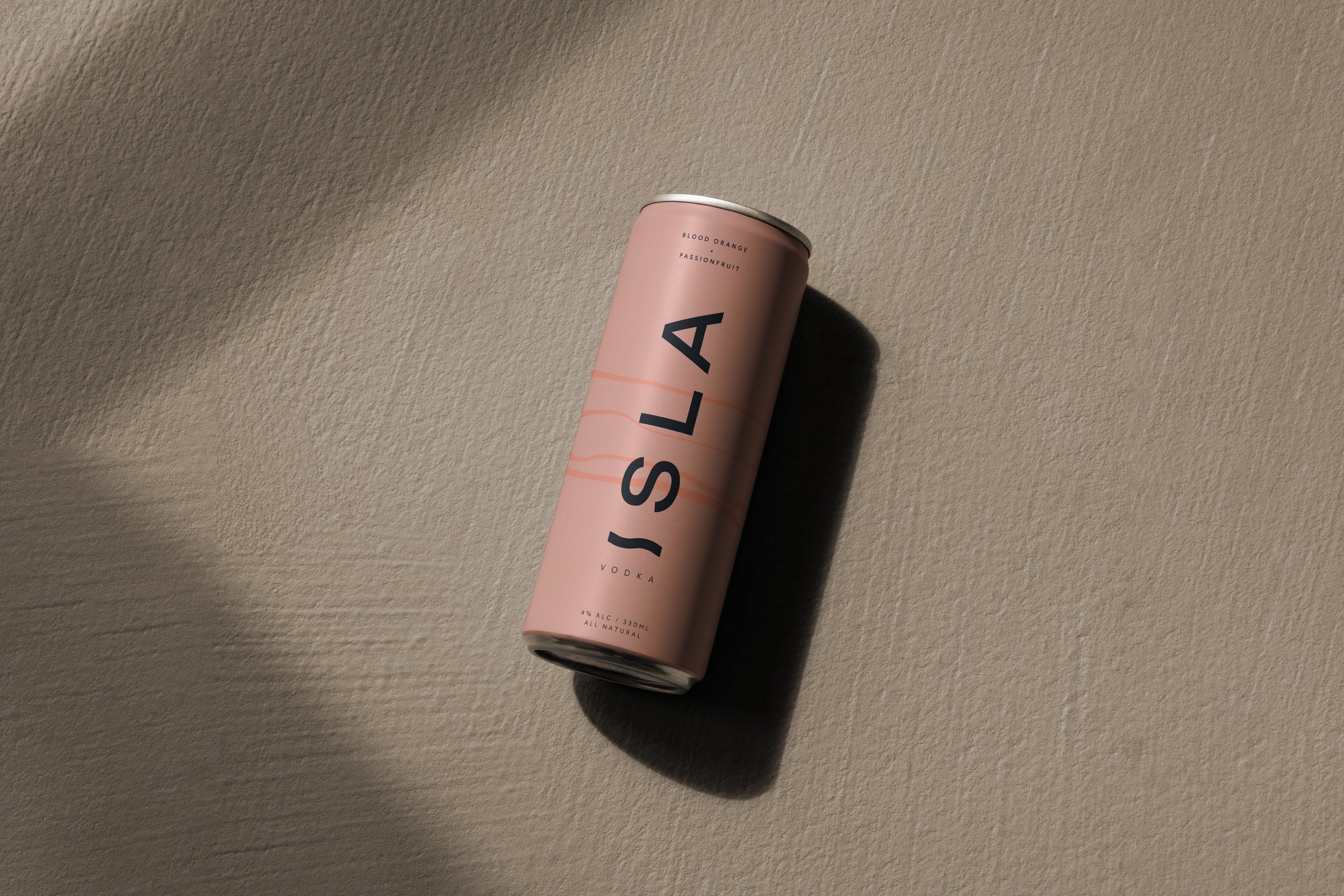
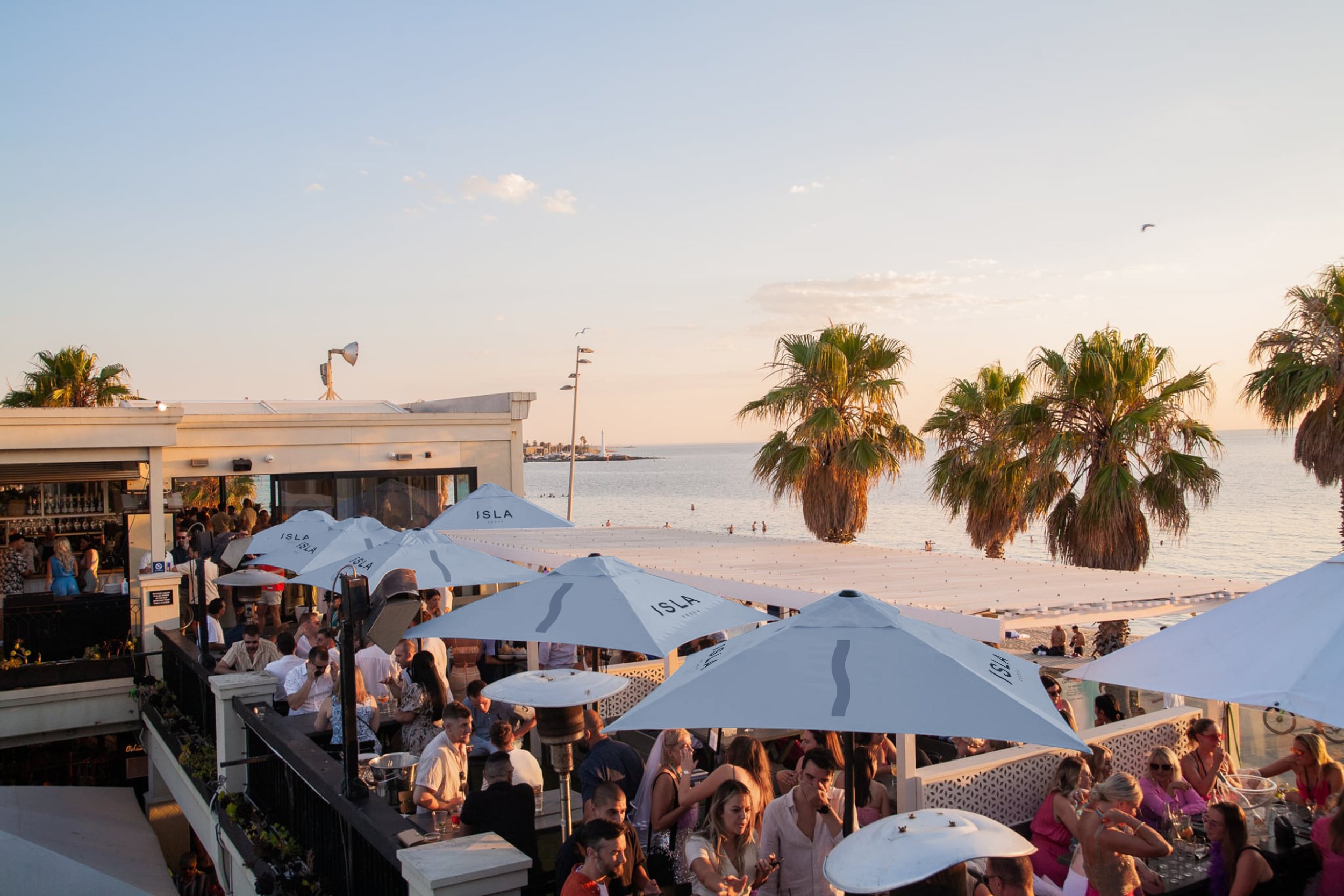
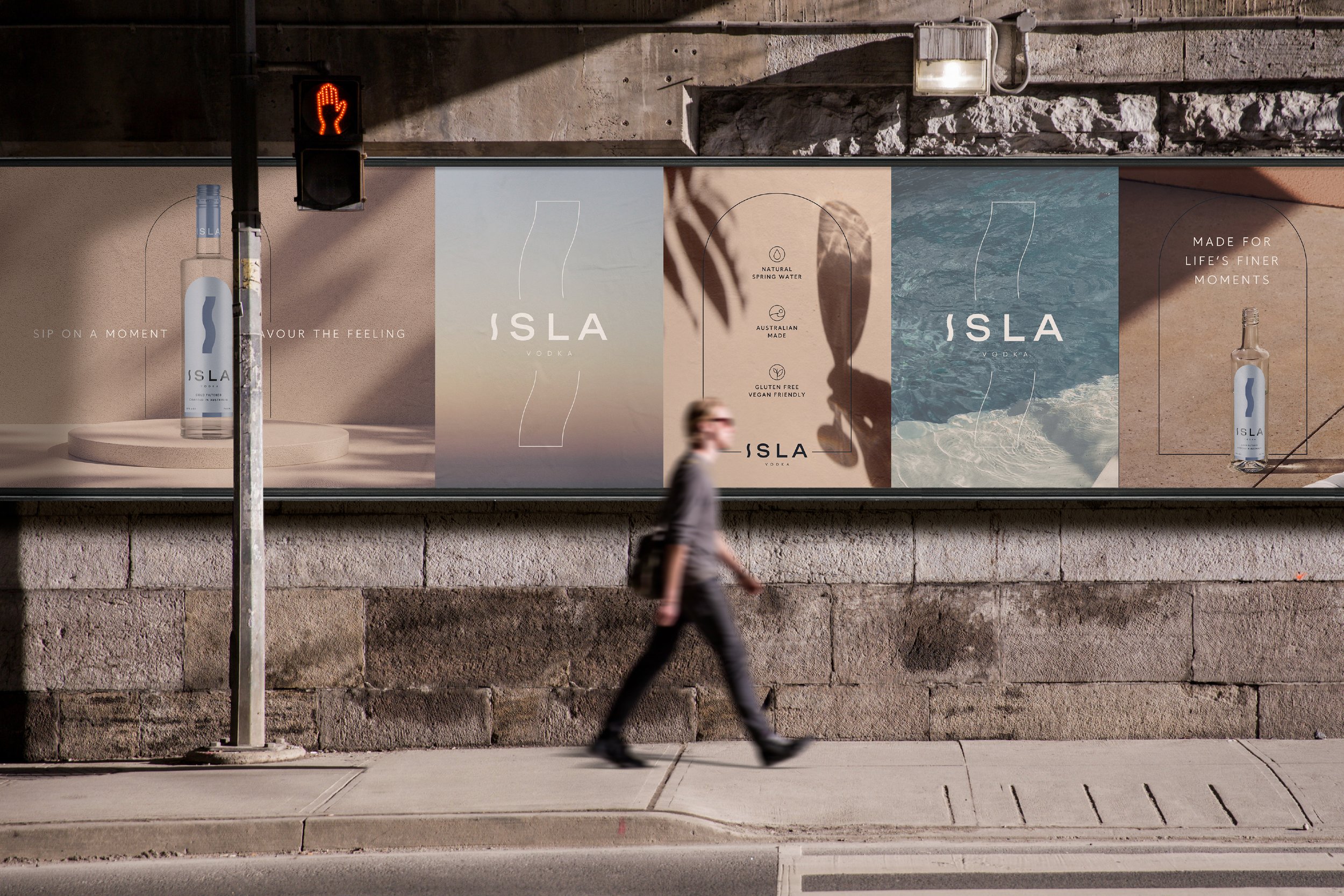
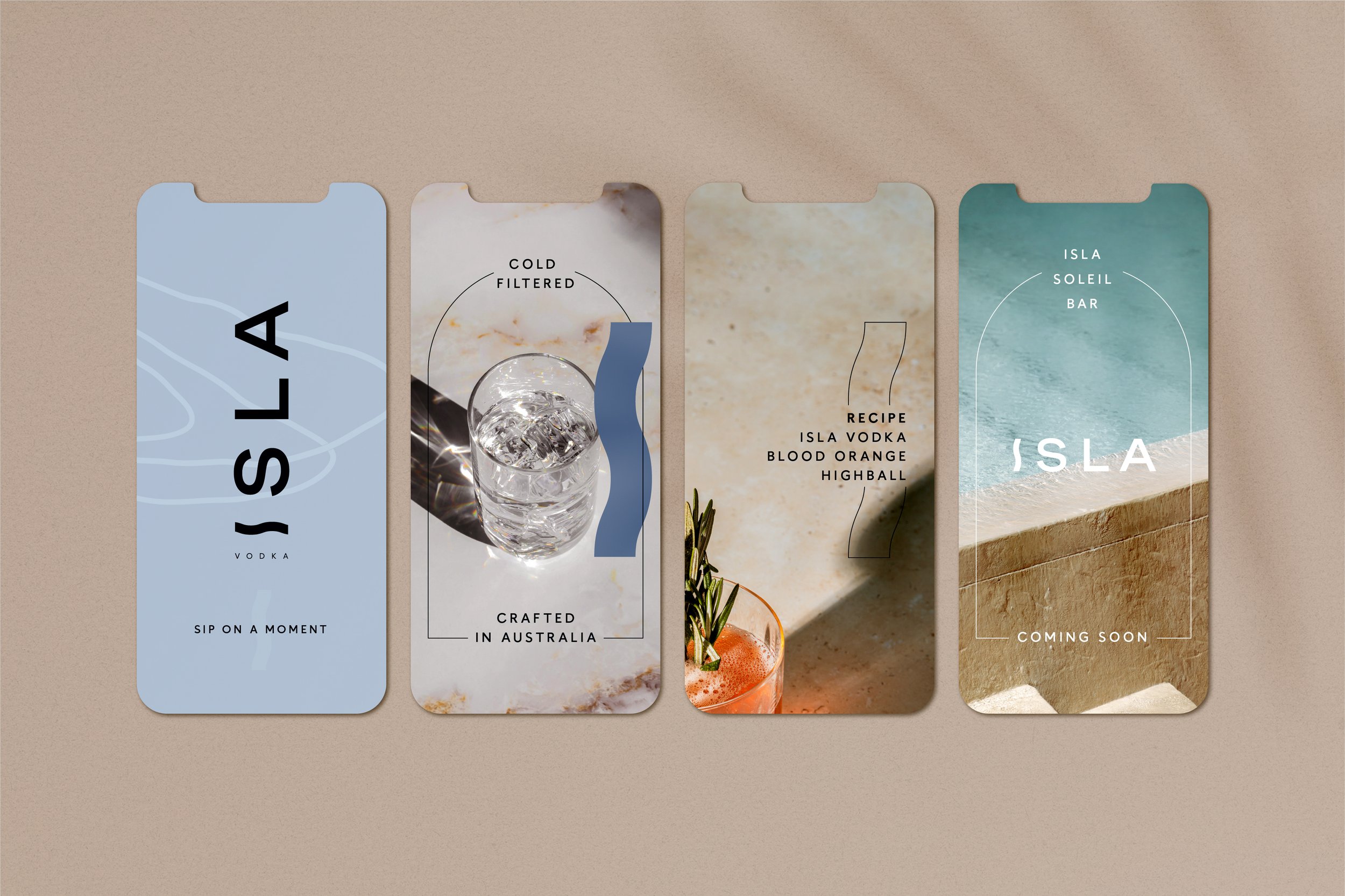
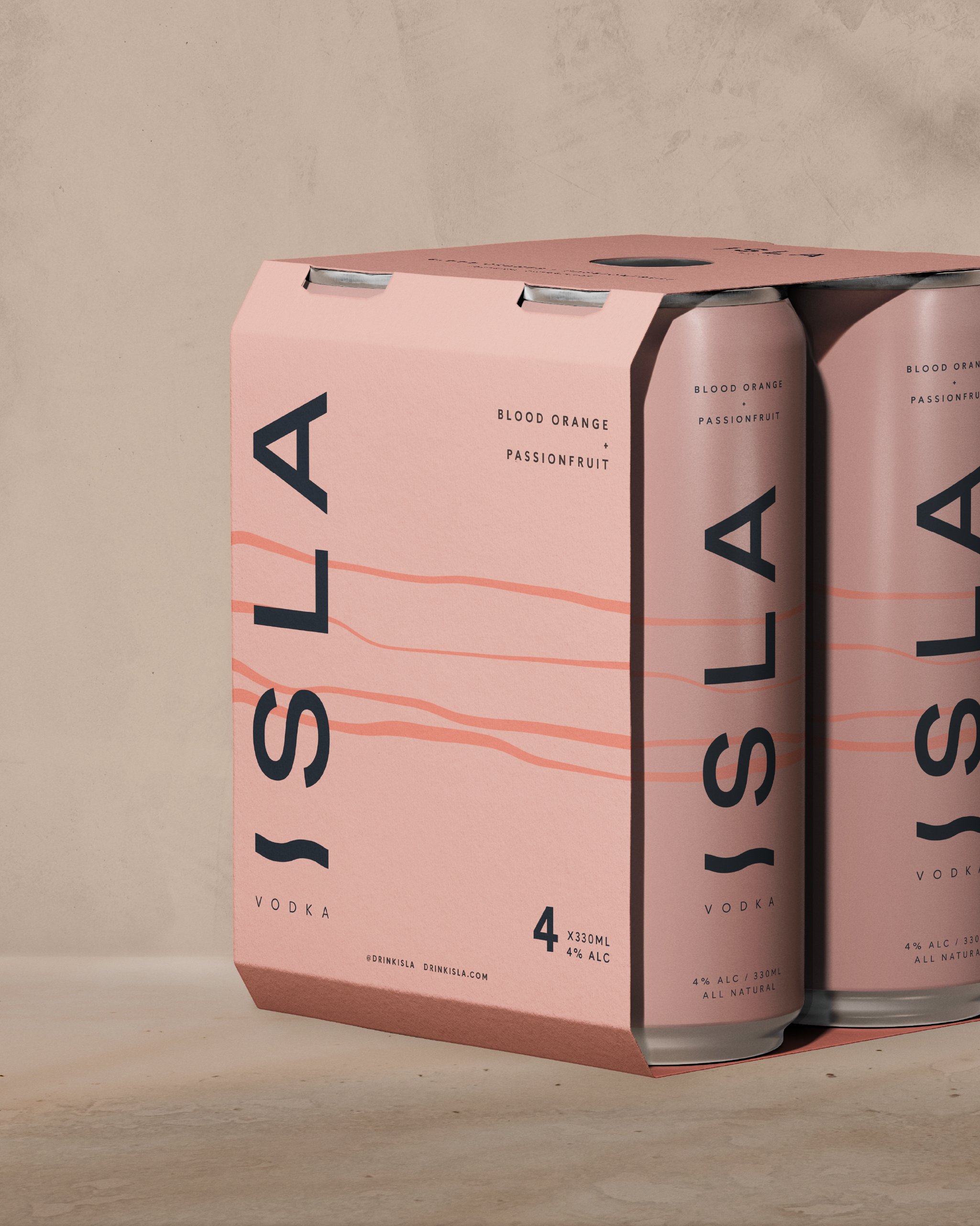
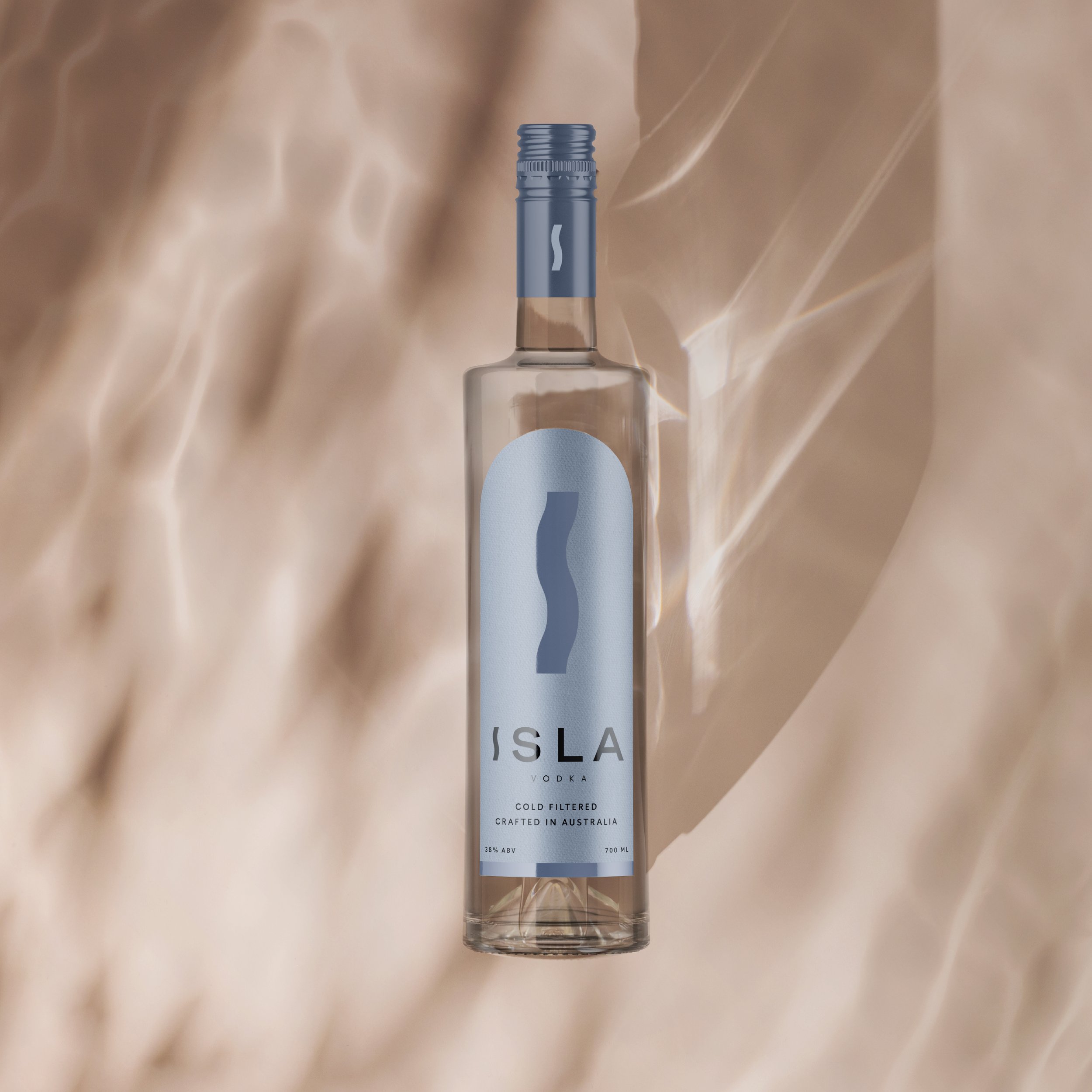
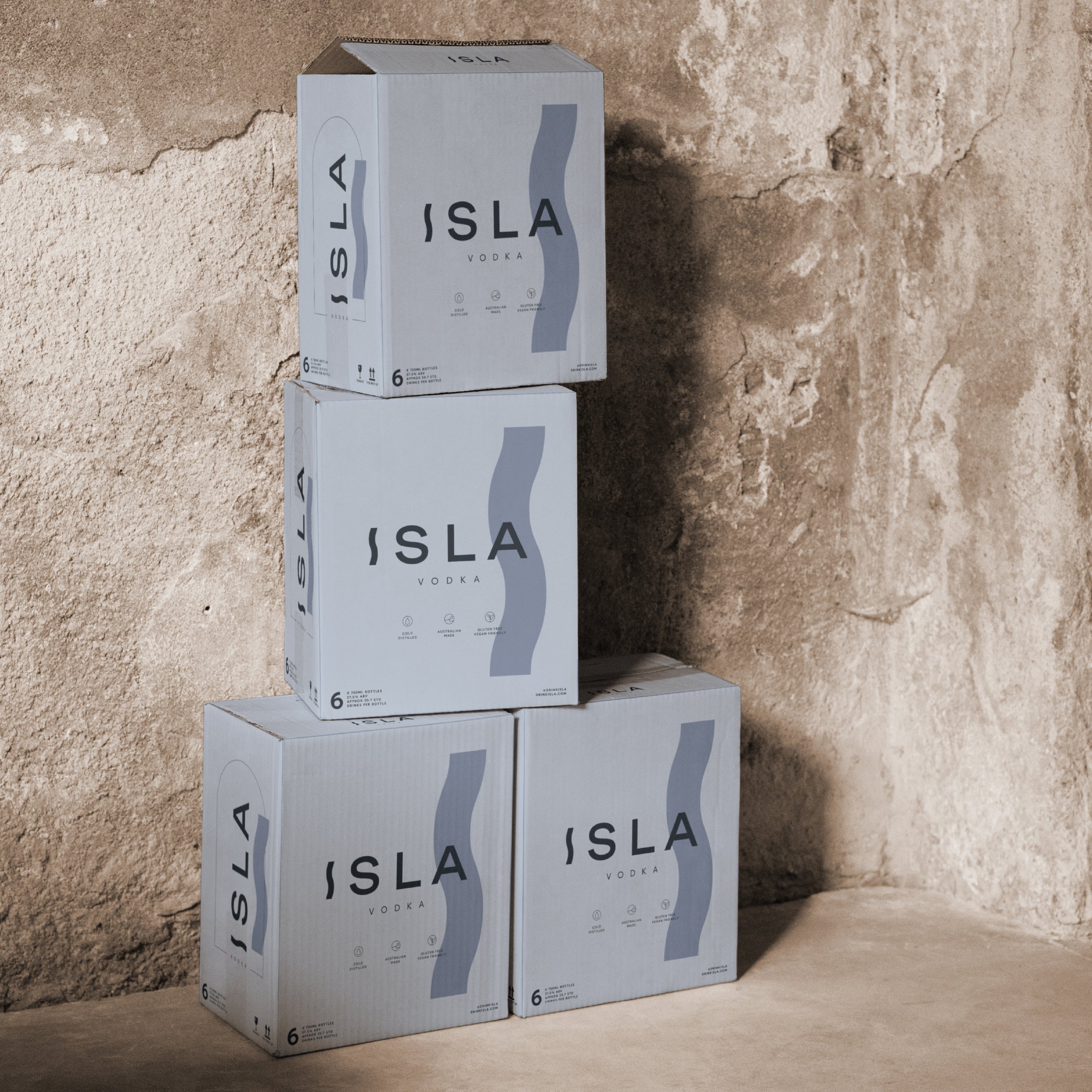
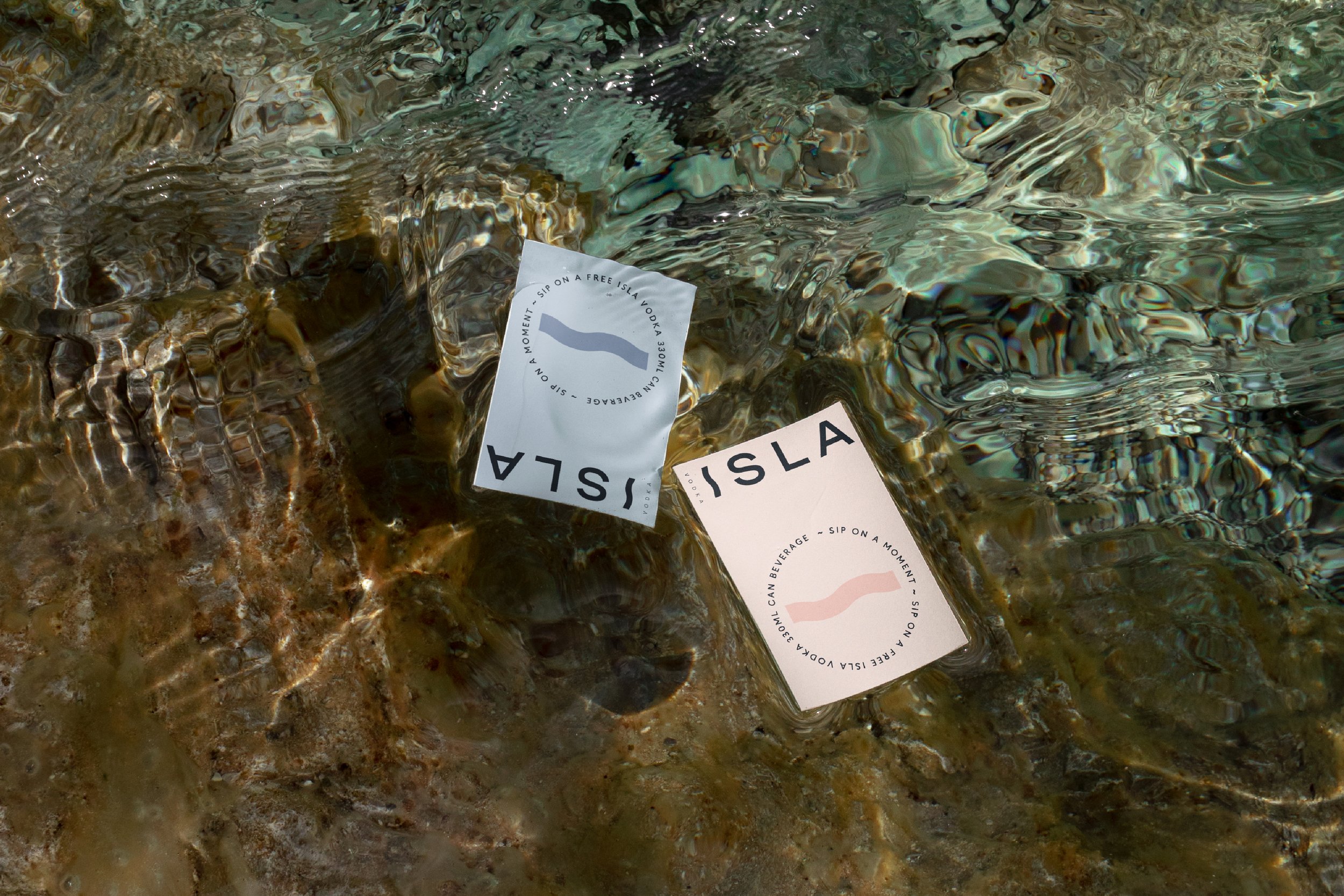
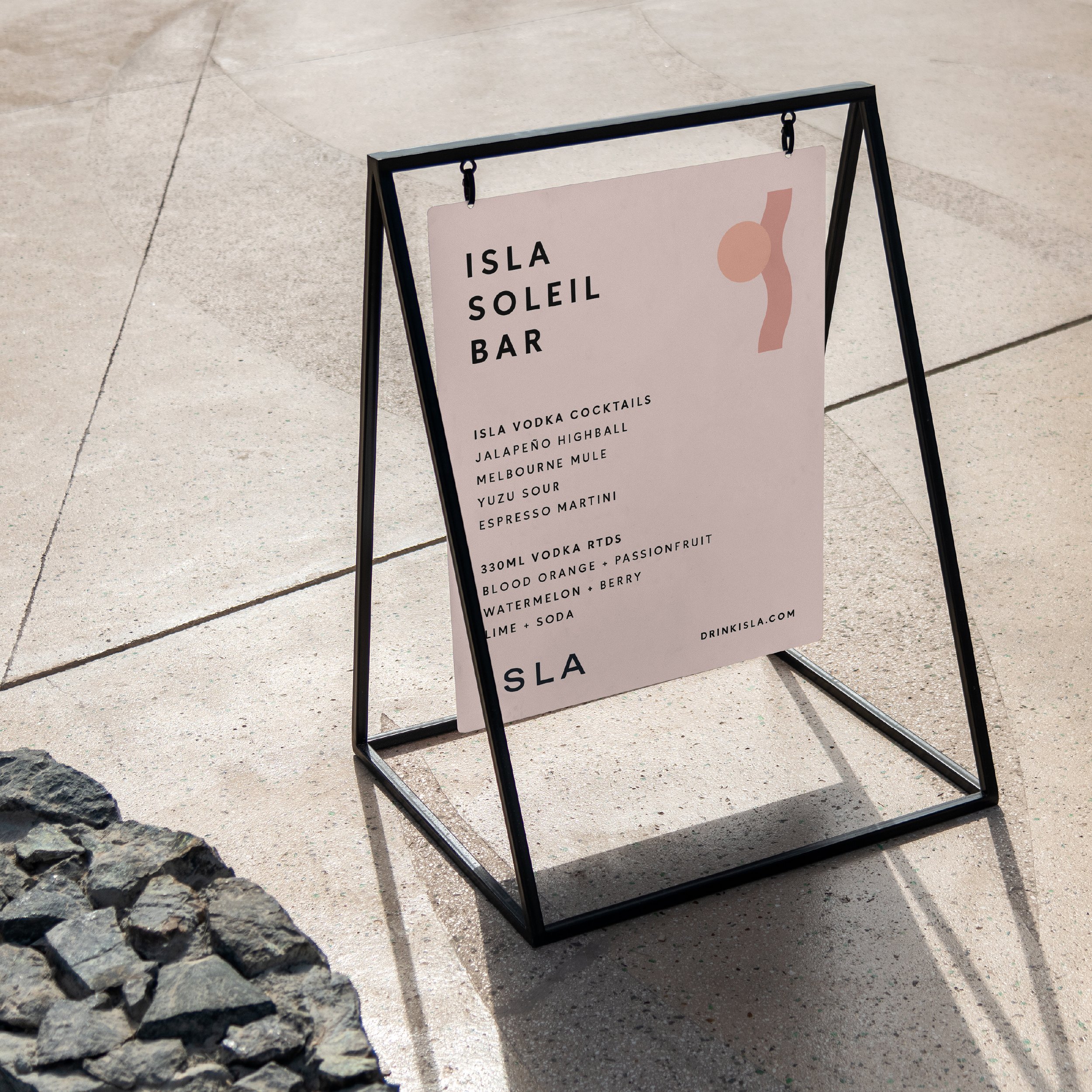
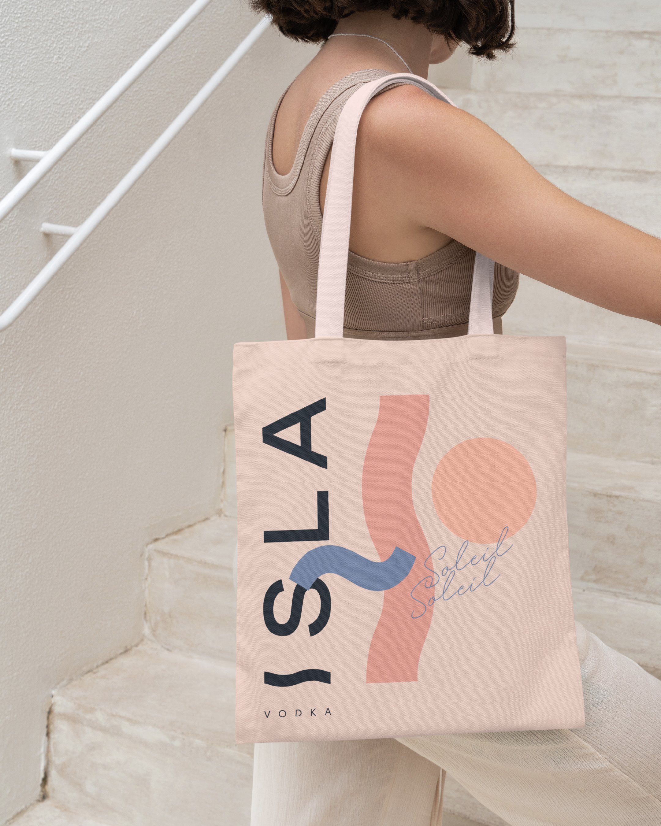
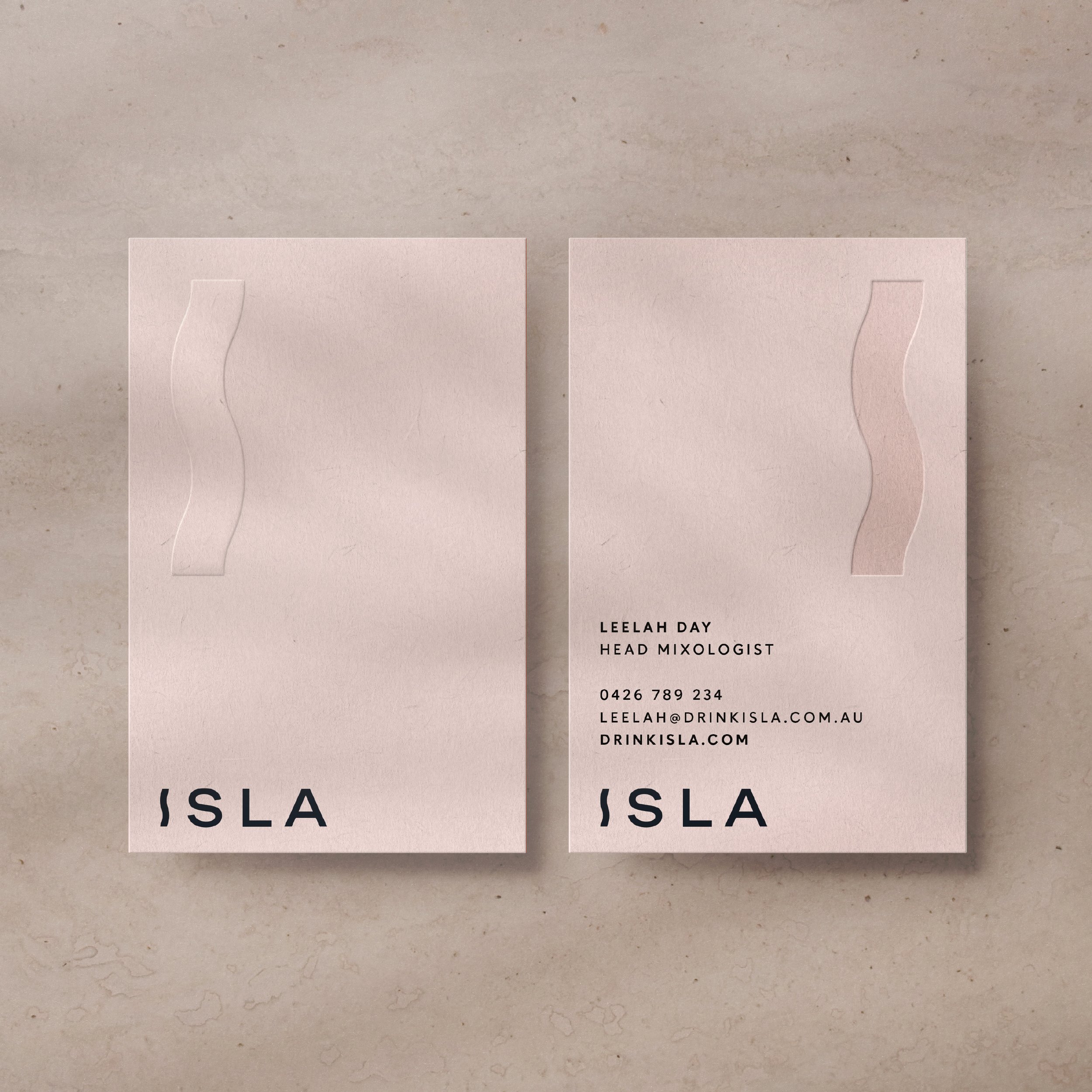
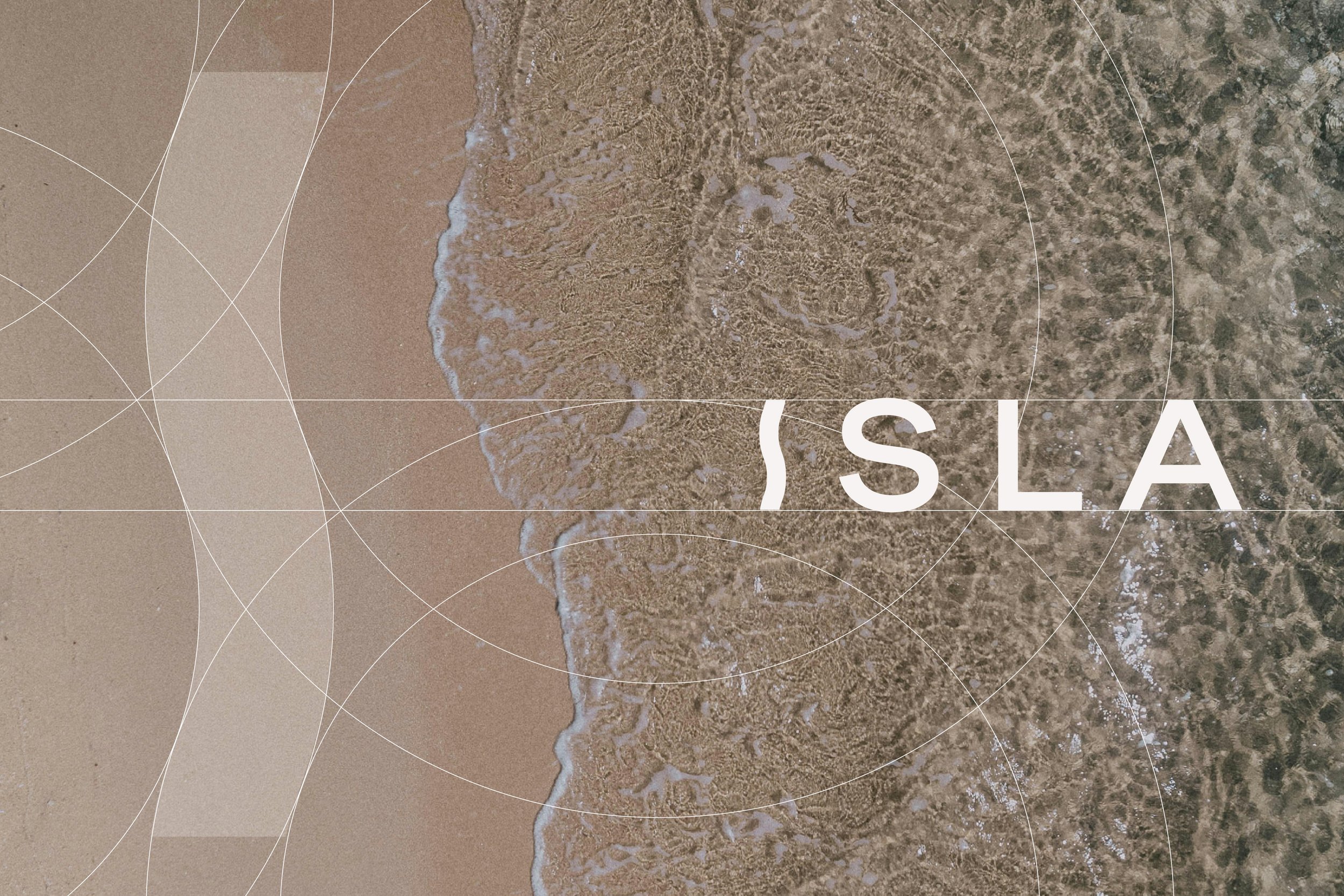
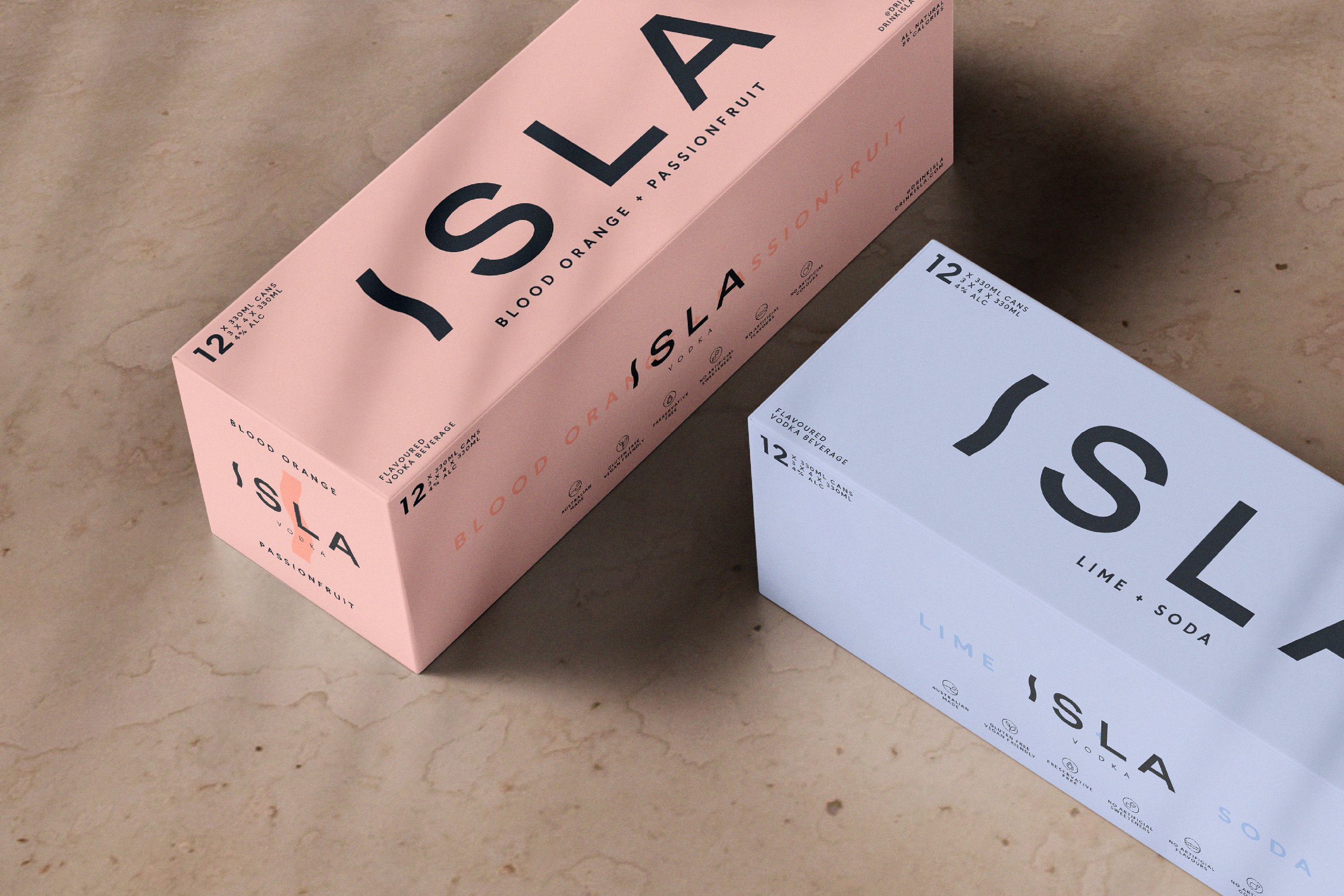
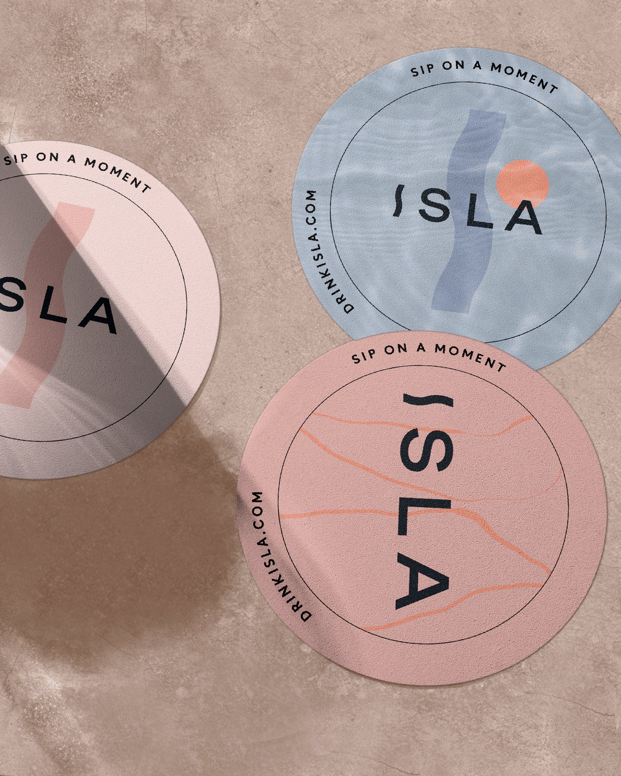
08_ISLA
Brand Creation > Brand Identity > Packaging
A premium vodka and RTD range positioned for life’s finer moments
-
ISLA is a fresh addition to Australia’s competitive spirits and ready-to-drink market. Its distinctive identity was designed to stand out in a category dominated by novel newcomers and established premium players. Leaning into a modern, lifestyle aesthetic, featuring soft, muted colours and an elegant ‘I’ lettermark, the brand appeals to a predominantly female audience—the perfect complement to warm sunsets and sophisticated gatherings.
-
‘Made for life’s finer moments,’ ISLA evokes a sense of escapism and style, with a brand inspired by the laid-back island vibes we so easily imagine—sun, sea, and moments to savour. The identity’s muted pastel tones, sleek typography, and pared-back aesthetic not only reflect its all-natural ingredients and clean, refreshing flavours, but help ISLA stand out on crowded shelves. From bottles to cans and packaging, ISLA is an elegant and aspirational addition to the vodka and ready-to-drink category.
-
“The unique skillset and talent of the US+US team [my former brand agency] combined with their professionalism make for one of the best creative partner companies in the industry.”Ben Tucker — Director, ISLA Vodka

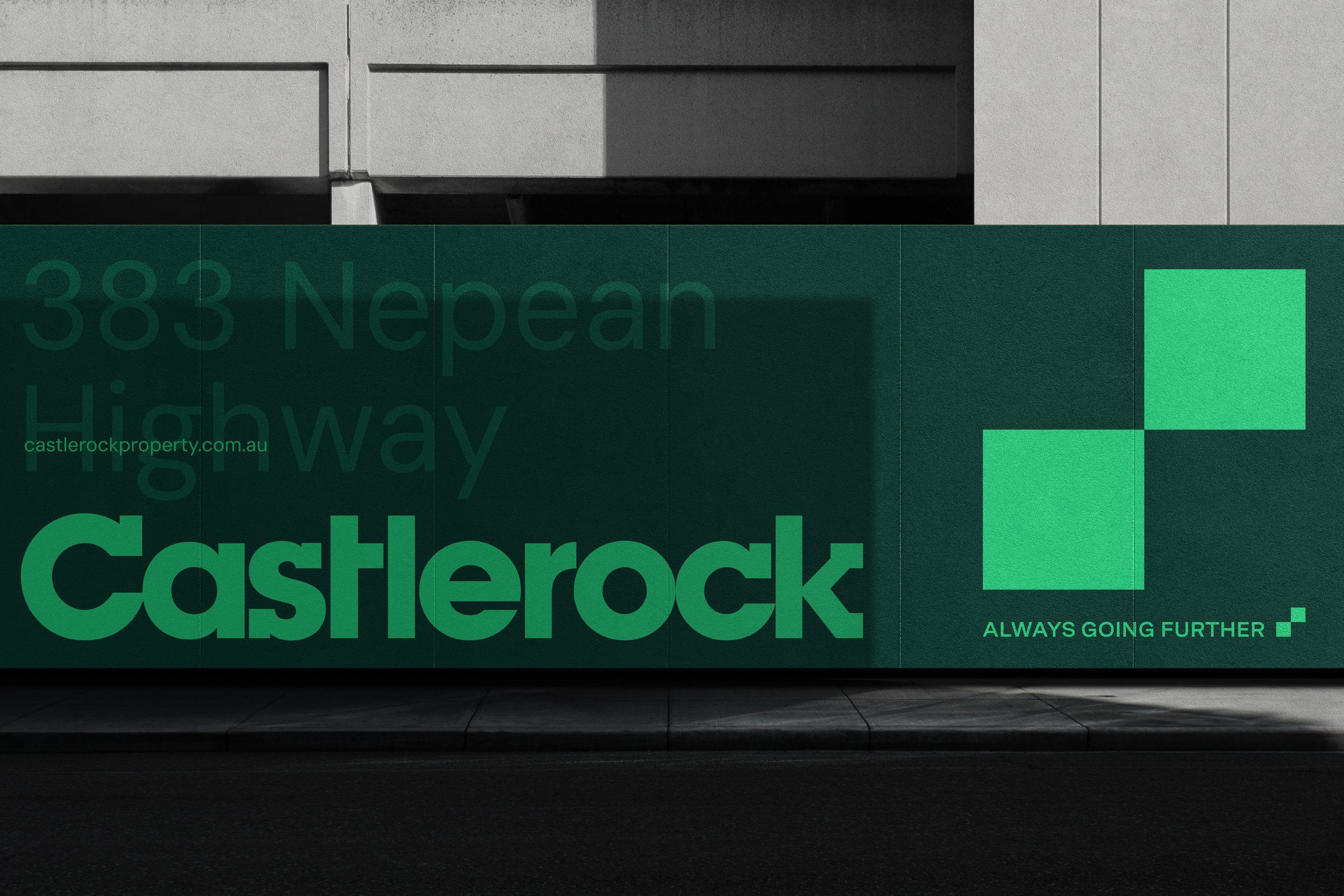
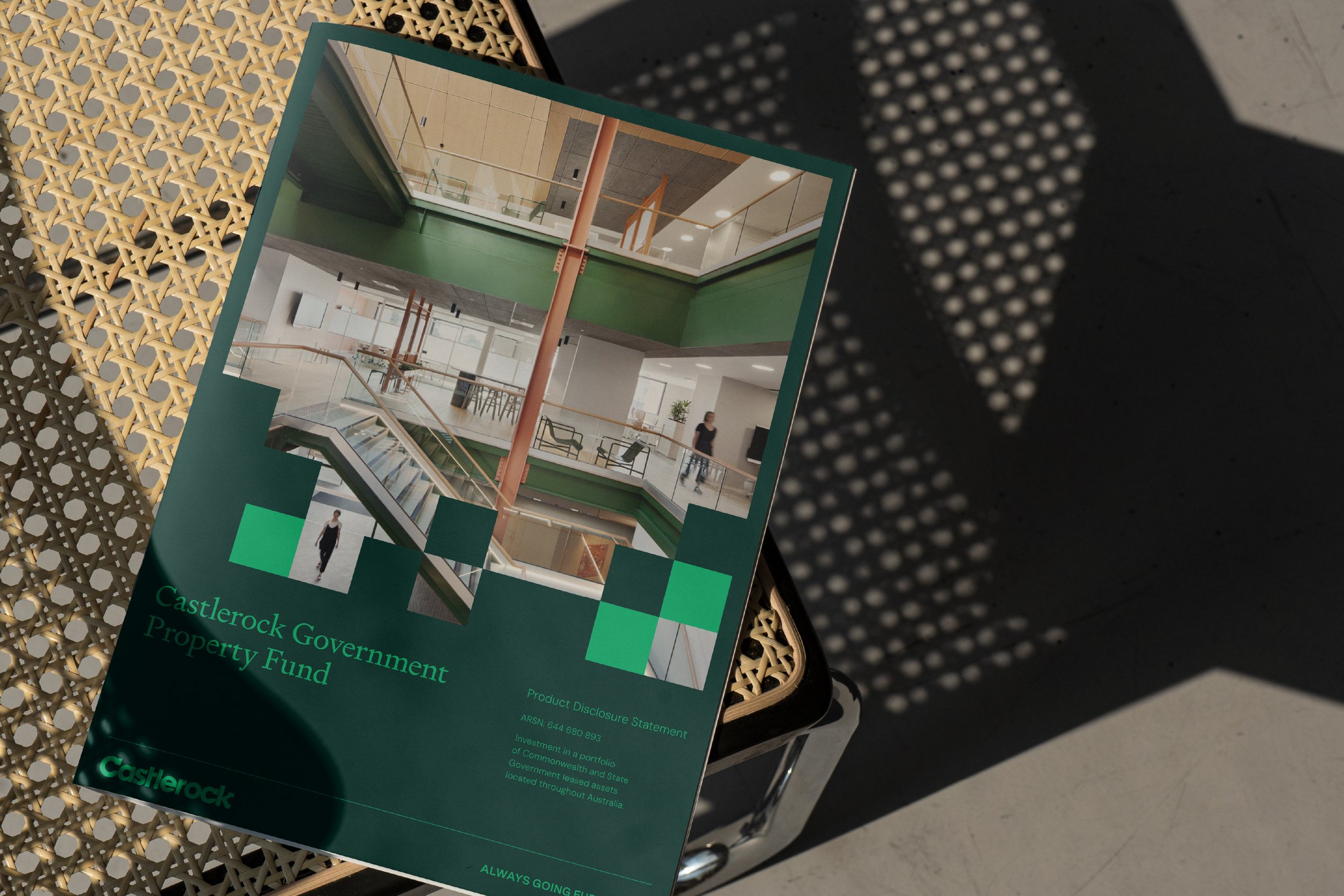
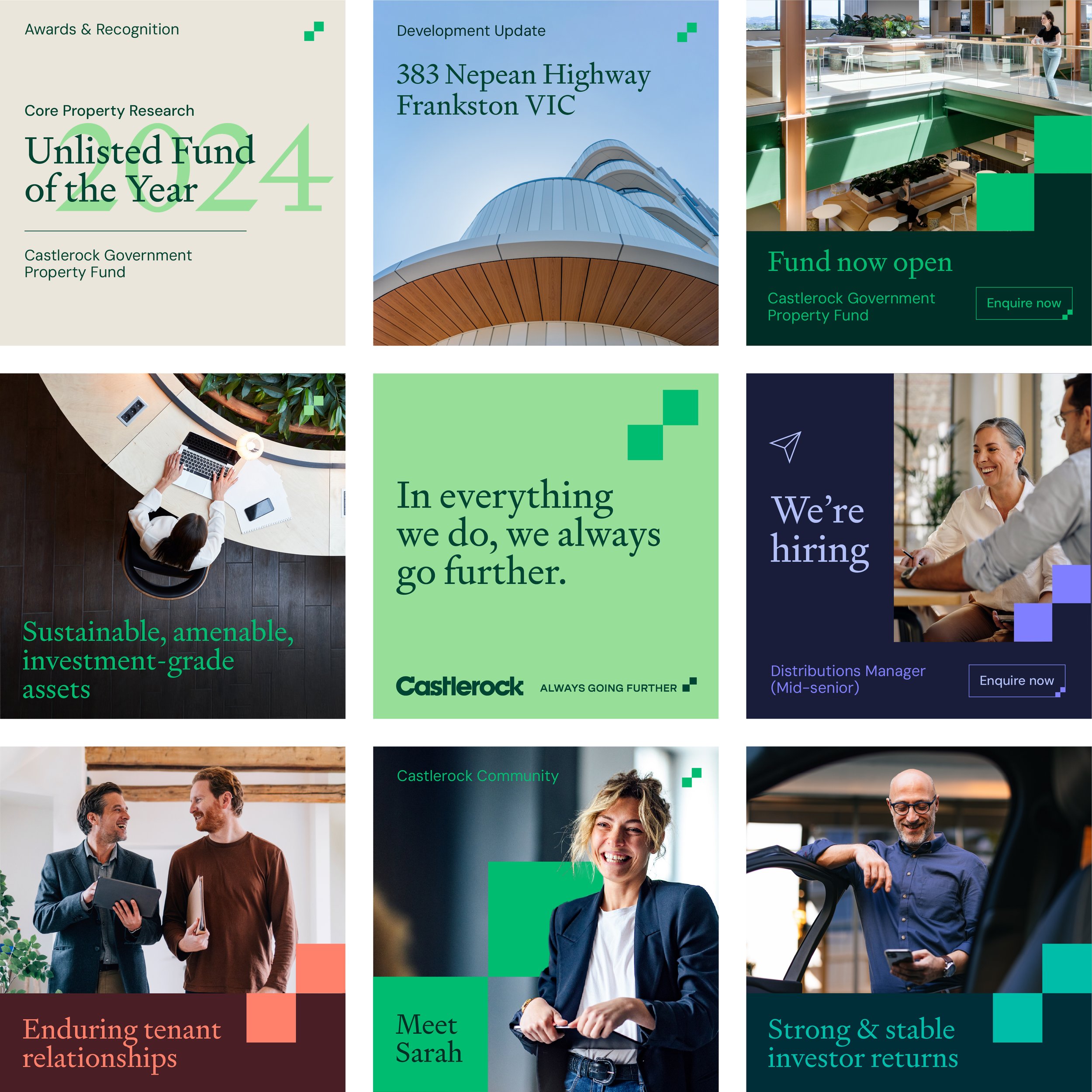
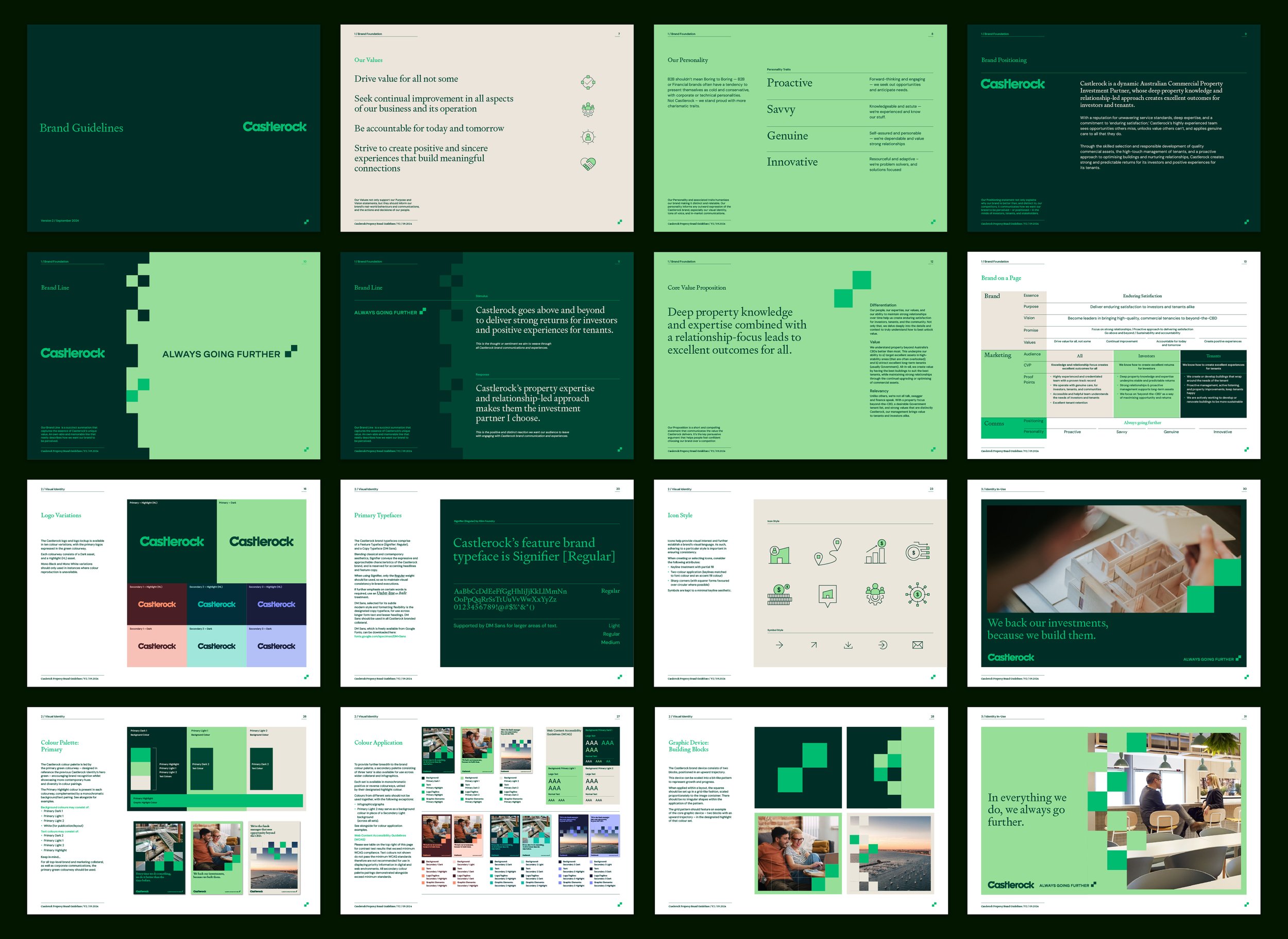
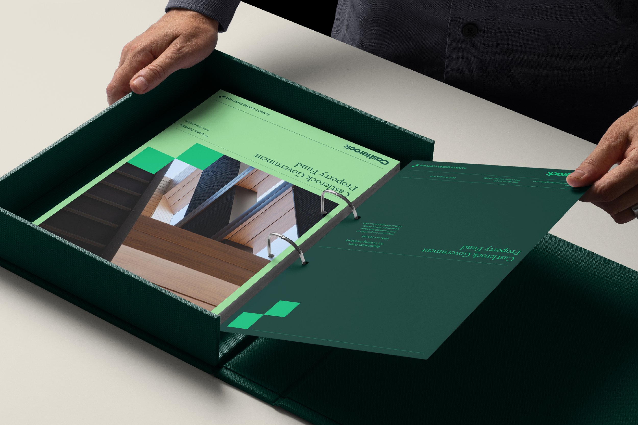
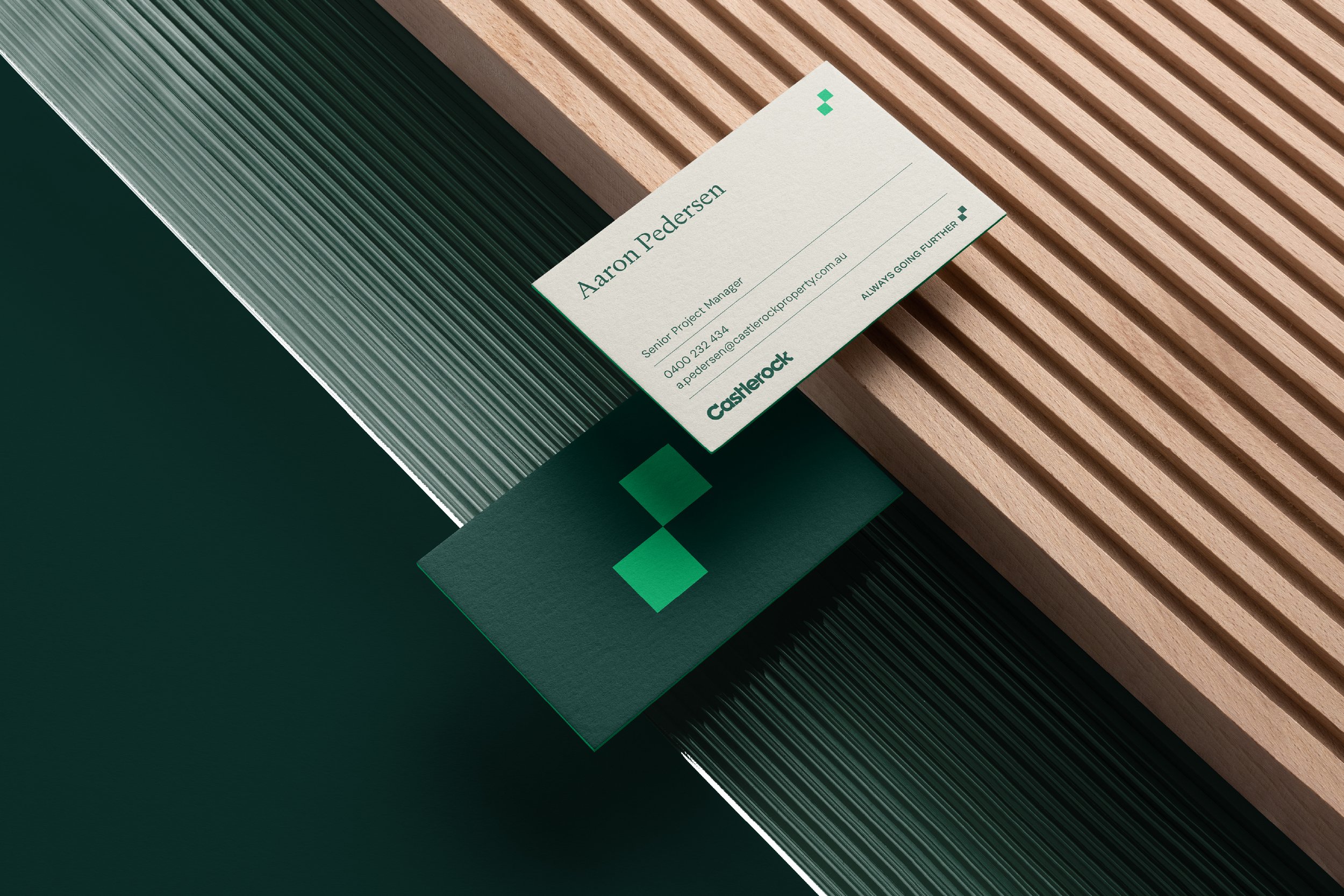
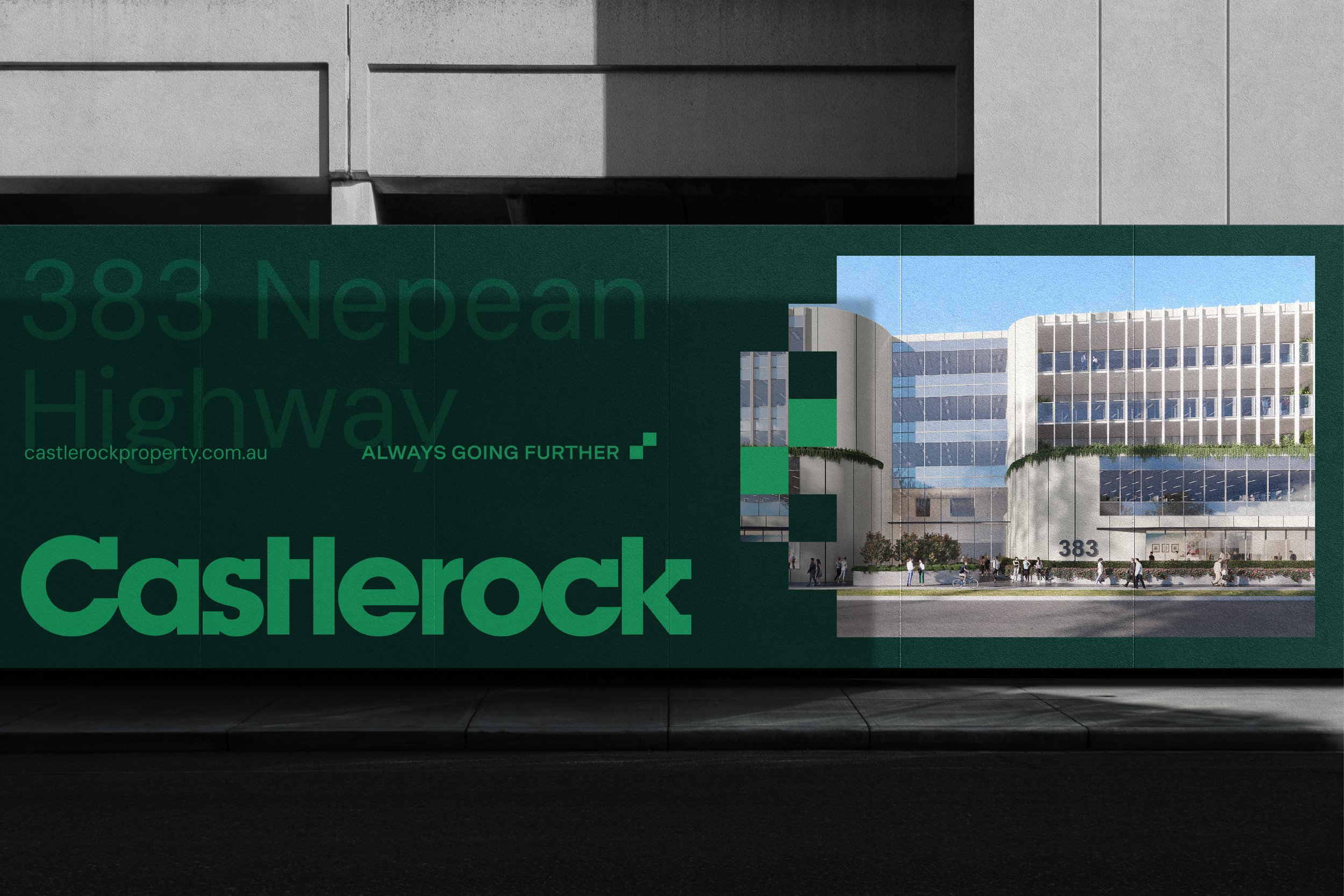
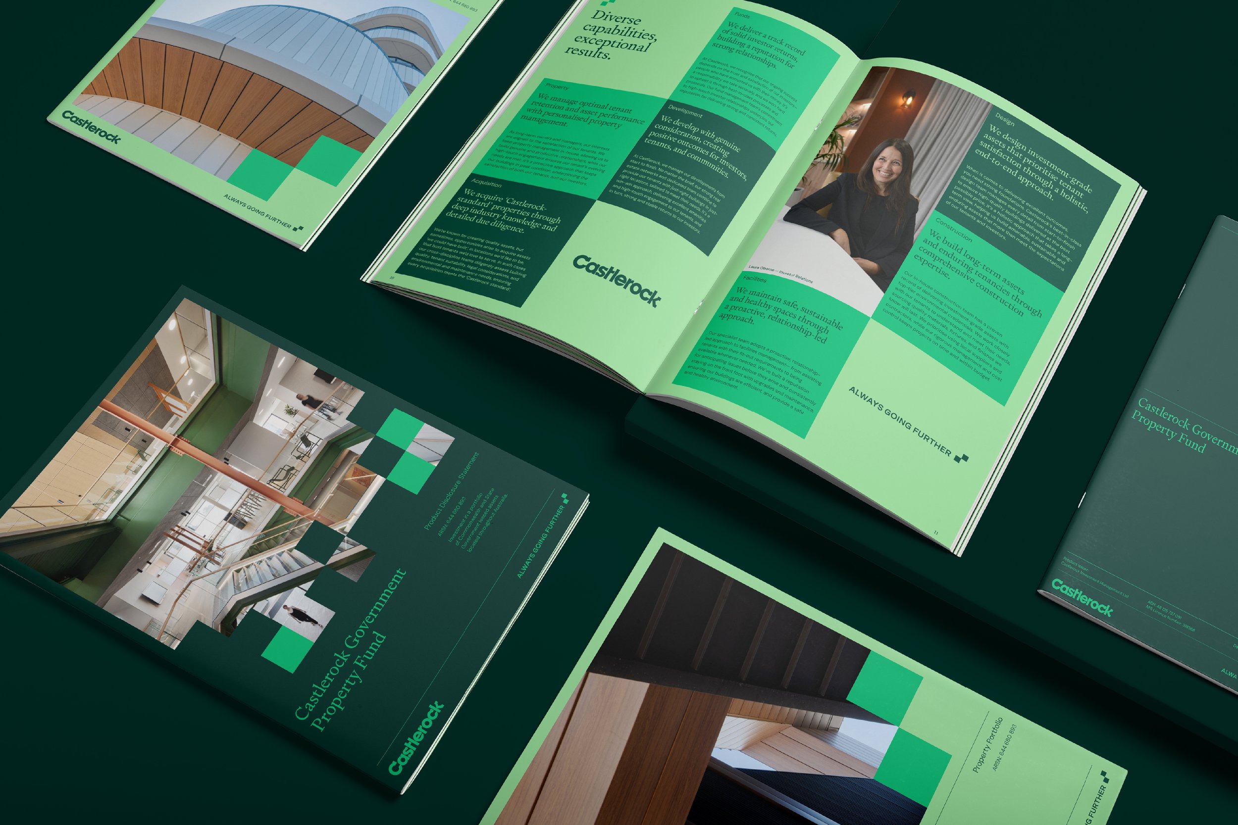
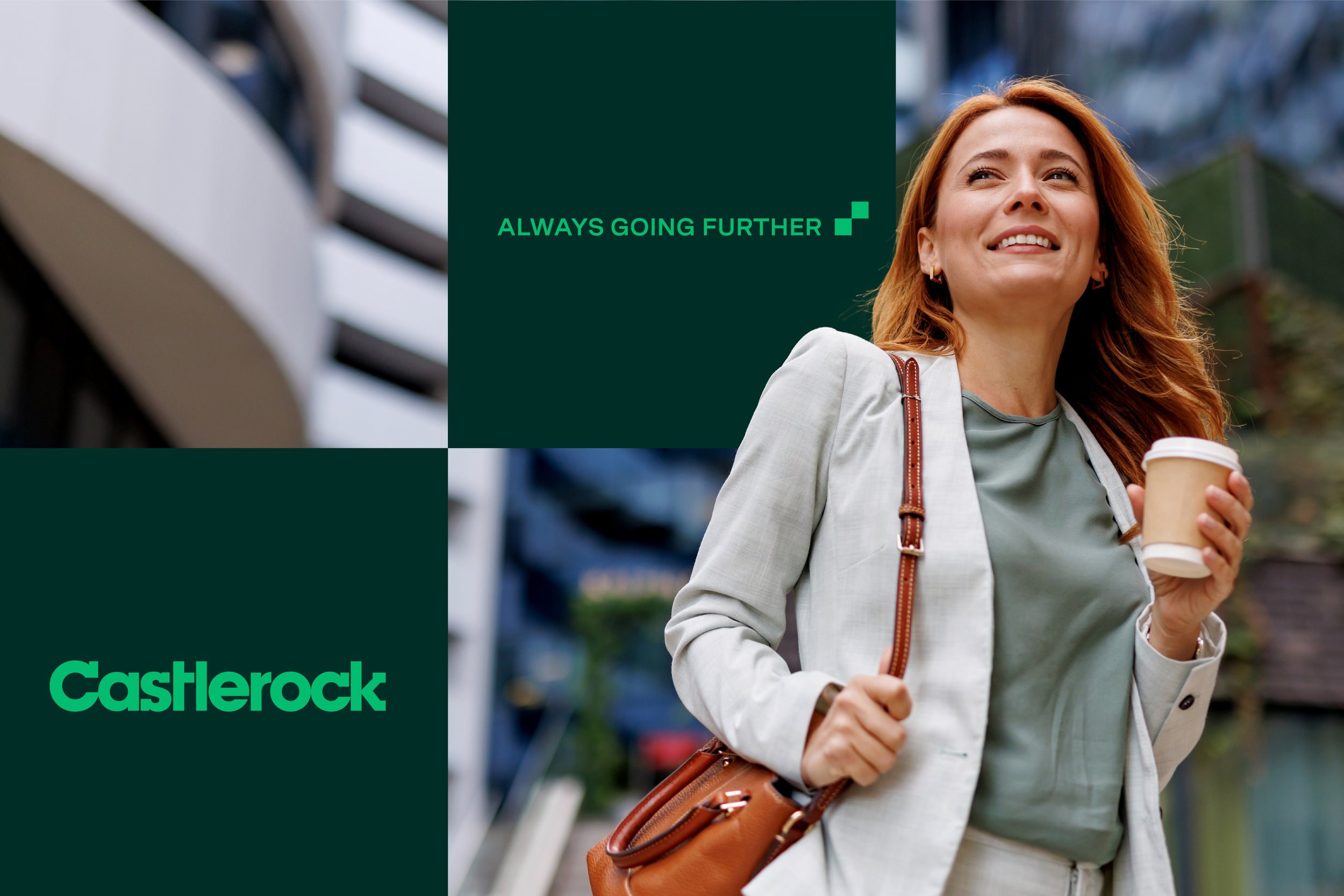
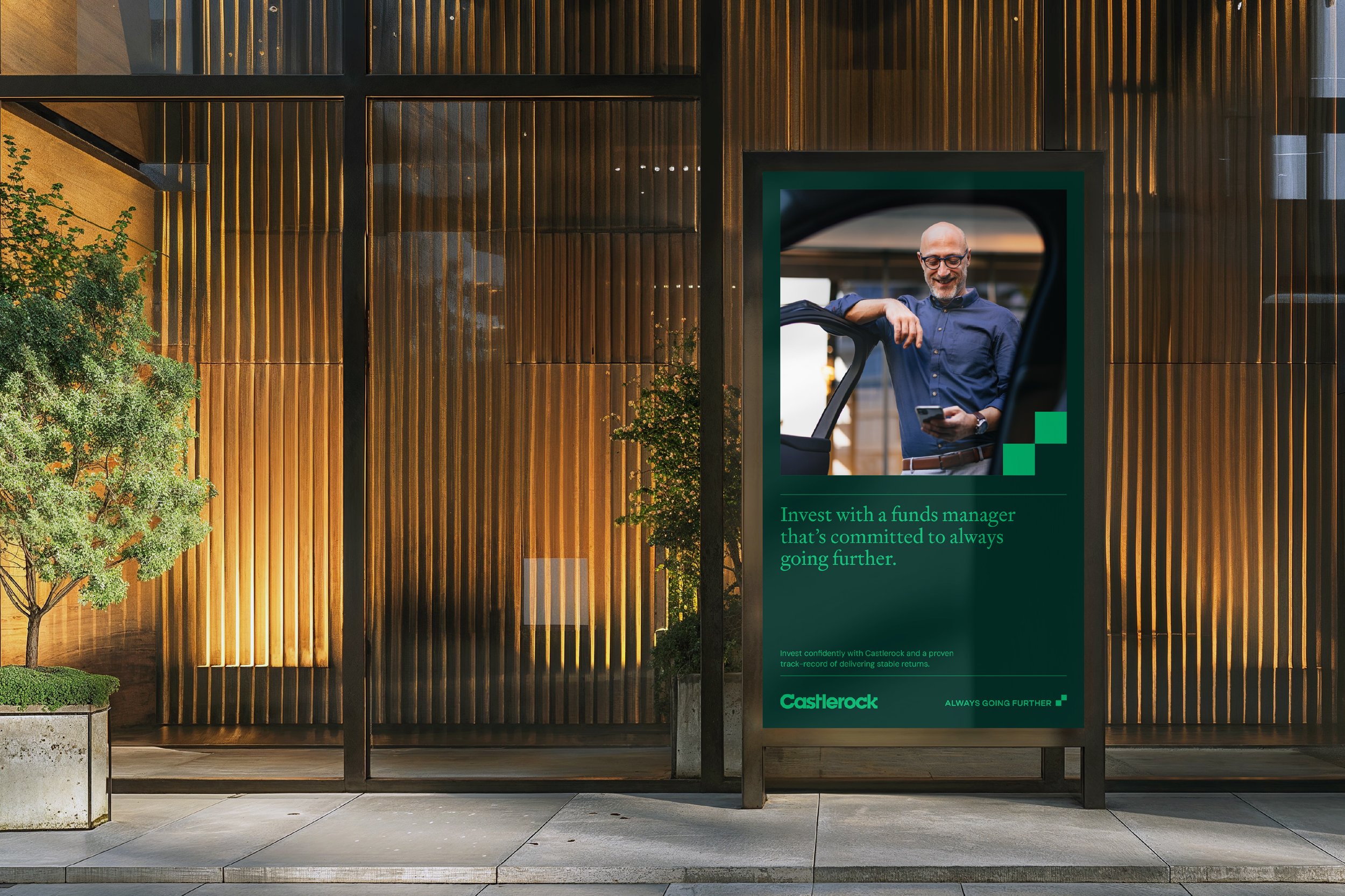
09_Castlerock
Brand Evolution > Workshop > Brand Framework > CVP > Information Architecture
A modern brand for a property funds manager always going further
-
Castlerock is a property fund manager with a reputation for delivering strong returns for investors and creating positive outcomes for tenants and communities. Focused on bringing high-quality commercial tenancies to beyond-the-CBD, Castlerock’s brand positioning and identity were created to support its ambitions. The refreshed brand informs all aspects of its market presence, from investor and tenant collateral, to its CVP, to a contemporary website.
-
The ‘always going further’ brand positioning encapsulates Castlerock’s commitment to developing properties in non-CBD Australia, and its values-led approach to business. Similarly, the building block identity reflects Castlerock’s expertise in building properties, investment portfolios, and relationships. In a category that can be conservative and staid, the refreshed brand is dynamic and approachable. The revitalised green palette and building-block device symbolise growth and progress, building on 40-years of trusted relationships and property knowledge, within a modern and flexible identity system.
-
“The team invested significant time and energy to truly understand who we are and the value we deliver to our investors and tenants. The new brand platform and visual identity are genuine reflections of who we are – our ambitions and our values.”
Adam Bronts — Director
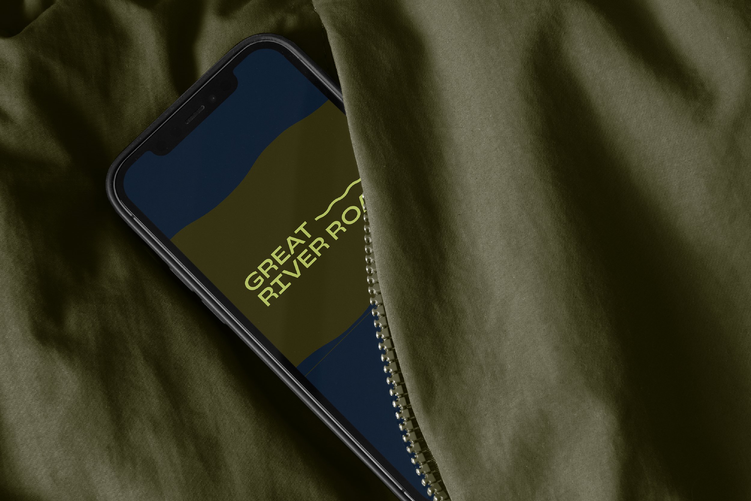
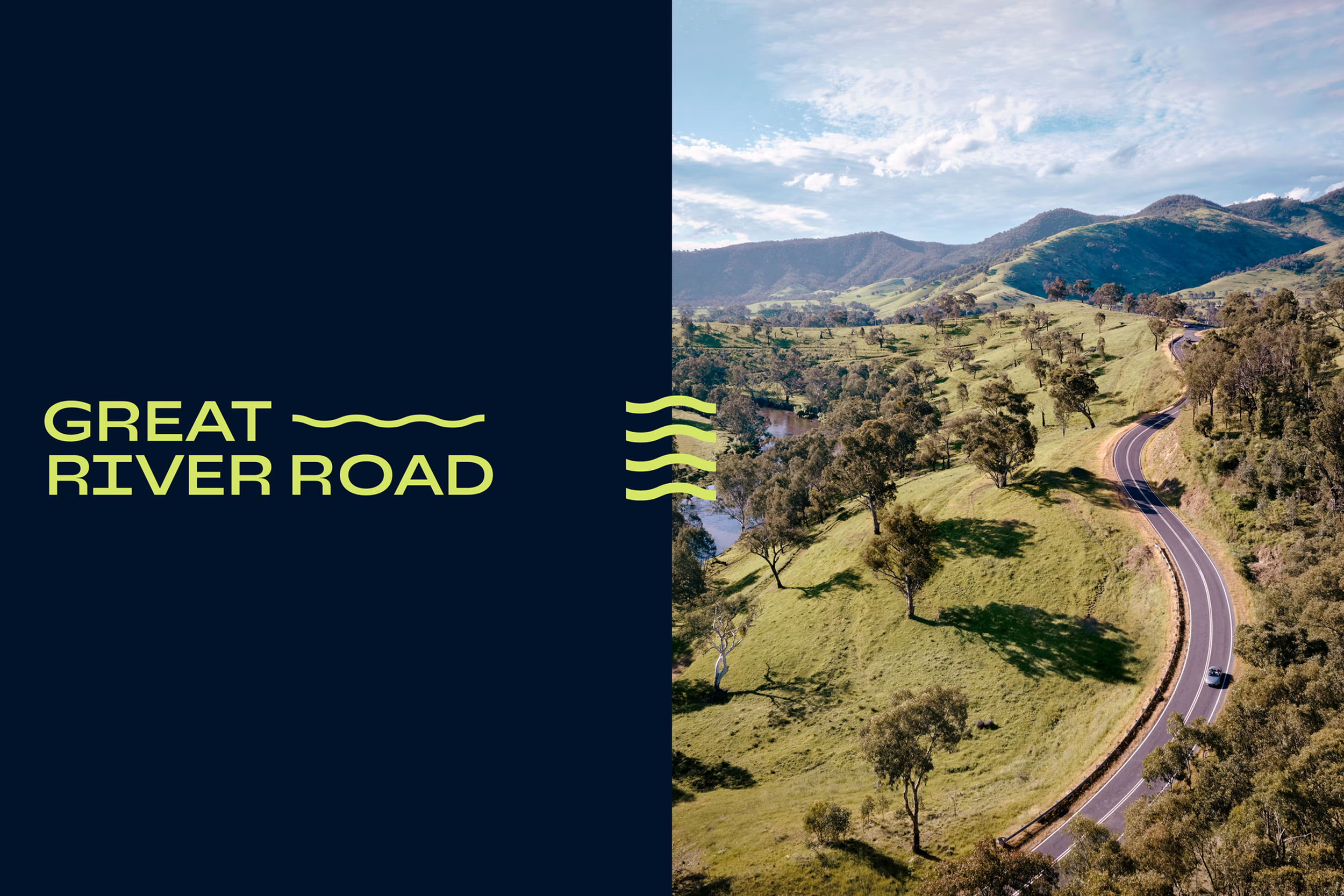
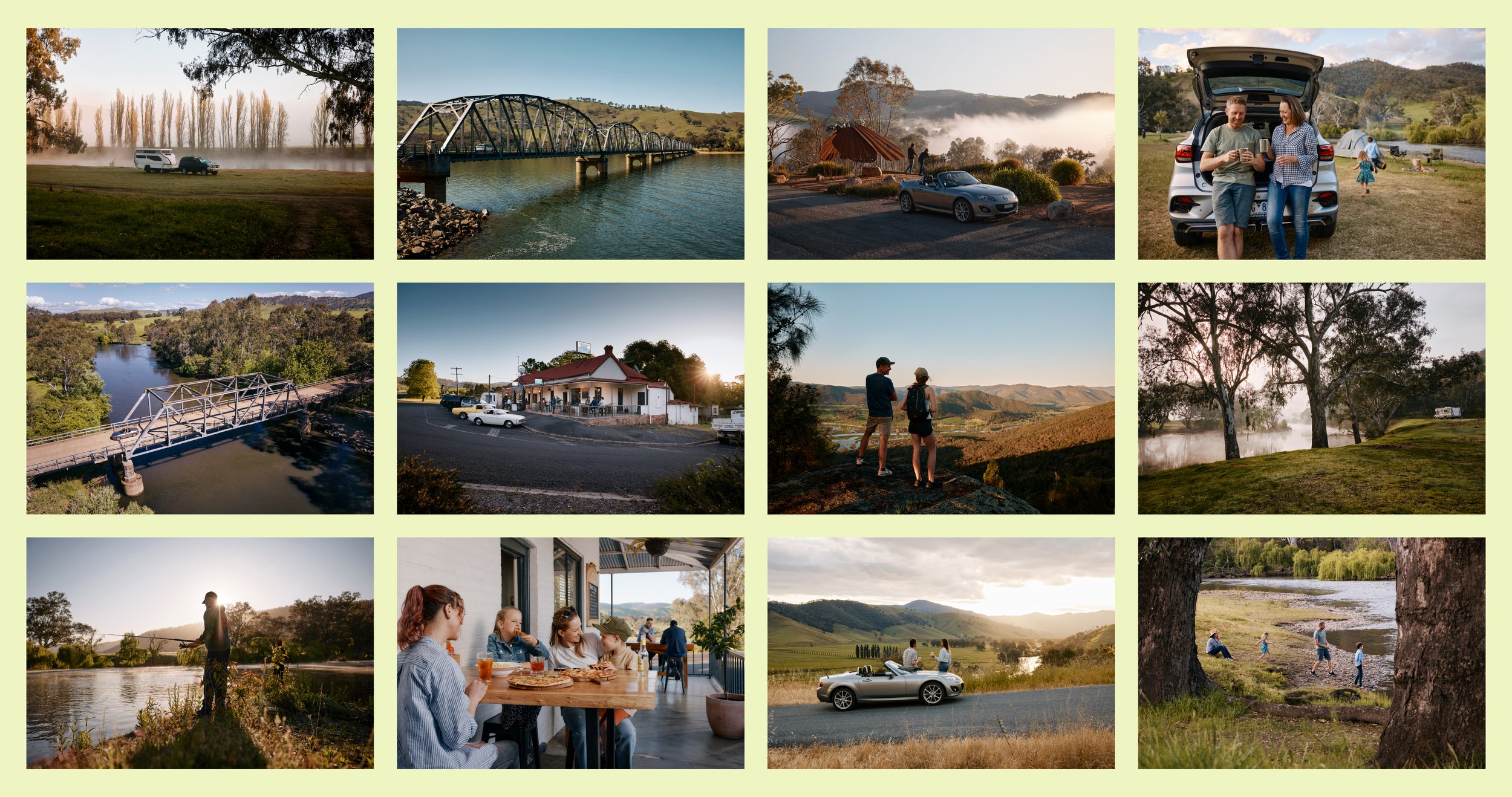
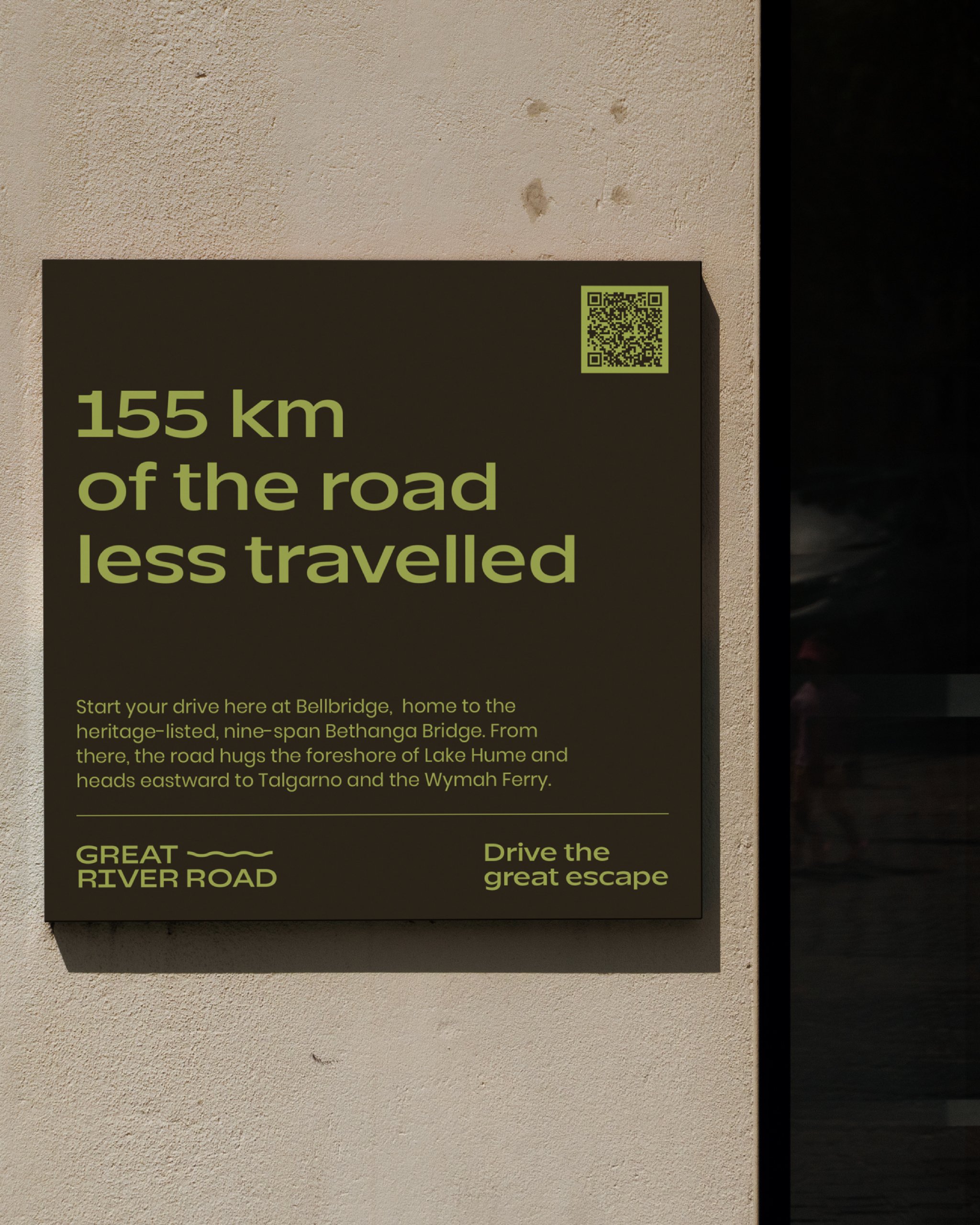
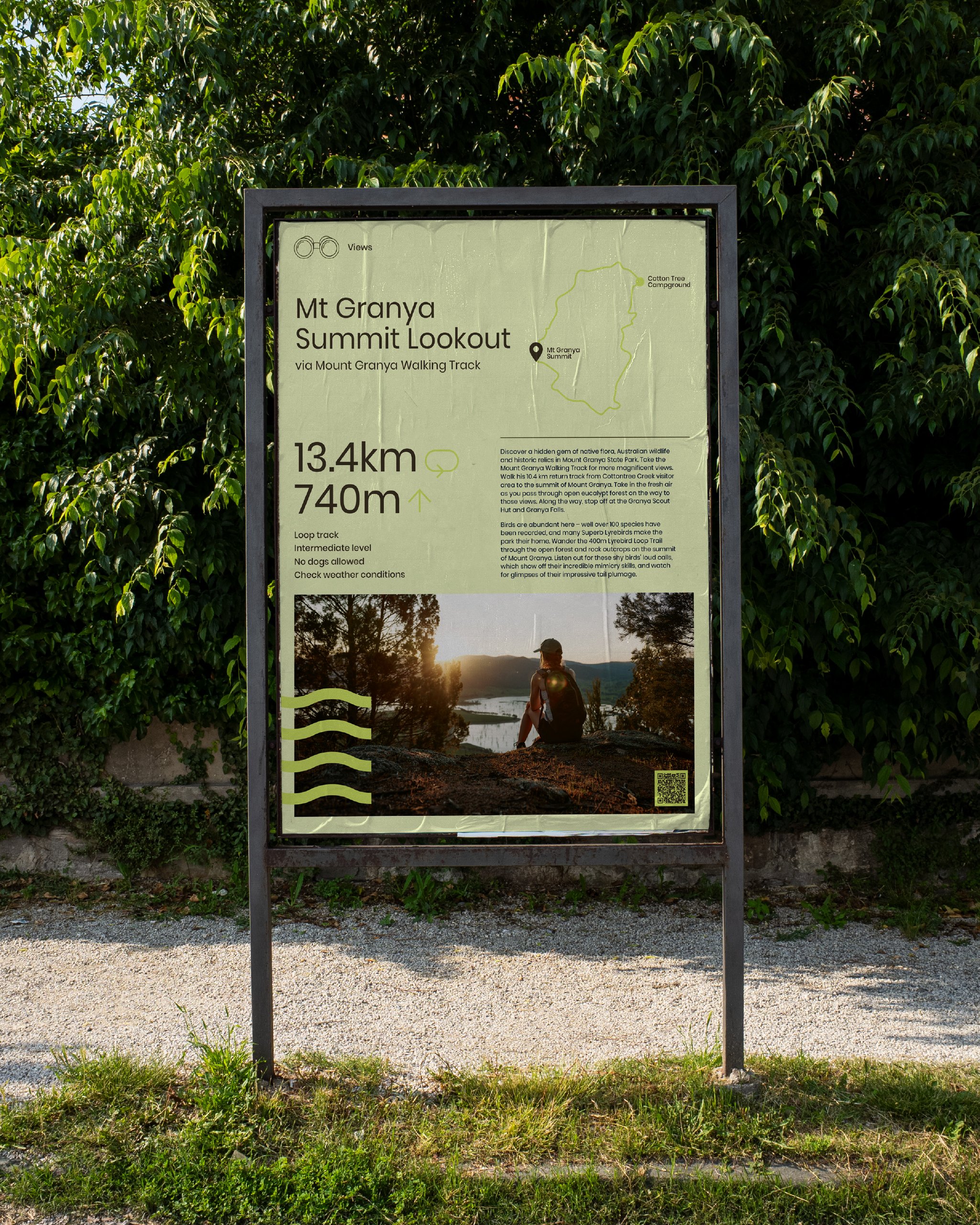
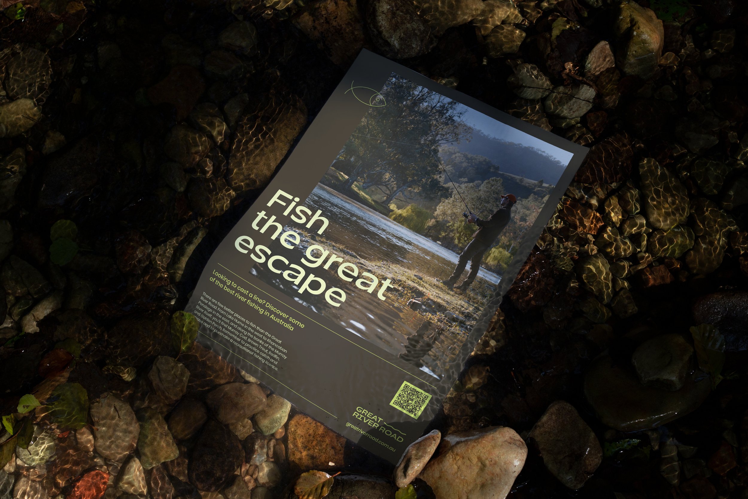
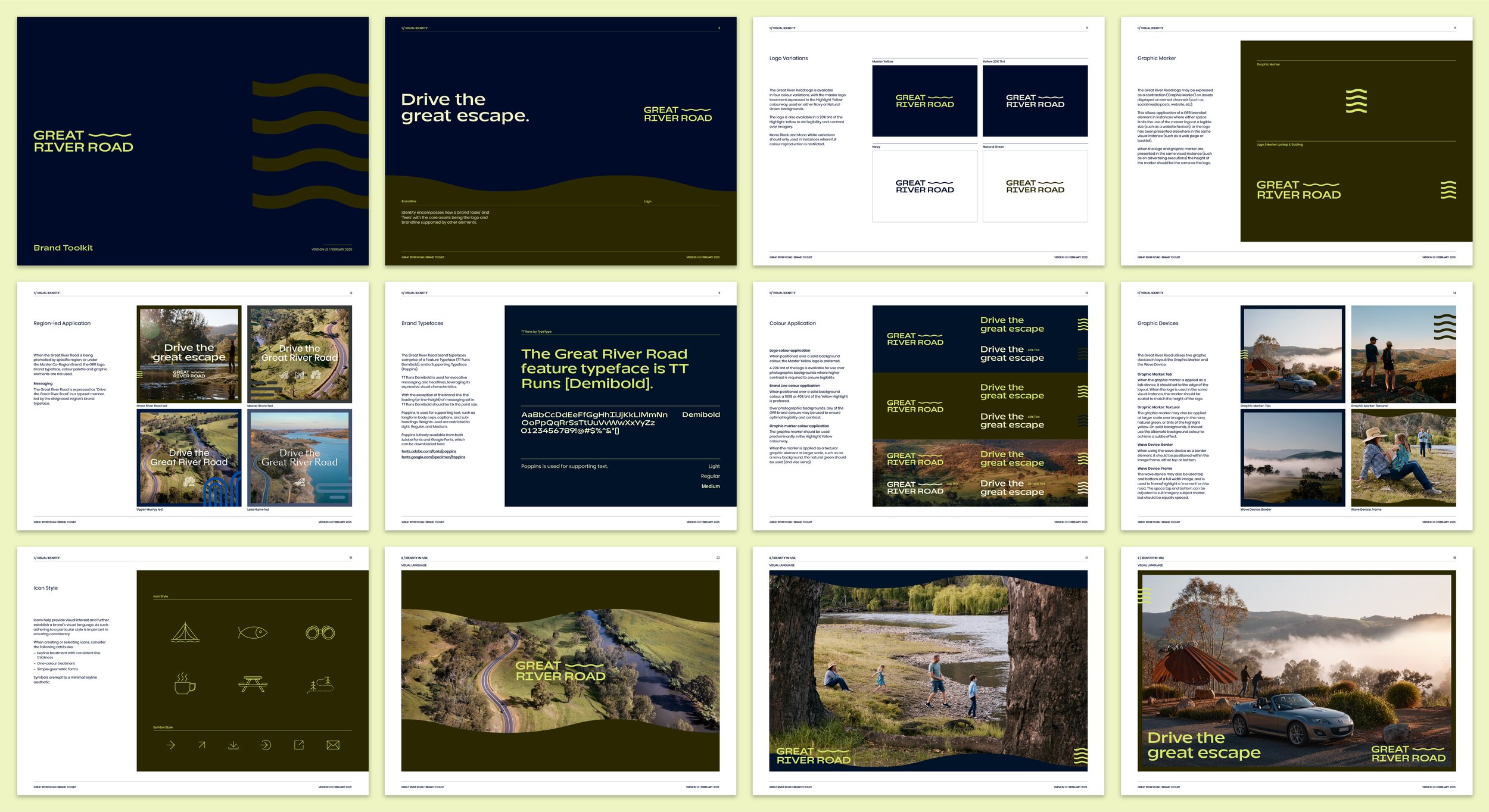
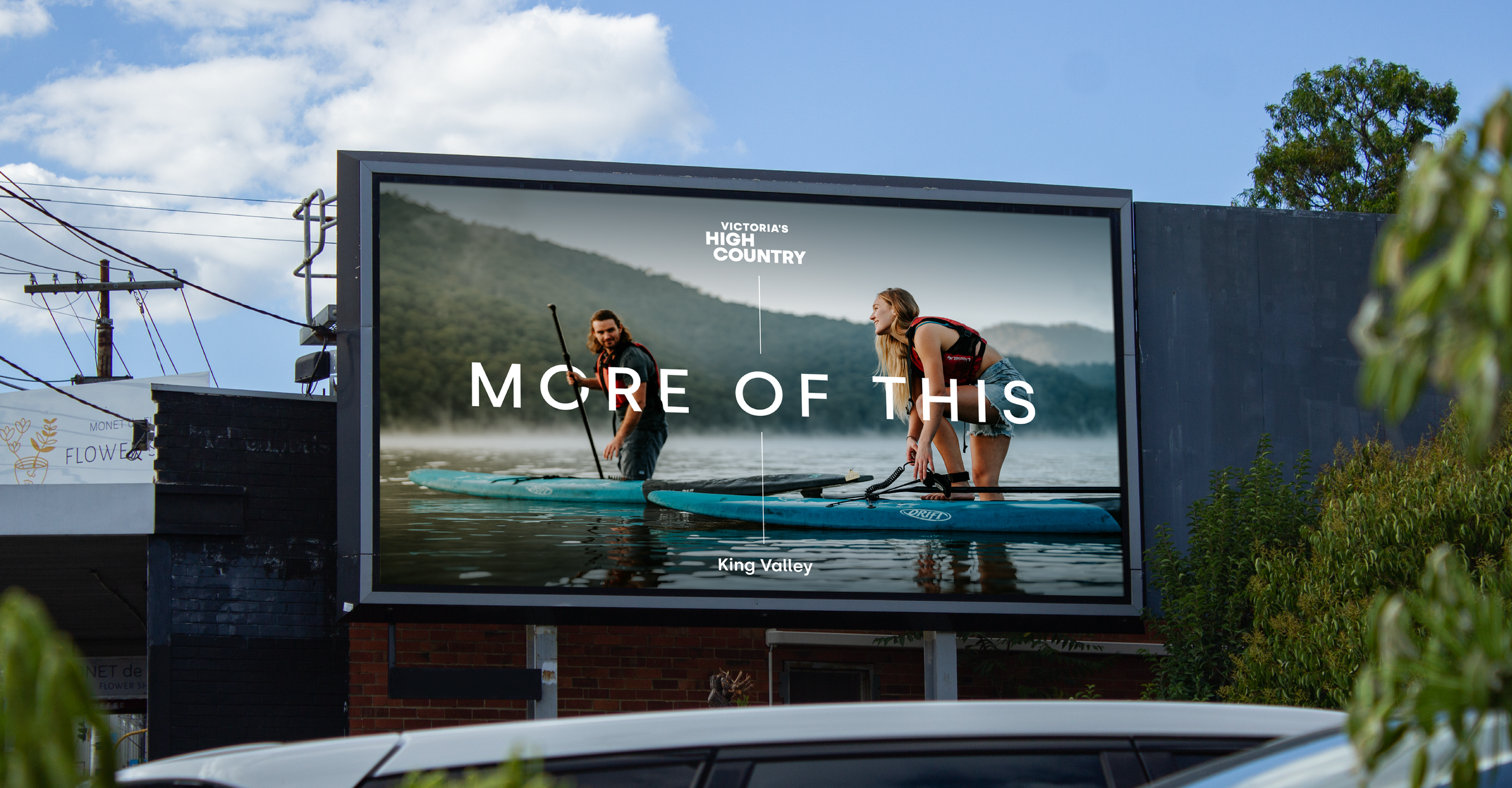
10_Great River Road
Brand Creation > Marketing Strategy > Brand Platform > CVP > Identity
Establishing a driving drawcard in Victoria’s border country
-
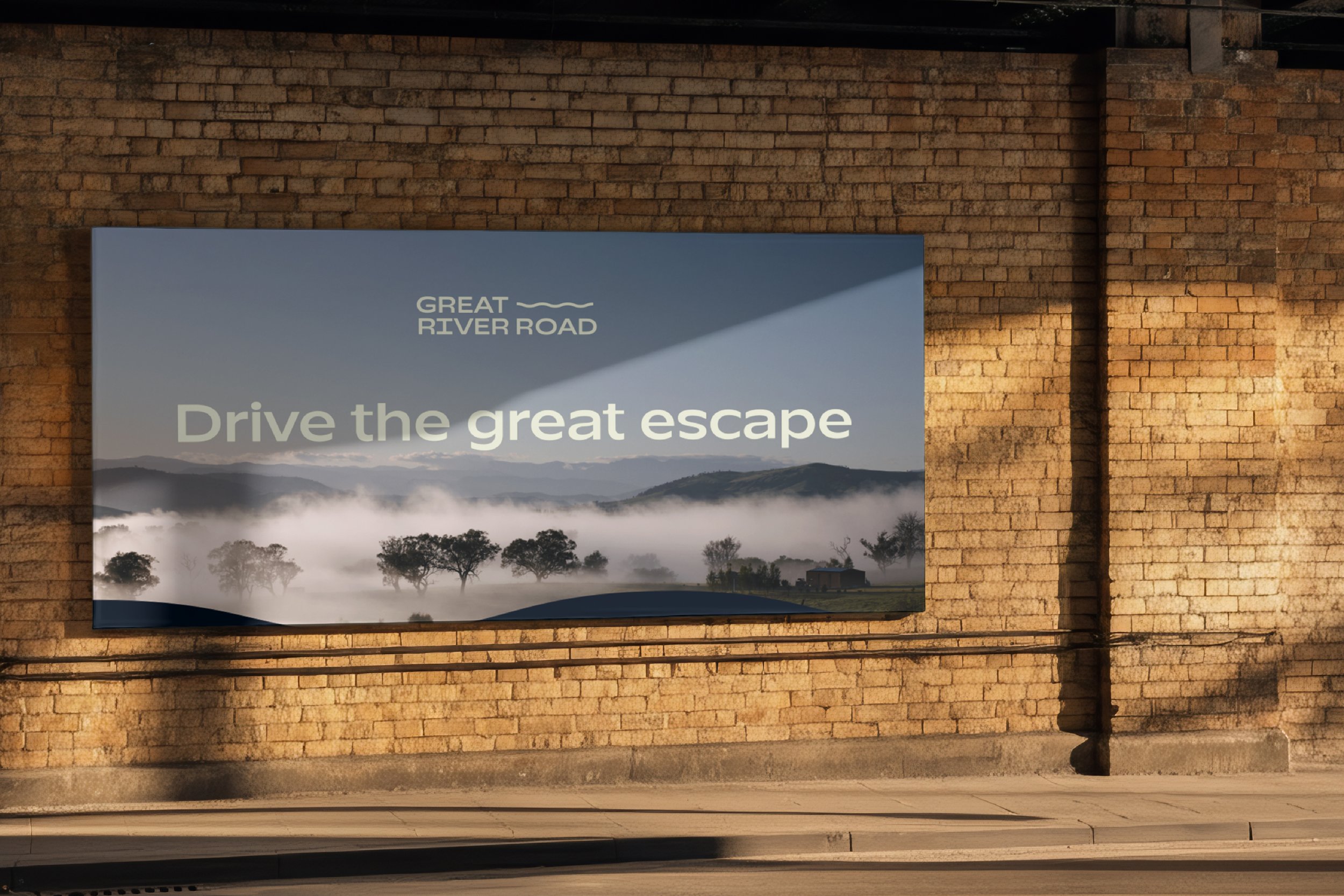
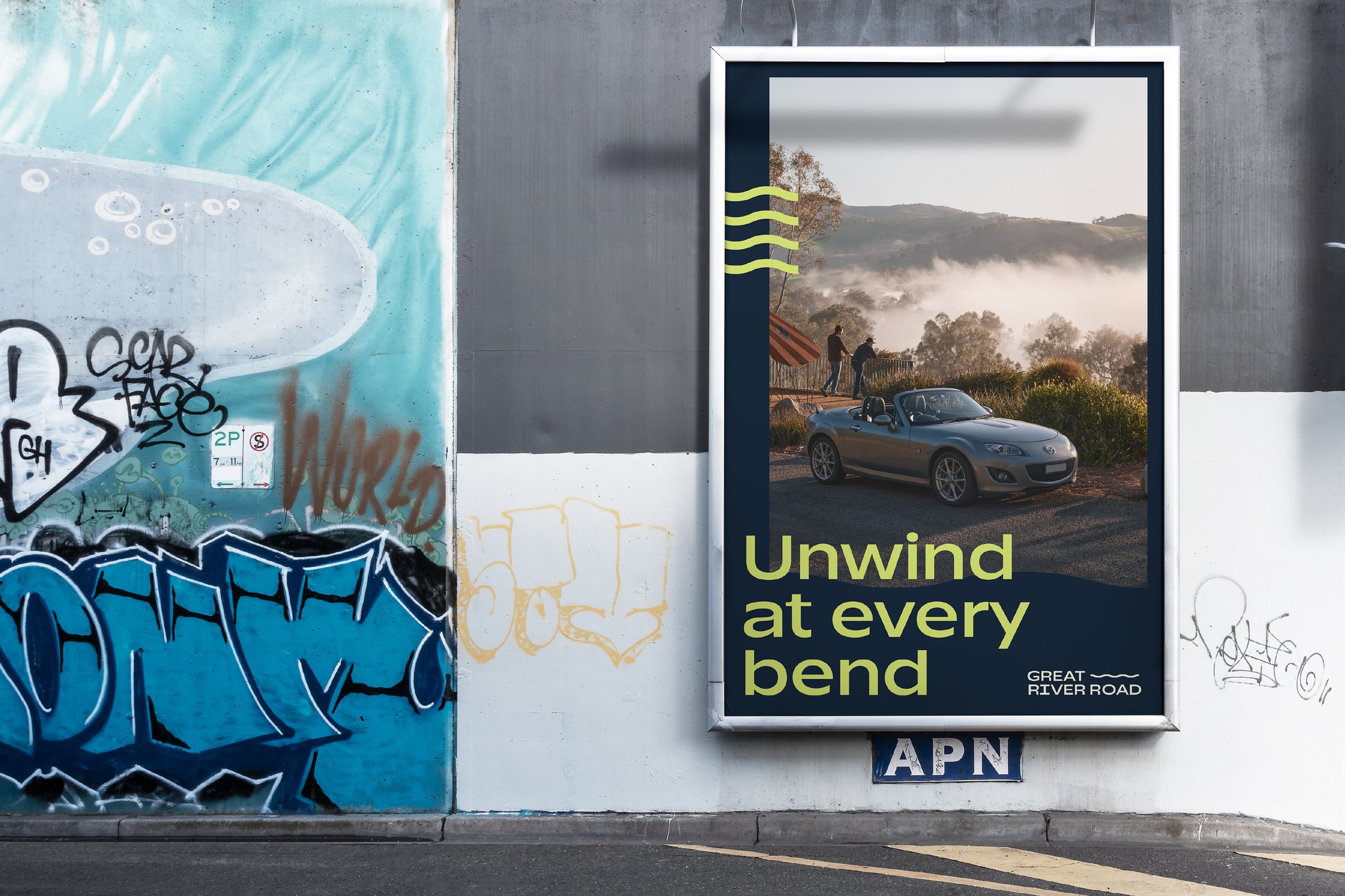
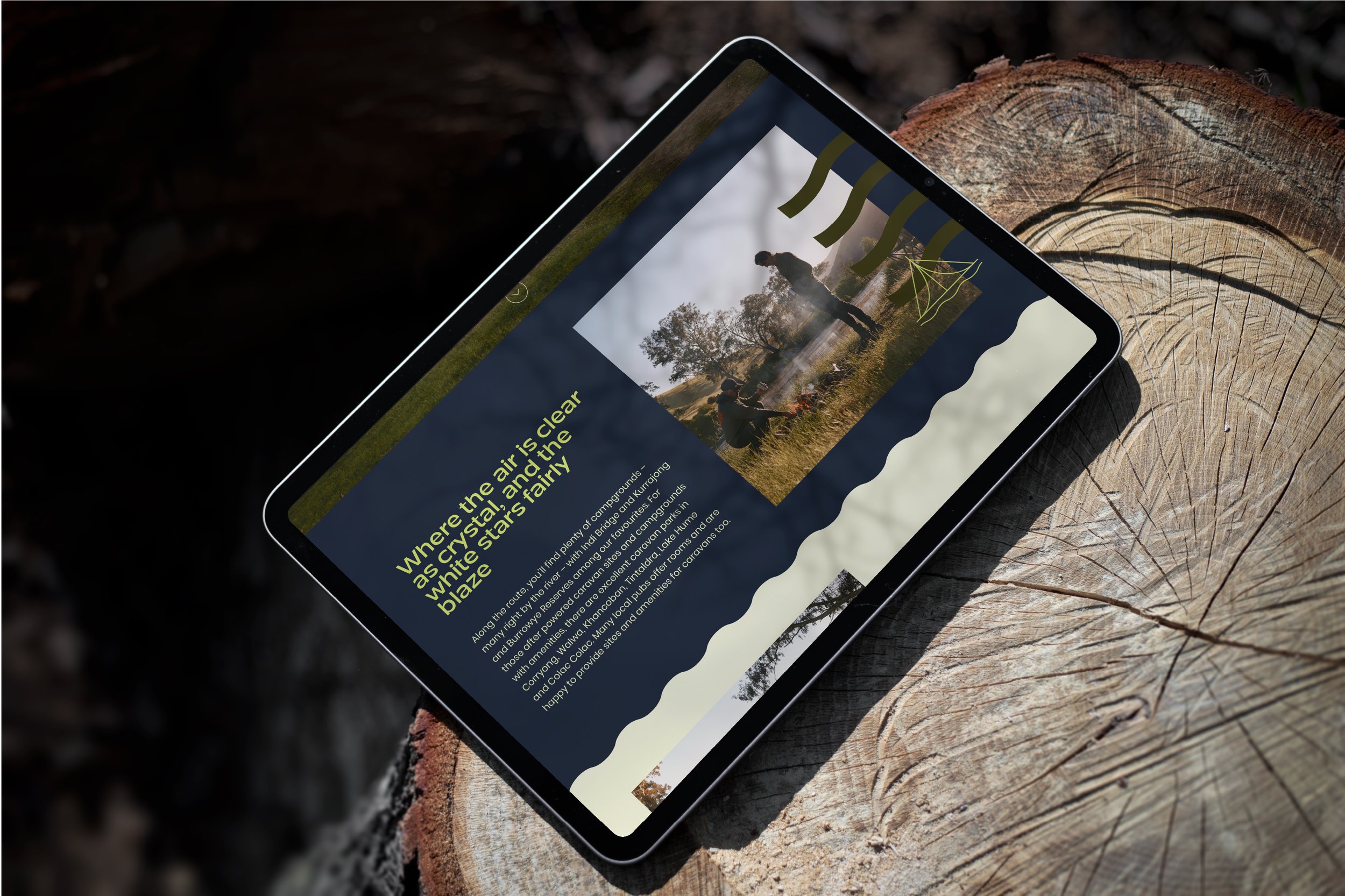
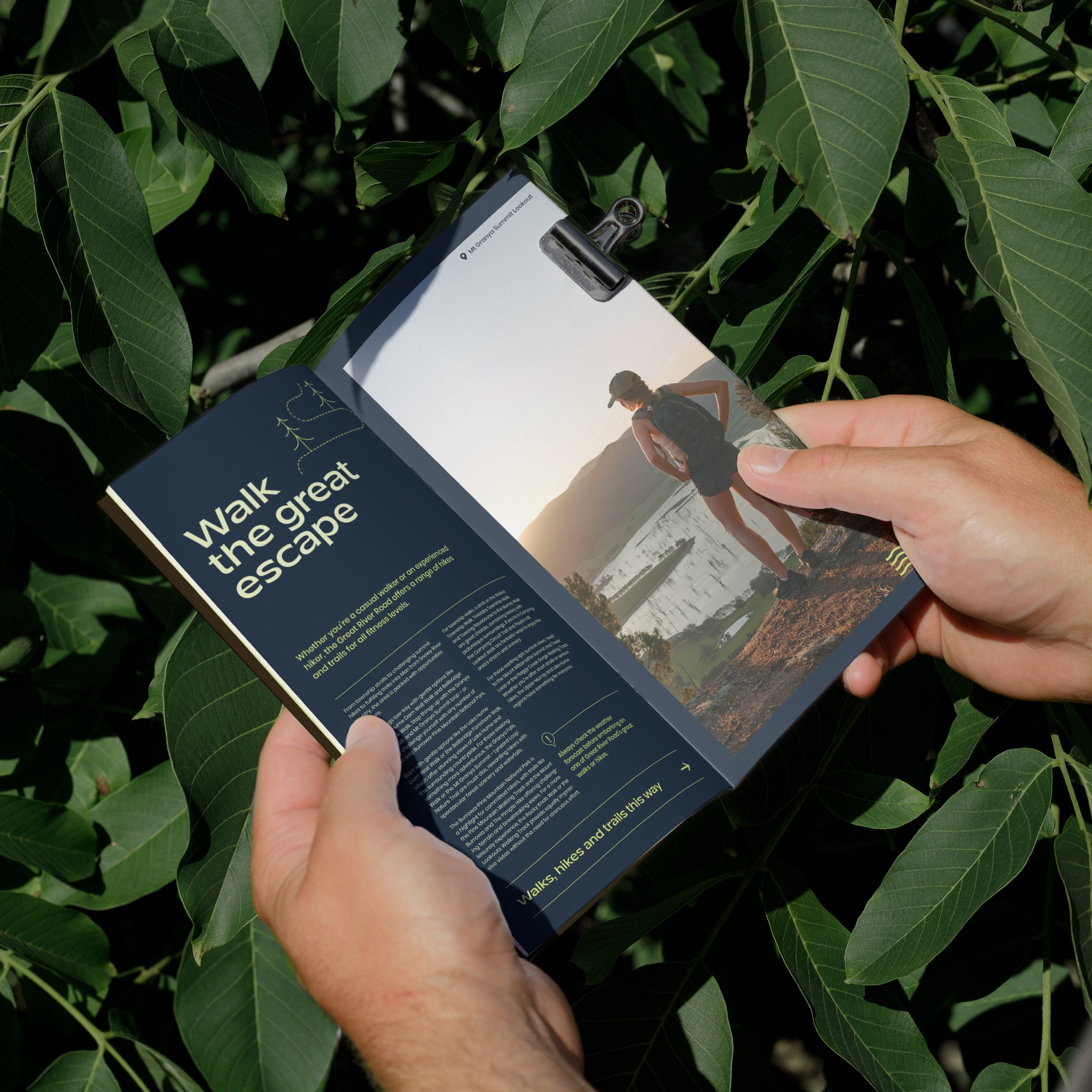
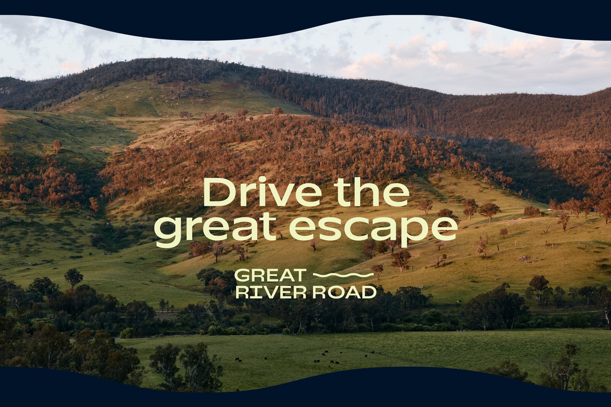
The Great River Road traces the route of the upper Murray River through north-east Victoria to its source in the Snowy Mountains. Beyond the physical route, there was no branding, no content, no website. A compelling destination brand identity and proposition were created to establish the road as ‘The Great Escape.’ Whether you love the open road or the great outdoors, the brand celebrates that at every turn, the Great River Road uplifts and inspires.
-
The border communities of the Upper Murray and Lake Hume have ambitions for the Great River Road to become their ‘Ocean Road’. Every bend reveals a different view and every kilometre brings a sense of calm; there’s no traffic here and no crowds, truths that underpin GRR’s core proposition – ‘Drive The Great Escape’. The visual identity features a fluid, quadruple-wave motif, which symbolises the road, the river, the drive, and exploration. Its refined palette draws from the landscape—a pop yellow from sunlit pastures, a deep ‘Murray’ green, and a bold blue reflecting pristine waters and mountains.
-
“I’ve been incredibly impressed with the professionalism, positivity, and standard of work produced. On behalf of the Towong communities, I express my heartfelt gratitude for helping put ‘The Undiscovered’ on the map. Things could have been so very different without your expertise.”
Kerissa Heritage — Economic Development & Tourism Officer @ Towong Shire Council

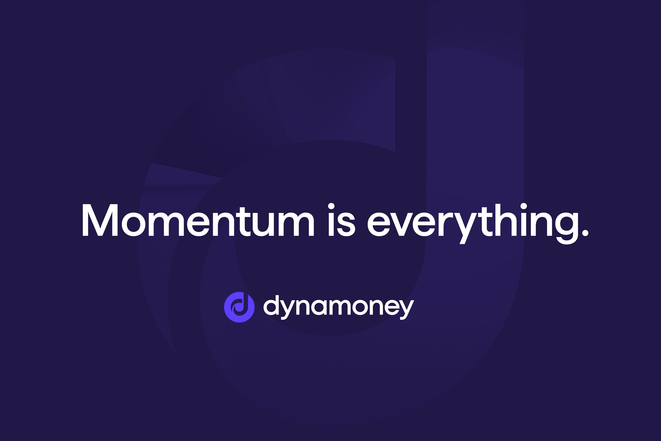
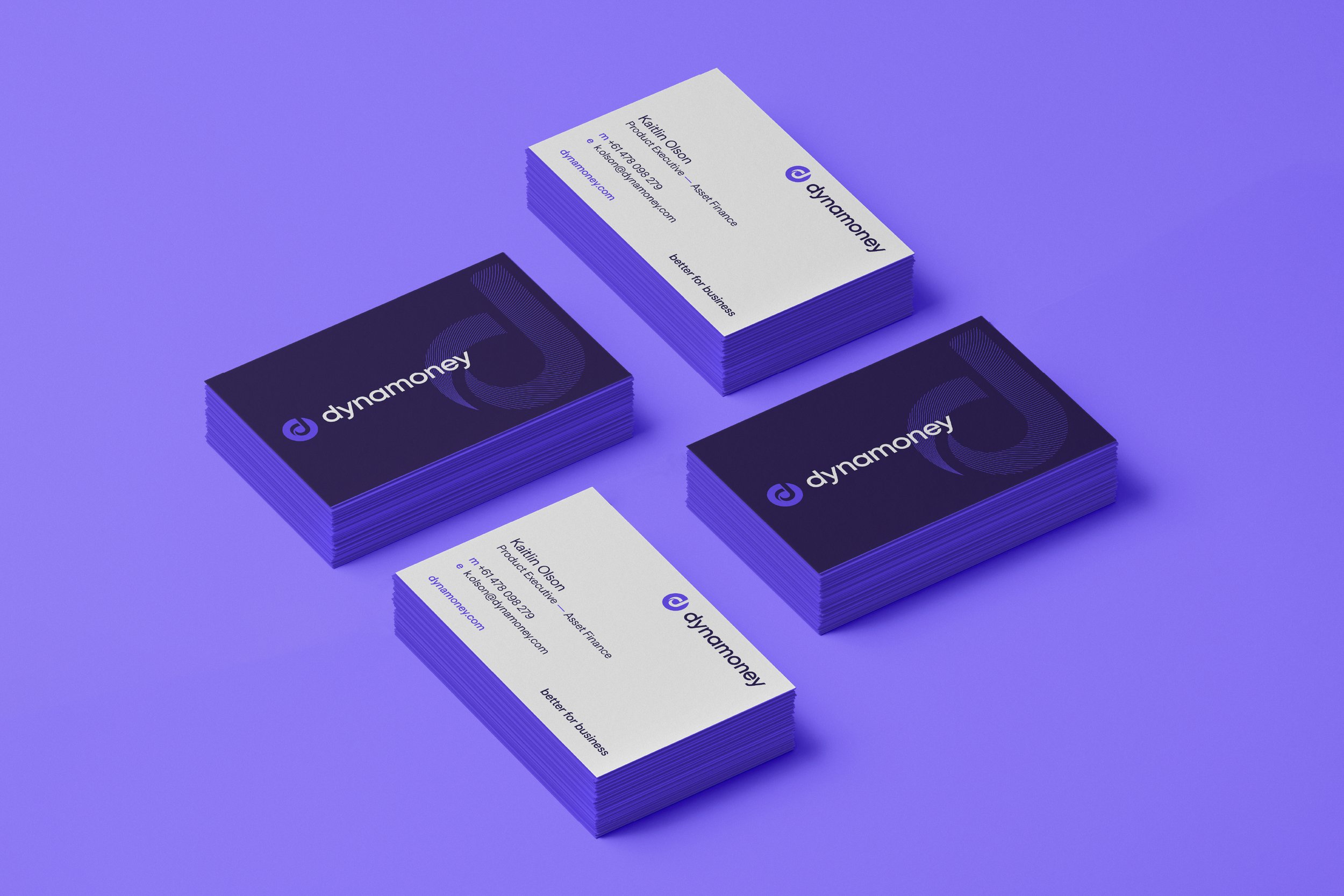
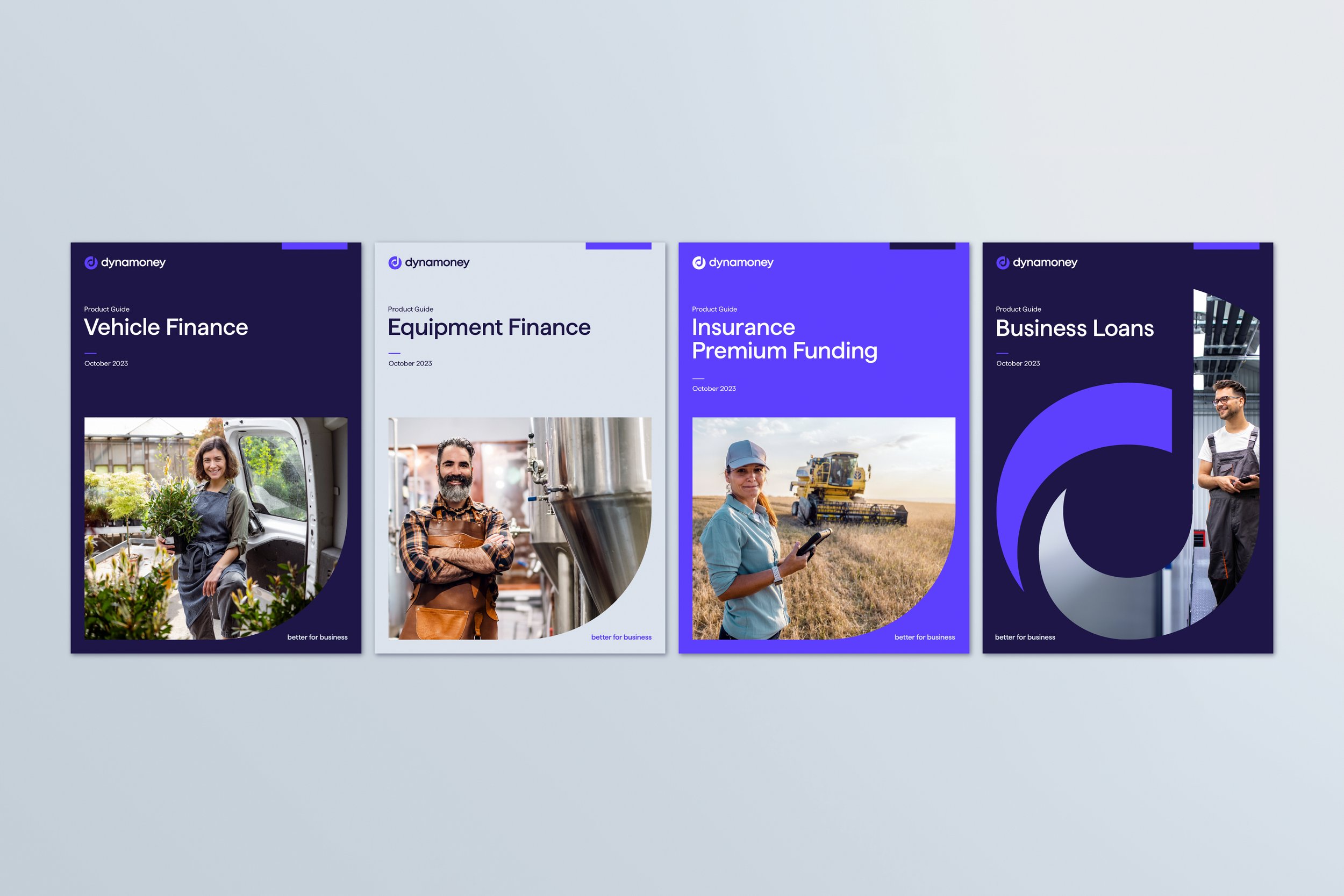
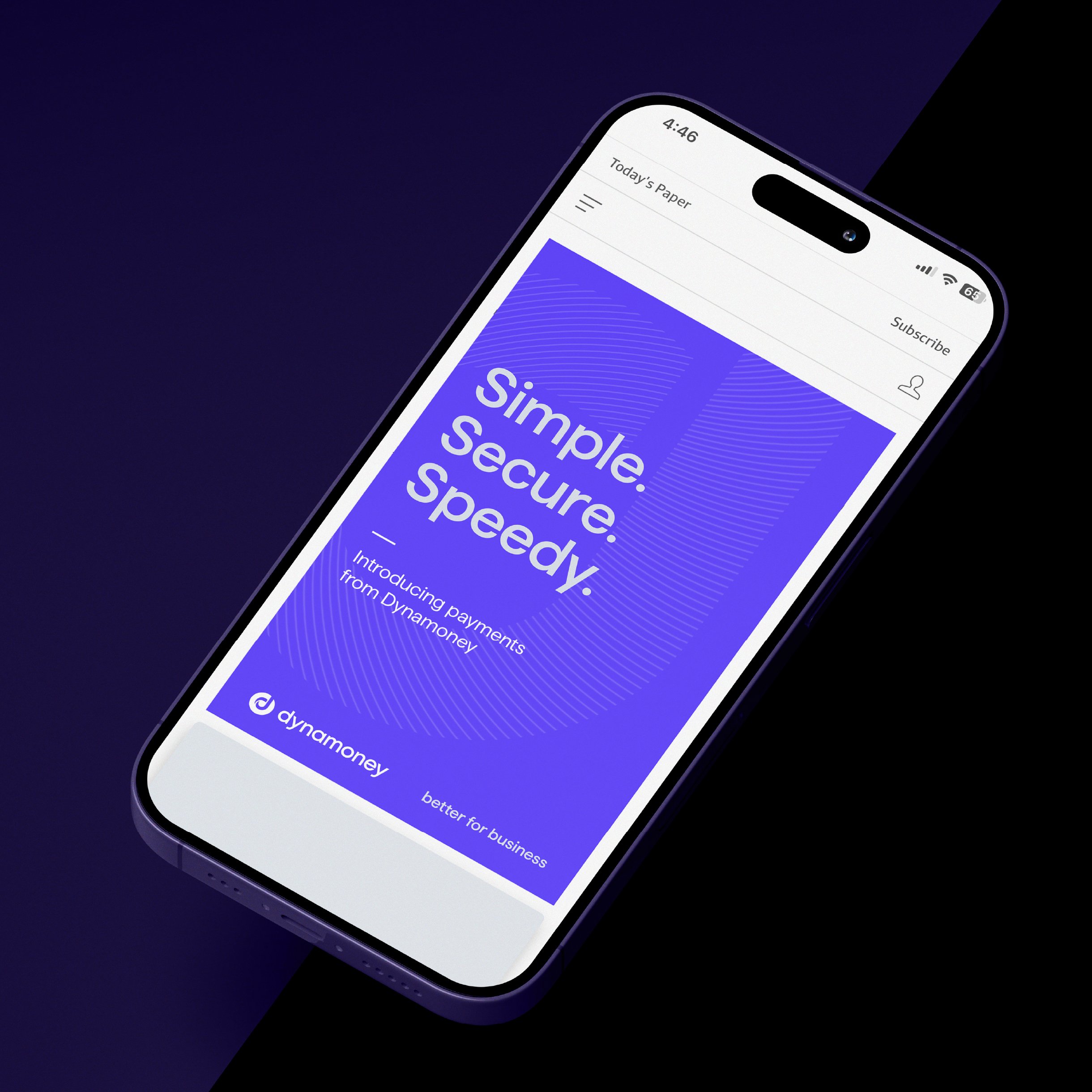
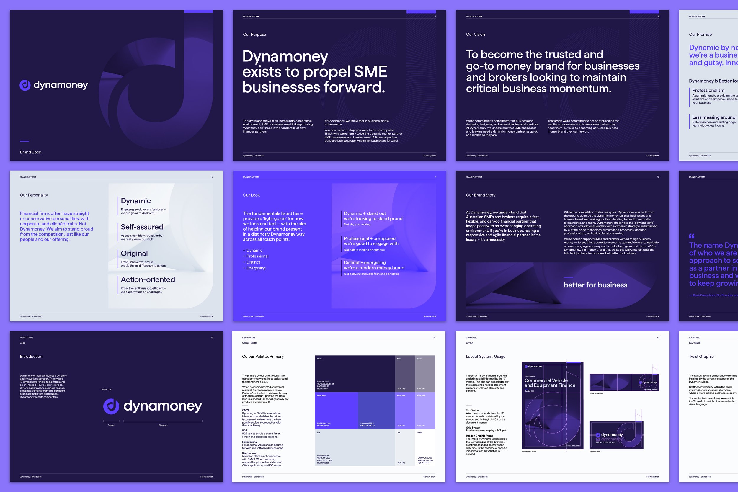
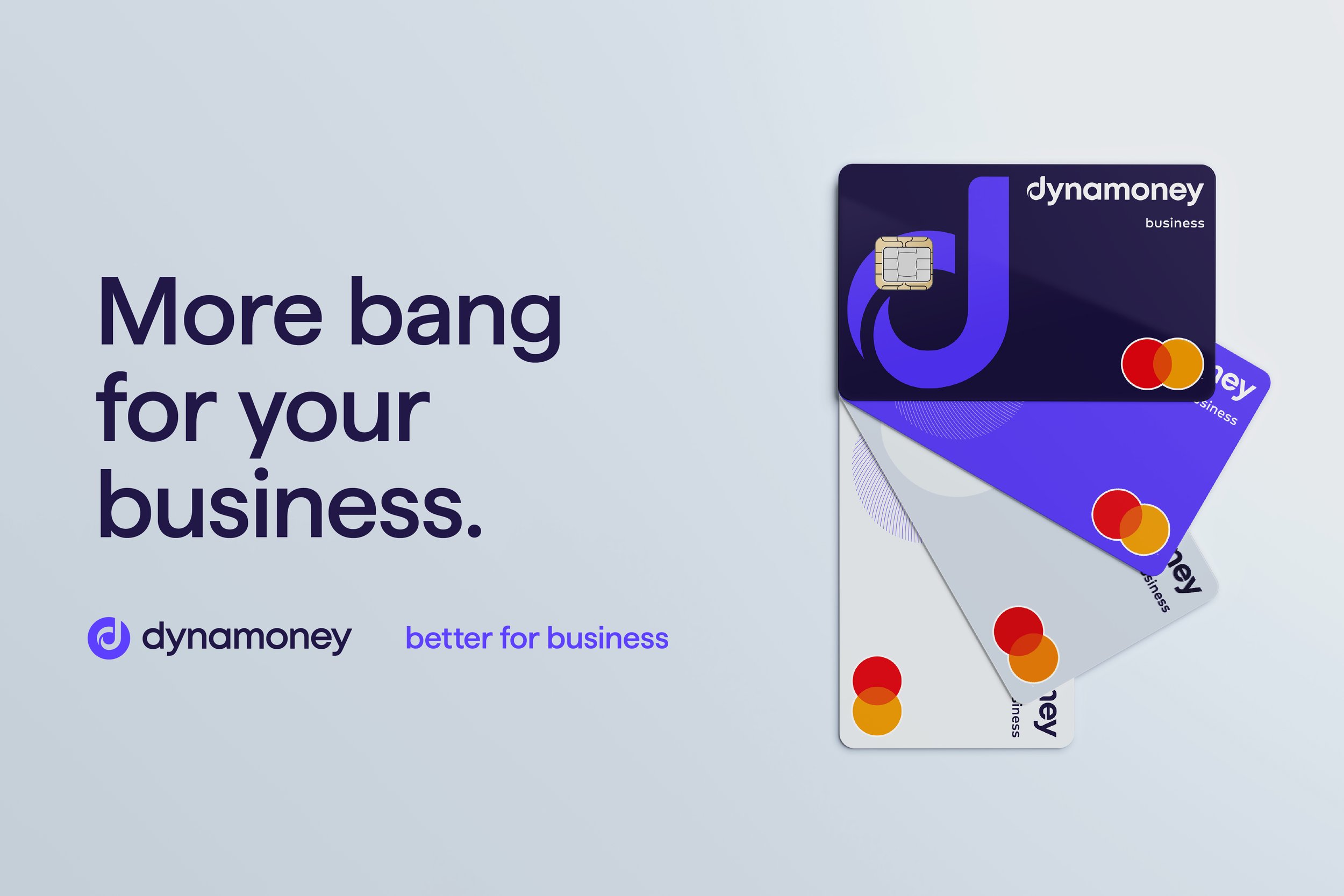
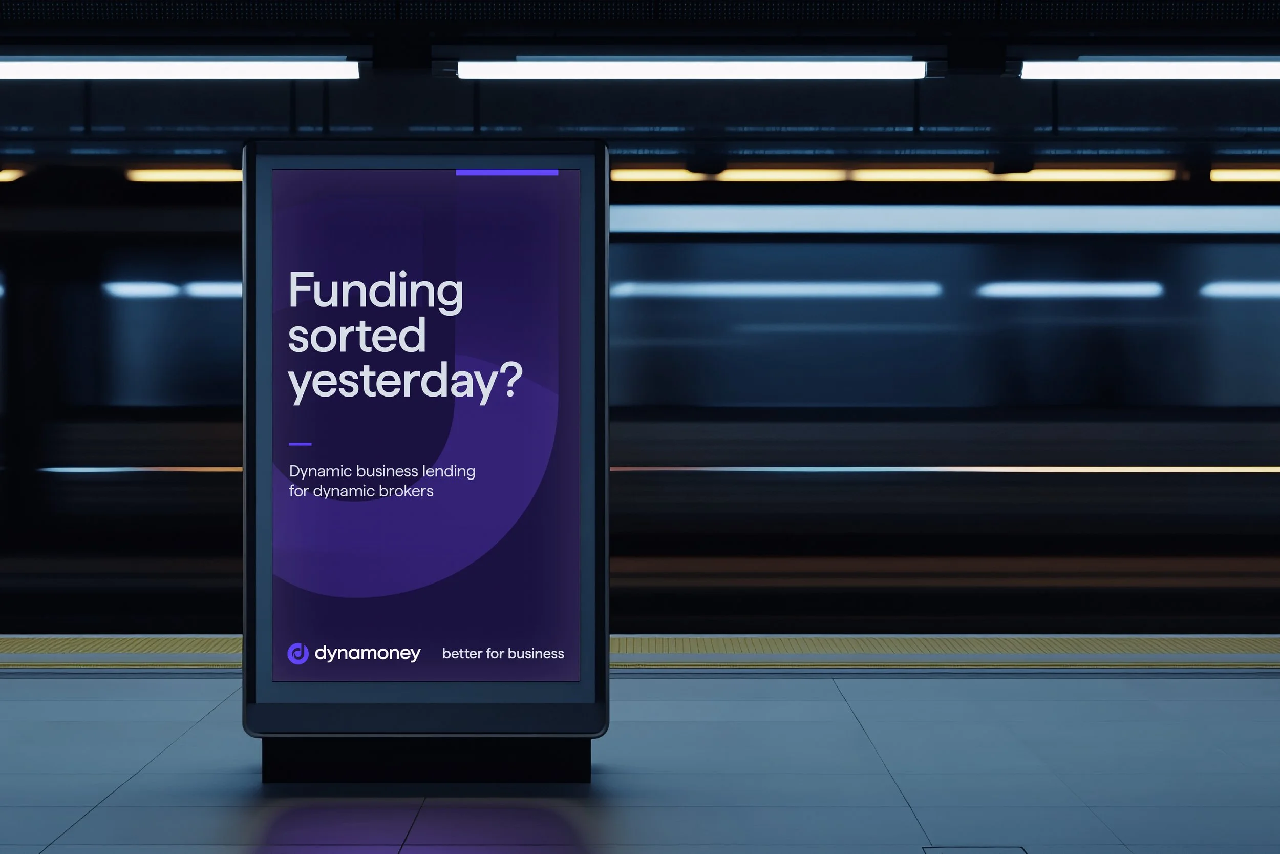
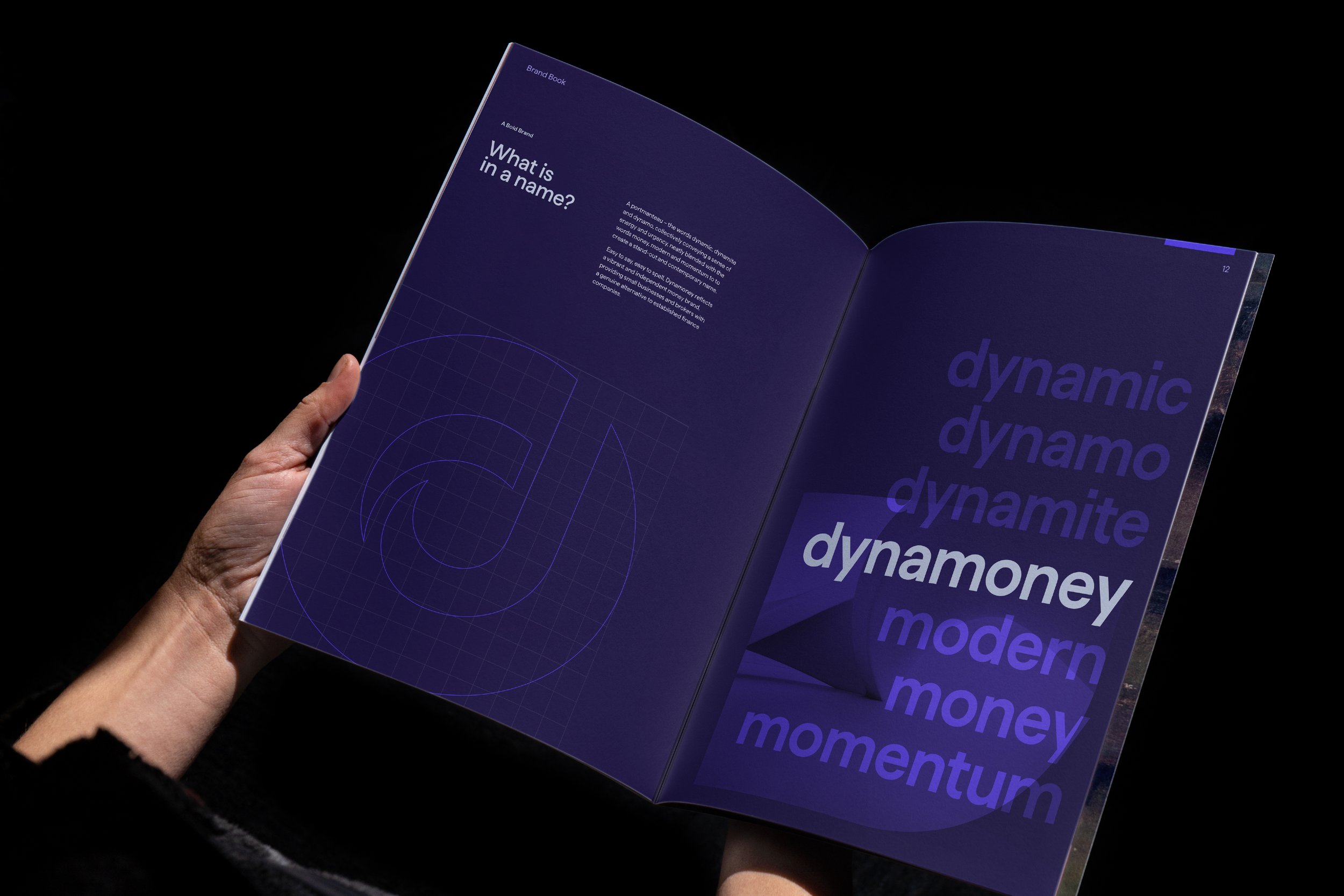
11_Dynamoney
Brand Creation > Naming > Brand Platform > CVP > Identity
A dynamic money partner built to keep small businesses moving
-
Dynamoney emerged as a bold rebrand of Grow Finance, repositioning them from a one-of-many lender to a distinct online ‘money brand.’ The name, a portmanteau of dynamic, money and momentum, reflects the brand’s essence that ‘in business, momentum is everything.’ The identity is designed to stand proud in a staid category, bringing cues of speed, adaptability, professionalism, and individualism to the forefront.
-
‘Momentum is everything’ defines Dynamoney’s role as a proactive financial partner for SMEs. Its identity features bold typography, vibrant colours, and streamlined layouts that convey speed, adaptability, and a can-do mindset. The brand’s visual and verbal systems exude confidence and individuality – while maintaining professionalism – positioning Dynamoney as a standout player in financial services. From the name to the CVP and messaging, every element of Grow’s brand identity was reimagined to create a dynamic money brand that speaks directly to businesses.
-
“The Dynamoney name and brand are a great representation of who we are and what we do – taking a dynamic approach to solving SMEs’ financial challenges. The guys did a tremendous job on this one.”
David Verschoor — Co-Founder & Co-CEO


12_Assorted Projects
Brand Creation > Brand Evolution > Brand Alignment > Brand CVP
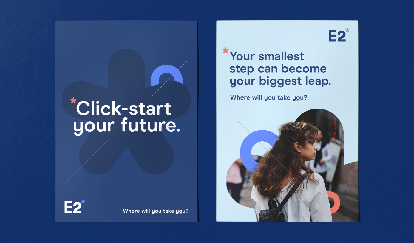
Varied category experience ranging from ed-tech and property, to cyber and law
-
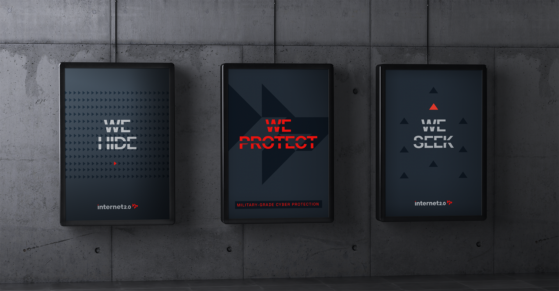
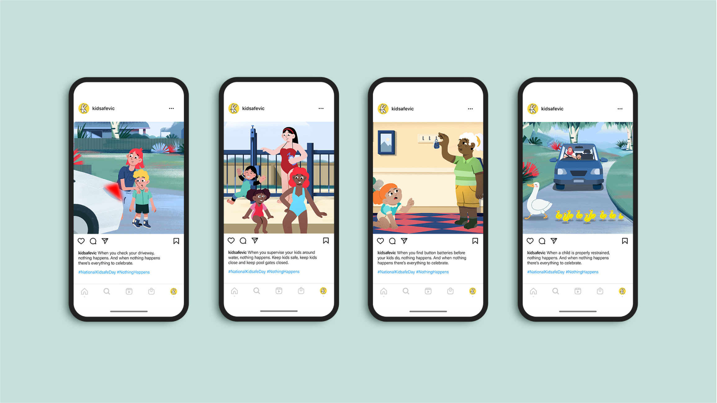
From established businesses to brands just starting out, I’ve worked with a multitude of clients across categories ranging from investment and advisory, ed-tech, and property to cyber security, law, convenience retail, and not-for-profit. A few highlights include: shaping a compelling brand proposition and platform for E2 Learning that brought its digital education offering into focus; building the entire brand identity for Sayers Advisory – from positioning and CVP to messaging – to reflect a progressive approach to business; developing a bold, security-first platform and value proposition for cyber disruptor Internet 2.0; and refreshing the brand and marketing framework for Kidsafe to elevate its life-saving mission and strengthen its connection with families and partners.

![[247] PFM_Work Sample_V5_Image-6.png](https://images.squarespace-cdn.com/content/v1/67ea1c1dfbf911379bde4b51/b326938c-8dae-4c35-b2cd-e82da1183cdb/%5B247%5D+PFM_Work+Sample_V5_Image-6.png)
![[247] TNE_MASTER_Work Sample V2_Desktop_Banner-Image.png](https://images.squarespace-cdn.com/content/v1/67ea1c1dfbf911379bde4b51/5546beea-cd98-45af-a3ba-6d1f4ce71c2b/%5B247%5D+TNE_MASTER_Work+Sample+V2_Desktop_Banner-Image.png)
![[247] Sayers_Work Sample_V2_Image-5.png](https://images.squarespace-cdn.com/content/v1/67ea1c1dfbf911379bde4b51/a809f1f5-6c8f-4430-bb11-bbe09bcaa9c1/%5B247%5D+Sayers_Work+Sample_V2_Image-5.png)